Karina Lax by Teacake
Opinion by Richard Baird Posted 7 May 2012

Karina Lax is a freelance fashion, music and editorial photographer and part owner of Richmond Pictures. Her new brand identity, designed by Manchester-based creative partnership Teacake which includes a new logo, stationery set and website, utilises a simple but elegant KL monogram against both a vivid and dark grey colour palette conveying a creative yet professional personality and approach.
“Having worked across a range of fantastic projects the priority was to show the sheer breadth of work in Karina’s portfolio. We created a very simple typographic logo with a diagonal embellishment inspired by old fashioned photo corners. To give this an injection of life we provided a range of brightly coloured stocks to allow her to produce stationery as and when it was required. The business cards were clear foiled on 540gsm GF Smith Colourplan resulting in them being almost invisible unless tilted towards the light! Her portfolio site was built with the kind help of our friend Nick Greenwood.” – Teacake
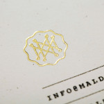
Built from a lowercase italic serif and simple ligature, Karina’s visual identity delivers a nice sense of geometry, balance and movement through mixed line weights, sweeping terminals, parallel and 45 degree strokes that mixe high fashion, boutique and editorial sensibilities with a classic monogrammatic resolution that feels personal and accessible. The slash introduces a slightly more abstract and couture quality that is perhaps a little superfluous but is underpinned by a traditional photographic reference but neatly frames the KL in the corner of the collaterals.


A bright fluorescent colour palette alongside darker boards of the stationery has a playful aesthetic reflective of contemporary fashion while its solid colour provides contrast to Karina’s layered and detailed work, adding a creative depth to the professional sensibilities of the monogram. The uncoated substrates offer texture and a more craft-like finish while the clear foil emboss delivers a subtle but sophisticated edge that plays with the light, appropriately drawing on the fundamental principles of photography.