Mi&Mall by Atipo
Opinion by Richard Baird Posted 28 June 2012

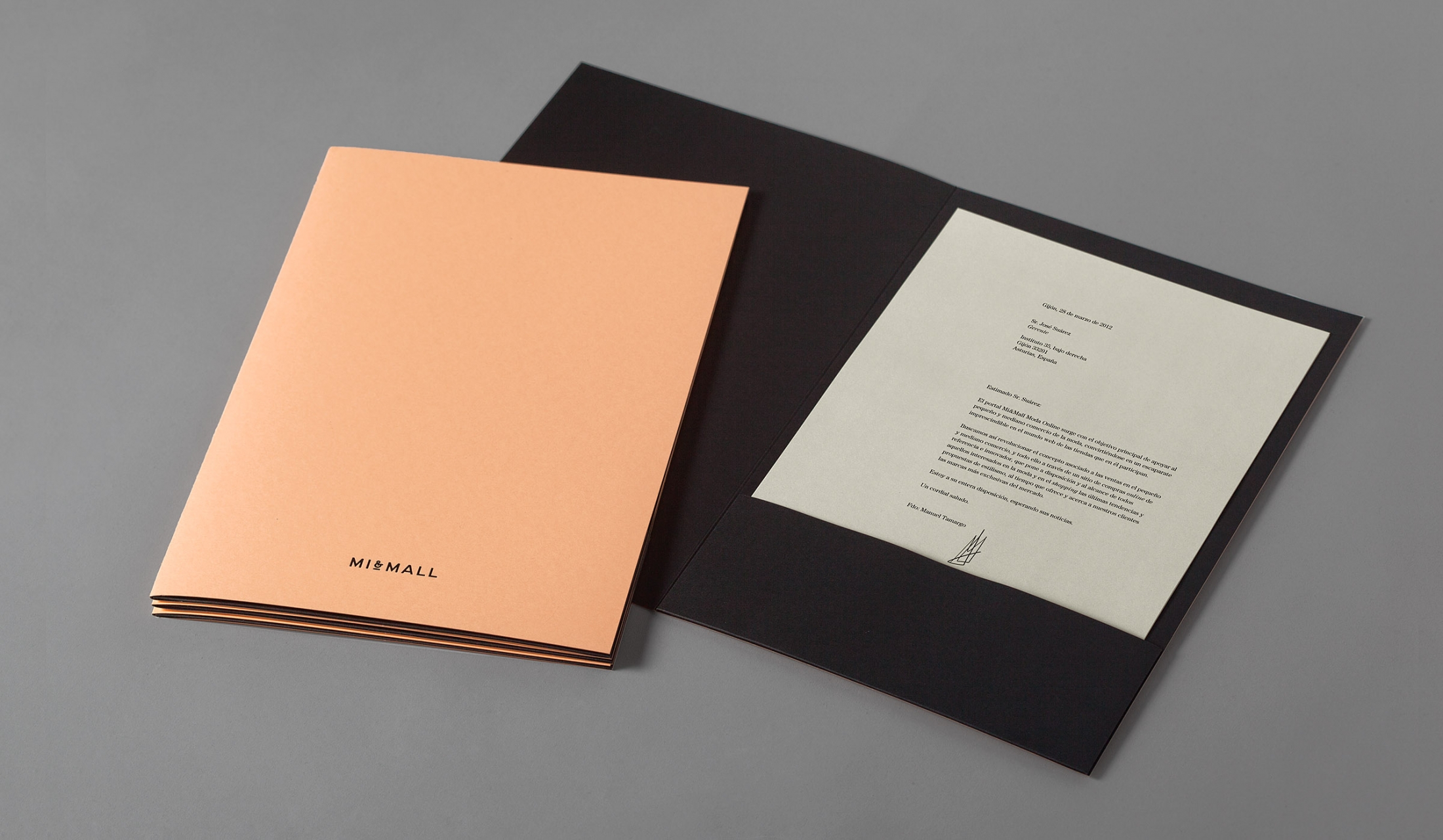
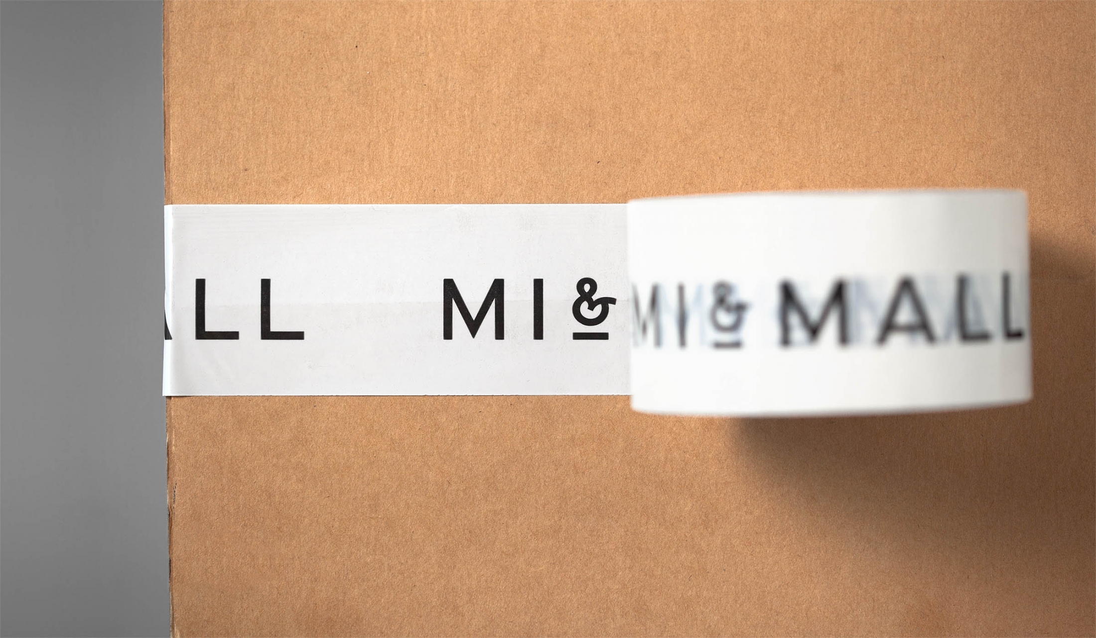
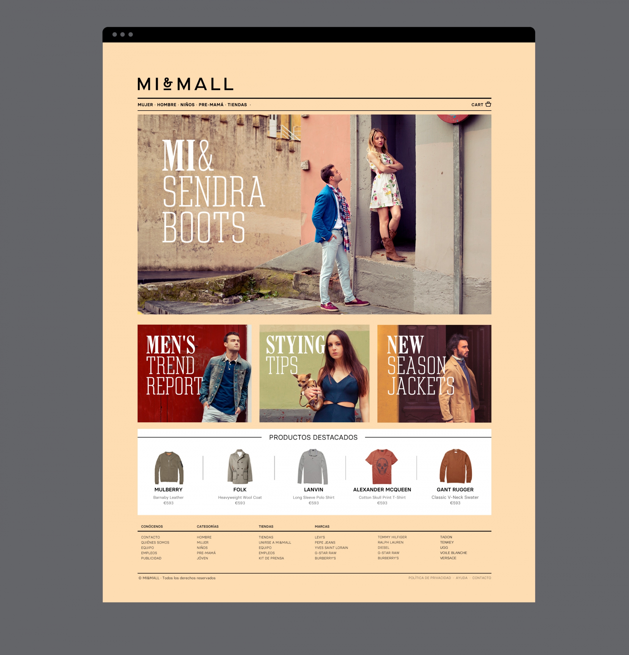
Mi&Mall is an online shopping destination and resource that brings together and supports small to medium designer brands for people interested in fashion, trends and exclusive collections. Based around a simple logo-type, ampersand, a pale colour palette and a tactile print and material choice, Mi&Mall’s visual identity, created by Spanish multidisciplinary design studio Atipo, mixes high fashion and boutique craft cues to express style and exclusivity with a sense of handmade quality and individuality.
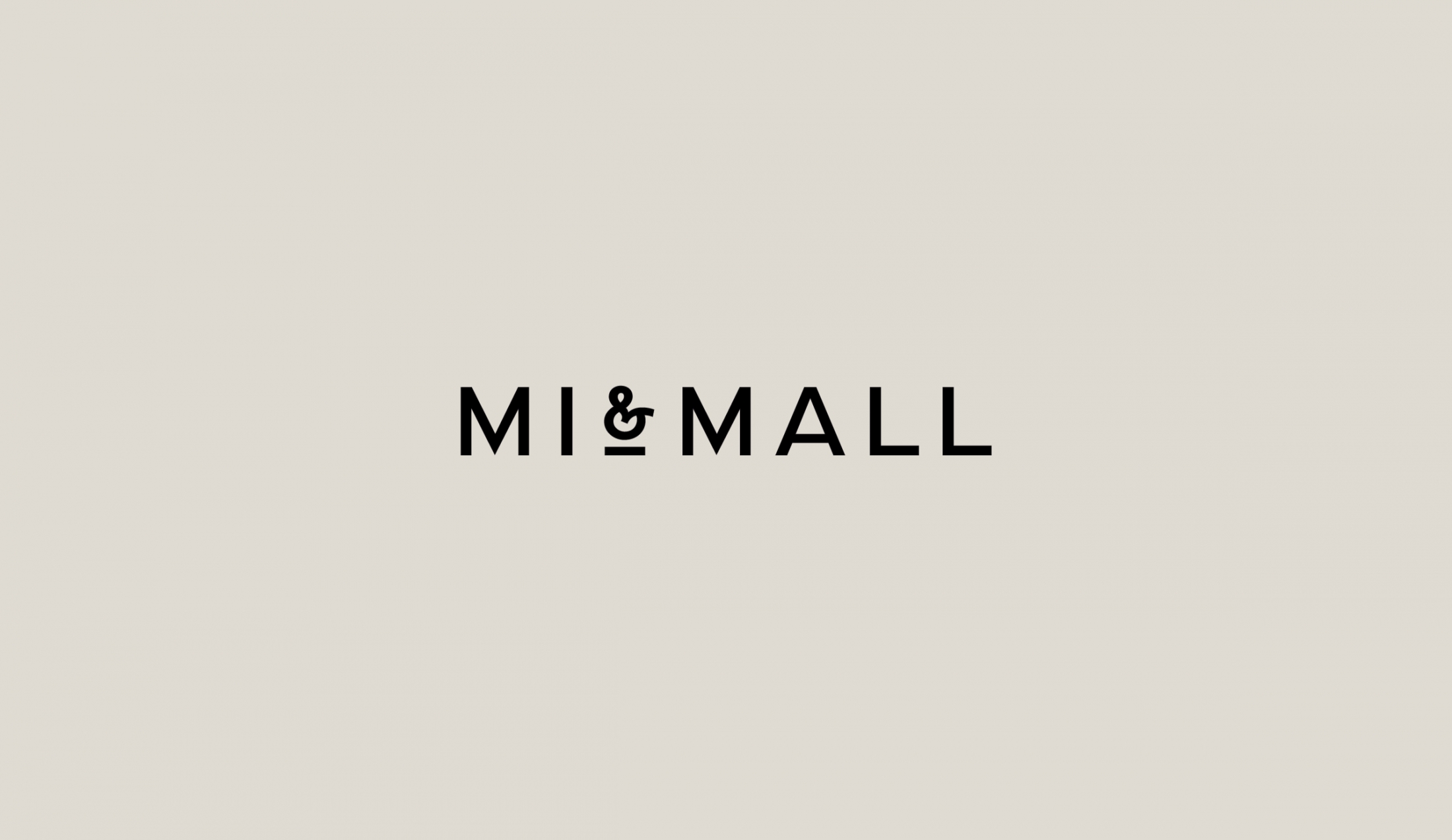
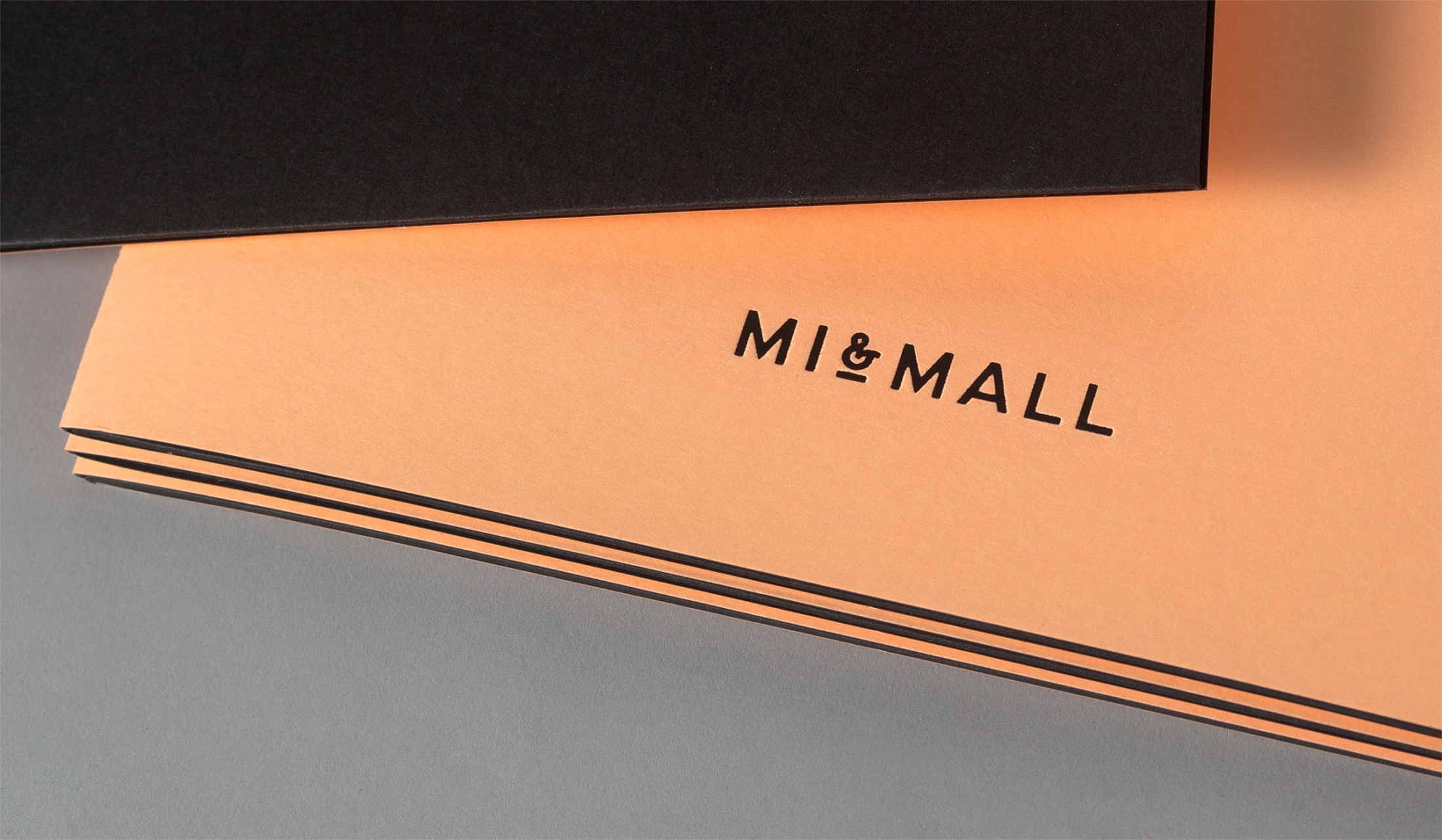
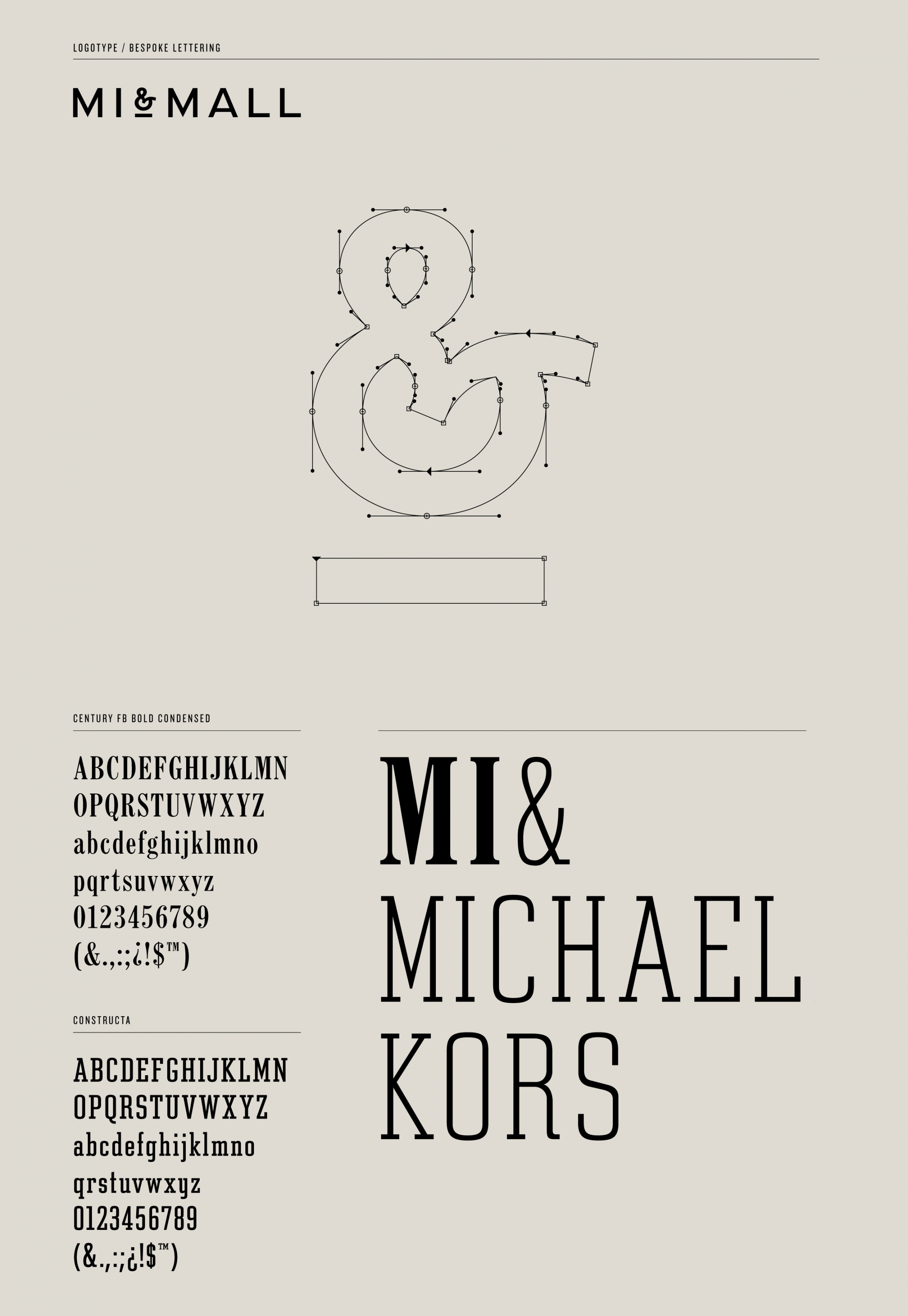
There is a lovely mix of ideas conveyed through Atipo’s logo-type solution that neatly manages to fuse traditional and contemporary through the high fashion sensibilities of wide, uppercase, geometric, broad mono-spaced and humanist letterforms (executed with a single consistent line weight), the threaded flourish of the ampersand and the traditional values of craft and quality delivered through a simple underline detail.

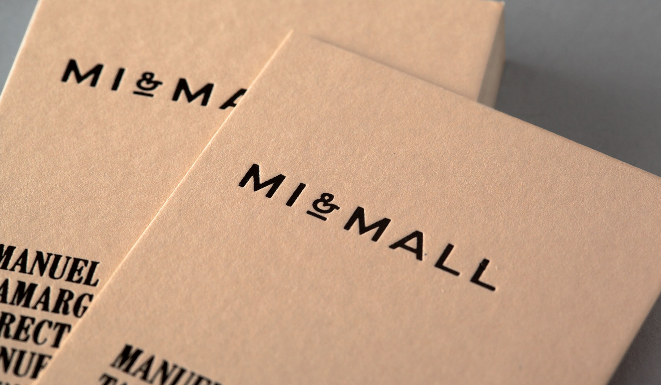
Combined, these cues work well to capture the handcrafted, small scale, individuality and exclusive nature of the garments and labels, a high quality service and the boutique personality of the site. The height and serifs of the accompanying typeface deliver an interesting contrast to the width of the logo-type, adding to brand personality with a sense of regional, Spanish heritage but retaining the uppercase confidence.
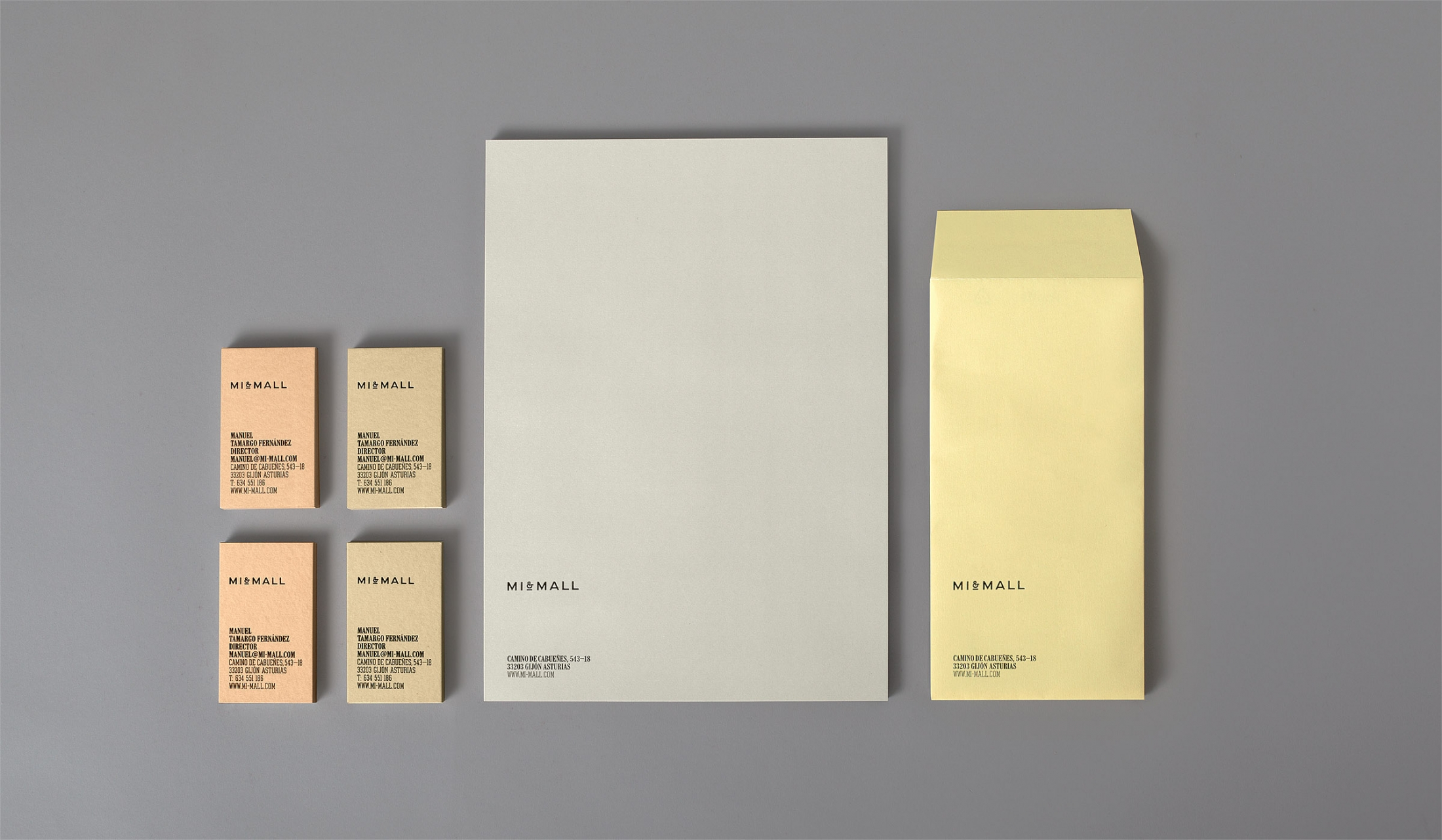
Craft and detail are emphasised through an interesting pale but warm colour palette, an uncoated, tactical substrate choices and the classic letterpress print treatment of the collateral while the restrained vertical layouts and high quality finish mirror those of the high fashion industry.
Materials: Arjowiggins’ Pop’set papers and includes Apricot, Fawn, Grey, Vanilla and Black.
Design: Atipo. Opinion: Richard Baird. Fonts Used: CenturyFB & Constructa.
