Caramela by Anagrama
Opinion by Richard Baird Posted 3 July 2012
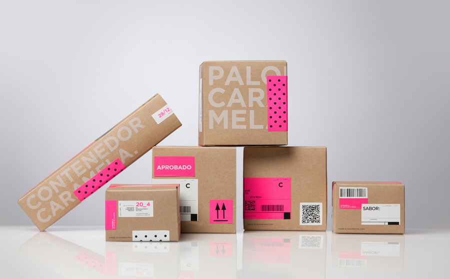
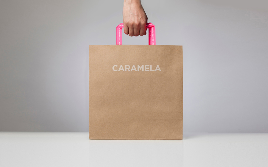
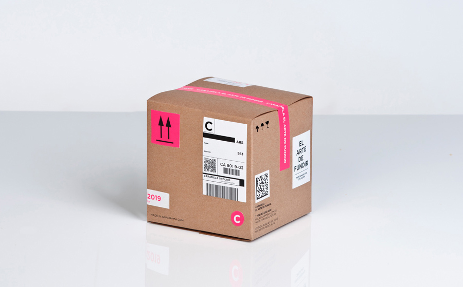
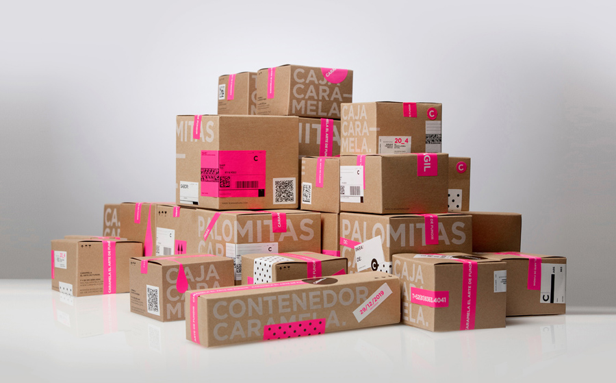
Caramela is a Monterry-based chocolate boutique and caterer that creates traditional treats inspired by European pastries. Their identity, designed by independent design agency Anagrama, is an unusual but striking mix of a sweet neon pink and clinical white, a subtle 80’s retro-fashion polkadot pattern, the practical/industrial and craft aesthetic of an unbleached and uncoated substrate, adhesives and white screen print, finished with a simple but contemporary Gotham logo-type.
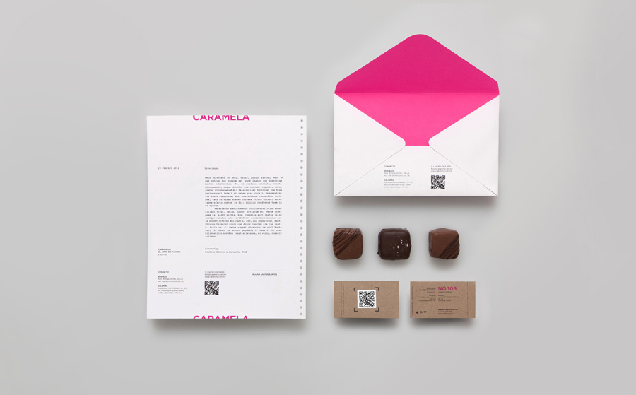
“Caramela is a fusion of traditional Mexican candy and the latest expressions of high European pastries, a place where craft work is done mixing the rustic flavors of Mexico with the sophistication of international cuisine. When the careful dedication and skill of expert hands melt in our workshop finest chocolates with ingredients of the highest quality in traditional copper pots, the result is a dessert of fine finish and great taste. Each of our creations is a moment of seduction for the senses.” – Caramela
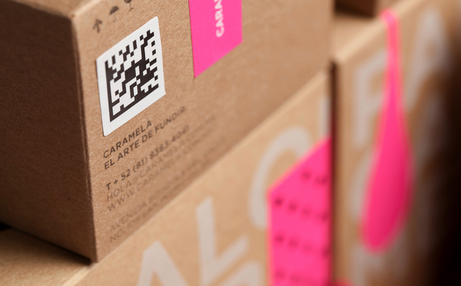
“This city differentiates historically for having an industrial golden ear in steel manufacturing. As part of the concept, we considered these historical values to inspire the brand to simulate a high-end handcrafted chocolate factory. The packaging design is inspired on industrial packaging systems. We used adhesive stickers and identification codes as part of the brand’s language stylizing them with simple layouts and joyful colours.” – Anagrama
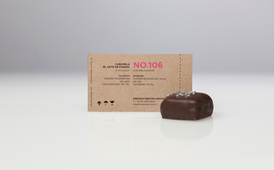
By fusing the high quality, professional, clinical, boutique aesthetic of a simple Gotham logo-type, plenty of white space and grid based layout across the stationery (an aesthetic drawn from the skincare sector) with an earthy, practical and tactile material choice, a single colour print treatment, stickers, labels and tape across the packaging, Anagrama has managed to balance the premium, sophisticated and internationally exported sensibilities with the regional, traditional, handcrafted and utilitarian. It is a distinctive and visually rich resolution of contrasting ideas delivered through an intelligent combination of straightforward typographic design alongside more communicative material and print choices.
