Batishta by The Bakery
Opinion by Richard Baird Posted 3 October 2012

Batishta is a Moscow-based musician who originally began his career with electronic rap group Band’eros. Following a recent split and seeking to establish a solo career, Batishta commissioned design agency The Bakery to develop a new visual identity, website and CD packaging solution for his 5010 album that would position him as a modern urban gentleman and reflect his ‘established celebrity, rooted in street culture and hip-hop’.
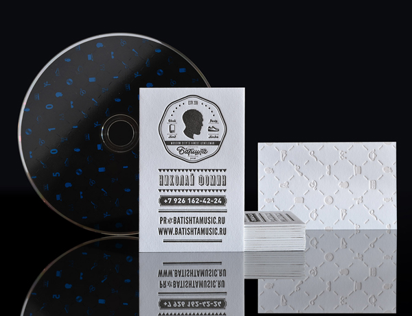
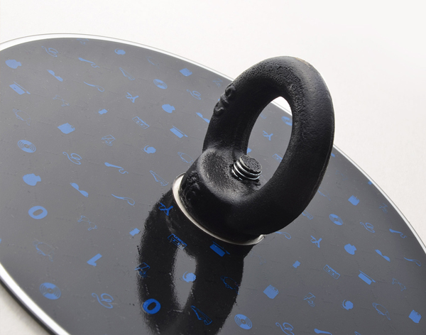
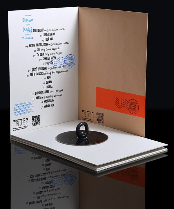
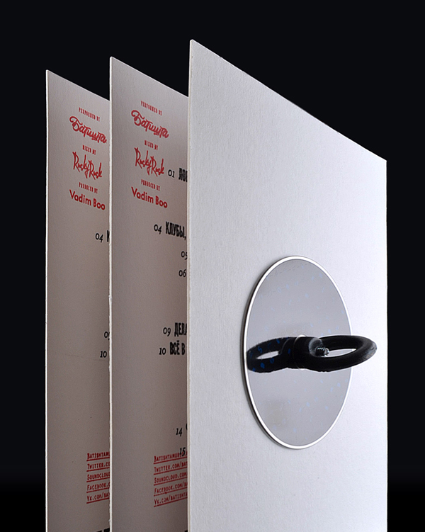
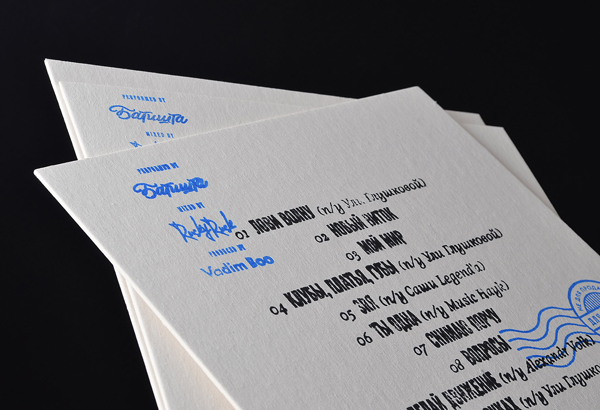
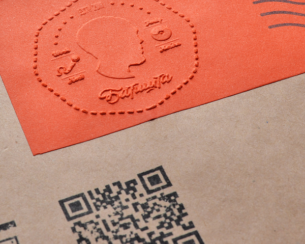
The duality of Batishta’s ‘pop-personality’ is clearly evident and cleverly resolved through multiple layers of contrast from the bold union of bright contemporary blue and orange highlights across the traditional cream tones of the substrate, to the more subtle, tactile qualities of a deboss.
The pattern’s quirky and unusual mix of stereotypical English gent, urban youth, music and street fashion – executed with a high-fashion composition – delivers a rich and multi-faceted personality and a sense of accessibility (through simple pleasure) to fans. The heavy fill and lighter line weights and typography of the coin alongside the spacious, well structured and communicative value of the pattern, deep deboss and stamp-based print finish across a weighty cream and uncoated board choice, create a nice balance between the fine qualities of craft detail and the bold attitudes of urban music.
The result is a well executed fusion of classic and contemporary motifs bound by a high quality and traditional finish that lends a little more class to the conventions of the hip-hop/pop industry.

