Tegn_3 by Neue
Opinion by Richard Baird Posted 26 February 2013

Tegn_3 is a Norwegian, multidisciplinary, architecture design studio that, through inclusive methods, process-oriented and competent project management, deliver holistic solutions that encompass the fields of architecture, planning and landscape, to large clients across Scandinavia. Their visual identity, developed by Neue, draws together the themes of technical knowledge, structure, connections, collaboration and creativity through neutral typography, a modular and expanding geometric pattern, tactile and reflective print finishes, ample white space and the more unusual, playful addition of colour and the engagement of an interactive image generator.
Like many other architectural identities Neue’s solution is a familiar combination of industry cues carefully distributed across graphic design, material choice and print finish. This familiarity is far from a criticism but an appreciation for clear communication over the pursuit of a pure and potentially abstract sense of originality.
The logo-type’s generously spaced, regular, sans-serif characters establish a near neutrality with a lowercase, non-hierarchical inclusivity – rather than an uppercase authority – and a technicality that resonates subtly through the consistent line weight, square terminals and underscore detail. A secondary typeface – a traditional serif executed with the contemporary utility of a stencil cut detail – carefully balances functionality and flourish to add a little more conceptual depth, contrary to the consistency often utilised within this field.
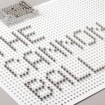
The isometric pattern work reinforces the technicality of the logo-type, clearly conveys a sense of structure and builds in – through the technology of a generative algorithm and the craft aspect of coloured pencils – a sense of connection and collaboration between disciplines, individuality and creativity. Its embossed and UV print finish across white, matt varnished and uncoated substrates, lends both a structural and elevated physical quality to the identity and, through the absorption and reflection of light, distills some of the qualities of architectural materials into the collateral.