Bølgeblikk Arkitekter by Tank
Opinion by Richard Baird Posted 12 March 2014

In response to a change in leadership and the acquisition of new staff, Norwegian architectural firm Ottar commissioned Tromsø and Oslo-based design studio Tank to develop a new name and brand identity—which would go on to include a logo, stationery set and responsive website—that would better reflect the quality, professionalism and scale of the firm’s work within the health and education sector, whilst maintaining an “innovative and modernist expression”.

The new name Bølgeblikk, corrugated iron in English, while traditionally associated with the utility of sheds and military installations, is described by Tank as having a ‘renaissance because of its unparalleled quality and flexibility’. The material’s wave like quality and the contrast of ‘movement and stillness, hard and soft, chaos and structure’ informs the aesthetic of the brand identity, from the gloss ink and matt board of the business cards and the two textures of the notebook, to its black and white colour palette.


The stencil cuts and partial deconstruction of the uppercase sans-serif characters of the logotype, and the relationship between positive and negative space that exists throughout these provide Bølgeblikk with a solid foundation from which to reflect the firm’s modernistic ideals, bold sense of structure, functionality and utility, and sets a robust, reliable and professional standard.

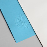
The logotype’s over-sized and cropped execution across the business cards, its stacked grid-based application across the front of the notebook and continuous stream along the tape, establish a clear sense of pragmatism and bold modernistic structure. These themes are then infused with the architectural nuance of light and shadow, space, perspective, movement and material through the tactile use of raised surface detail, matt papers, white and black boards, glossy ink choice, a limited colour palette and the layout and parallax windows of a responsive website.

Tank have managed to extract a good amount of visual and communicative equity from a simple typographical treatment through relevant print and material choices and a bold and considered eye for layout. It does not deviate far from what designers and architectural clients have come to expect but it is bold, distinctive and understandable in the values it aims to communicate.
Photography by Espen Gees