The Best of BP&O — June 2014
Opinion by Richard Baird Posted 1 July 2014

June was a great month for new projects. Highlights included Mission’s brand identity for Norwegian bank alliance Eika, Here’s work for restaurant The Palomar and Bond’s visual identity for Puustelli’s reductionist kitchen Miinus. However, there were five projects that really stood out and have made it into BP&O’s top five, a feature that brings together the most interesting of each month for another opportunity to be seen and shared. Projects that make it into the top five display a good balance of graphic design, print finish, material and structural choice, and have a communicative depth and precision.

Stephenson Personal Care is a fifth generation family business which has been making soap bases from top grade, renewable, ethically sourced ingredients since 1856, yet remain innovative and ambitious. Over this time Stephenson have built a broad customer base that includes multinationals, supermarkets and hobbyists. Stephenson recently worked with Leeds based design studio Robot Food to develop a new brand identity and flexible packaging treatment that would place their significant heritage and experience at the heart of communication, convey the concept of ‘creative chemistry’, support their international ambitions and would be sensitive to both their blue-chip and homecraft markets.
See more of the project here


Silver & Green is a producer, importer and wholesaler of authentic Mediterranean delicacies such as olives, olive oil, tapas and meze, established in 2007 and located in the English Lake District. Silver & Green describes itself as a ‘family of foodies’ who share a passion for the Mediterranean, high quality artisanal products and good customer service. Dorset based Salad Creative were recently commissioned to redesign Silver & Green’s brand identity and packaging in a way that would increase its appeal to delis, farm shops and food halls. Recognising that the market is currently well-served by a multitude of rustic and heritage brands, Salad Creative chose a playful, modern and handcrafted aesthetic that avoided the ‘obviously rustic’ and drew inspiration from the variety of ingredients and their Mediterranean origins.
See more of the project here

Iona Brown is a London based contemporary jewellery designer who favours classic simplicity, understated detail, precise finishes and minimalist lines, shapes and materials. Graphic designer and art director Sam Flaherty recently worked with Iona to develop a new visual identity for her expanding collection. Built around a customised logotype and a simple print and packaging treatment that uses few but good quality and contrasting paper and print choices, the solution reflects the key aesthetic and design values that run throughout Iona’s work.
See more of the project here

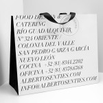
Casa Virginia is a restaurant and culinary project, created by chef Mónica Patiño and located in Mexico City’s Roma neighbourhood, that mixes the highest quality cuisine and meticulous processes with the familiarity of eating at home. This fusion of restaurant quality and easiness is perhaps most acutely manifested throughout Habitación 116’s interior, a space that juxtaposes the modesty and simplicity of wooden and basketweaved furniture alongside the ornate cornice and sculpted detail of the walls.
Savvy were recently commissioned to create a brand identity for the restaurant, which included logo, stationery, menu and signage design, that would resonate well with Habitación 116’s interior, be informed by Mónica Patiñ’s philosophy and honours her processes. This was achieved through the contemporary reinterpretation of what Savvy describes as the traditional graphic language popular in Mexico during the 1920s and an attention to detail.
See more of the project here

Seafarers is a recently rejuvenated seven floor habour front building located in Auckland’s Britomart precinct that will house, over two floors, Michelin starred chef Josh Emett’s flagship restaurant, due to open in stages throughout 2014, as well as brasserie and bar Ostro. The brand identity for the building, restaurant and brasserie, developed by Inhouse, draws on the rich history of the space — once known as Auckland’s Sailors Home — and its contemporary renovation through a variety of traditional and more recent typographical and nautical detail.
See more of the project here