The Counter Press by The Counter Press
Opinion by Richard Baird Posted 5 November 2014

The Counter Press is a letterpress studio and workshop located in an old chocolate factory in the East End of London. They work exclusively with hand set wood and hot metal type on antique presses to create contemporary typographic design, artwork and limited edition prints. While taking on small outside projects, founders David Marshall and Elizabeth Ellis are keen to stress they are not a commercial printer but full-time designers with a passion for traditional moveable type, and the craft and beauty of letterpress.
After three years of business The Counter Press recently found the time to build on their visual identity with a new set of business cards. While a limited canvas, these manage to bring together and convey some of the studio’s typographic and print expertise, and draw contemporary design sensibilities from traditional processes.

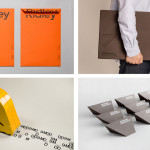
Although the studio’s business cards received a complete overhaul their monogram remains, and rightly so. The extended C, ball terminal, serif and curved brackets are clearly traditional references, however, the cut through the centre and smart use of negative space is, in opposition, far more recent. The combination is subtle and unforced, reflects current design practices and a retrospective appreciation, and appropriately leverages the well-established associations monograms have with craftsmanship and individuality.


The monogram’s balance of past and present is expanded upon in print. As you might expect from a letterpress studio, the business cards are as much about process as they are about finish and make good use of colour, type, texture, material and print technique. The front, hand typeset in 8pt Plantin, utilises typographic heritage and classic flourish, drawn out using plenty of unprinted space, to establish a professional formality and reflect an appreciation for simple, well set design.
The reverse is distinctly more expressive. Rather than a rigid logotype, The Counter Press have run with a greeting in a variety of wood cut letter faces. Their rough edges, inconsistent ink coverage, large size and occasional full bleed introduce a current, crafted and aged sensibility. This contrast between front and back is acute, effective as an aesthetic and communicative endeavour, working well as a testament to the studio’s metal and wood type capabilities, the opportunity for restraint and bold self-expression, as well as its enthusiasm.

Printed using black ink across a weighty 360gsm Fedrigoni Materica Clay stock and finished with fluro orange edge painted detail, the disparity of type is united by a consistent colour palette, material choice and finish. Like the monogram and the juxtaposition of large wood and smaller metal type, the uncoated board and its bright orange edges effectively mix past, present and process.
As business cards go, these are as distinctive and as high quality as you would expect them to be, appearing as a showcase of typographic and communicative subtlety, aesthetic impact and print ability without going overboard. If there was any reason to combine fluorescent ink, heavy dyed board, worn type and a letterpress approach, this is most definitely it.
Design: The Counter Press
Opinion: Richard Baird
Fonts Used: Plantin