STRP Biennial 2015 by Raw Color
Opinion by Richard Baird Posted 2 September 2015
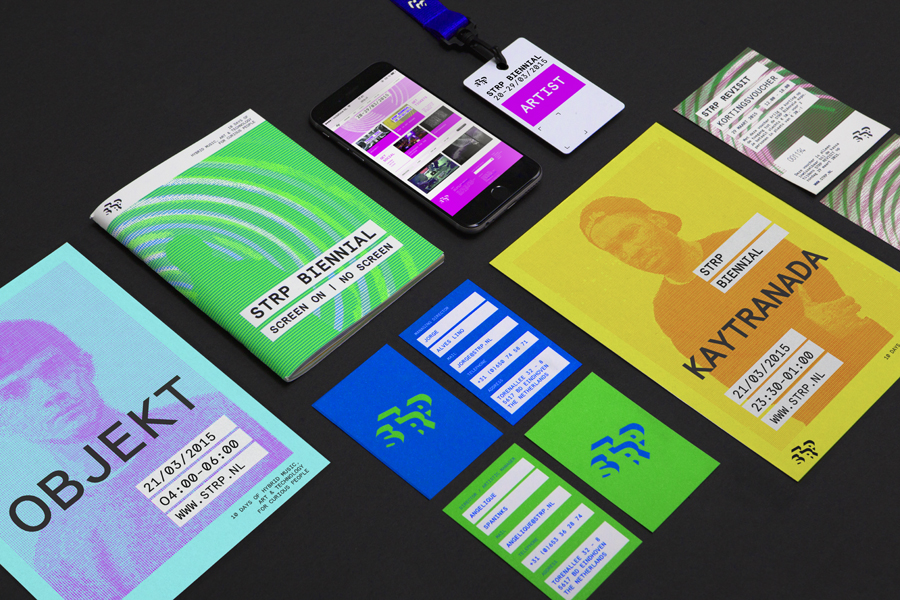
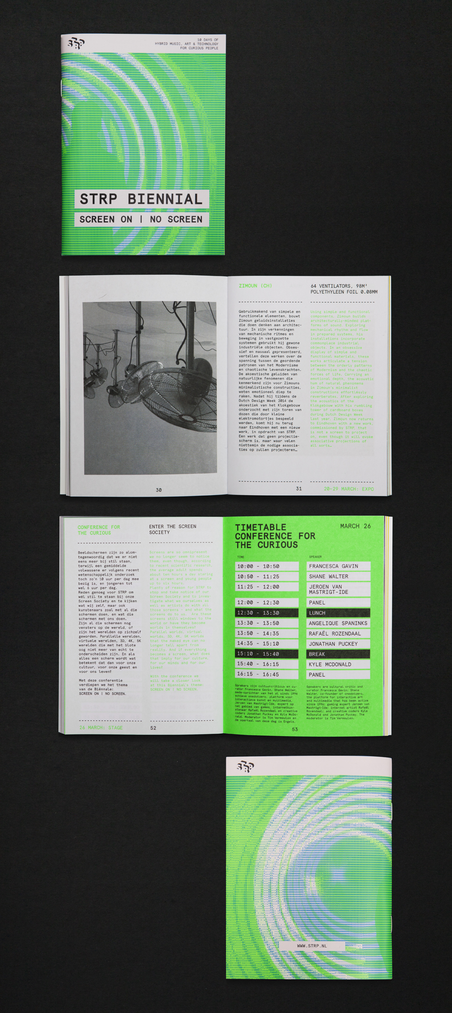
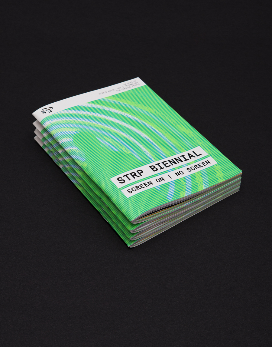
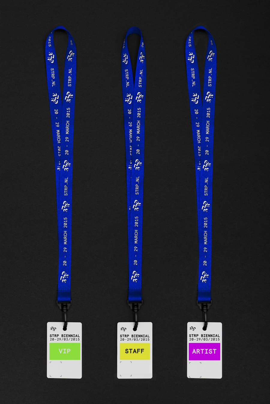
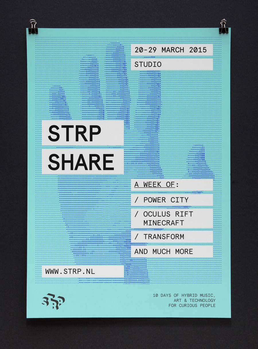
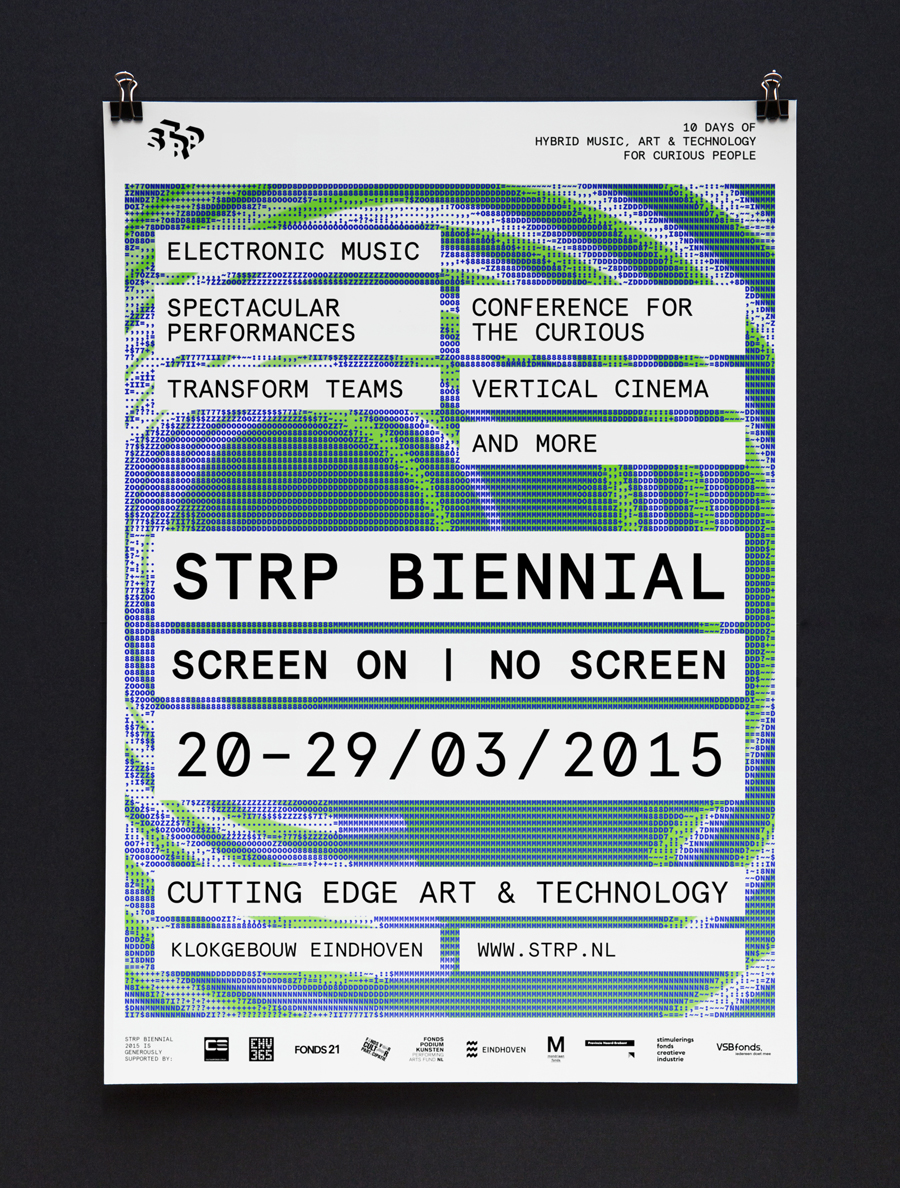
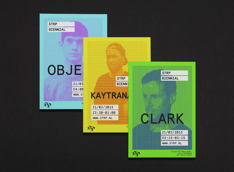
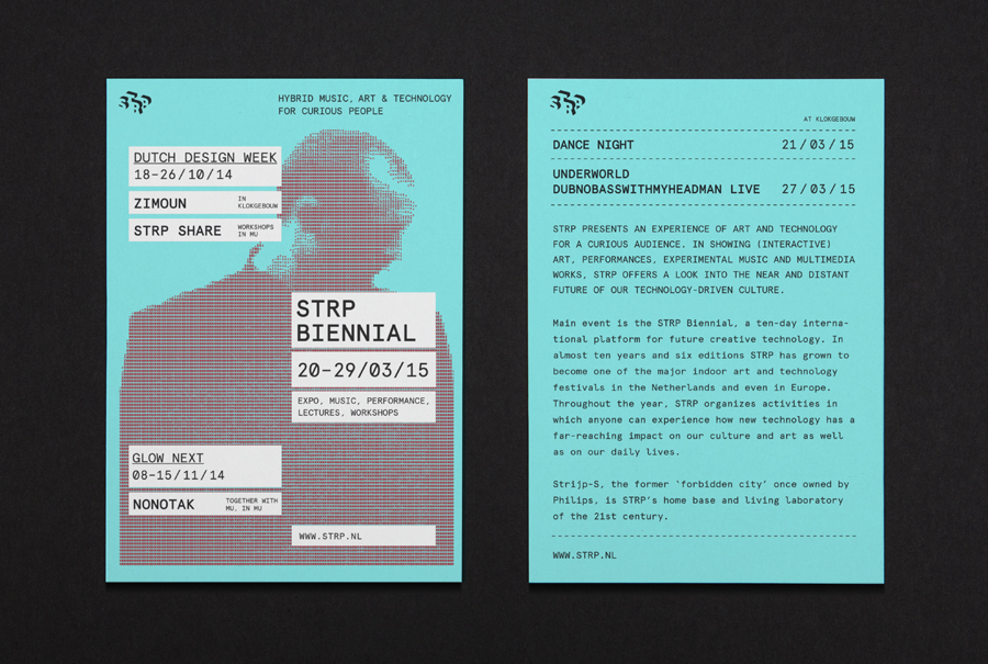
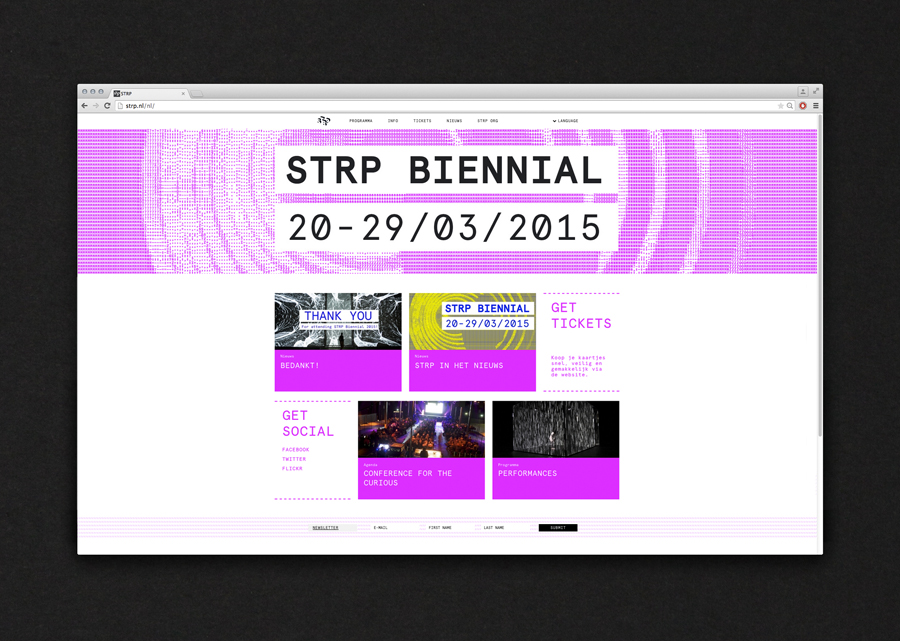
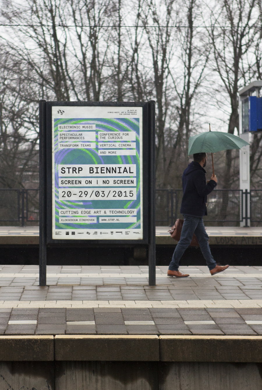
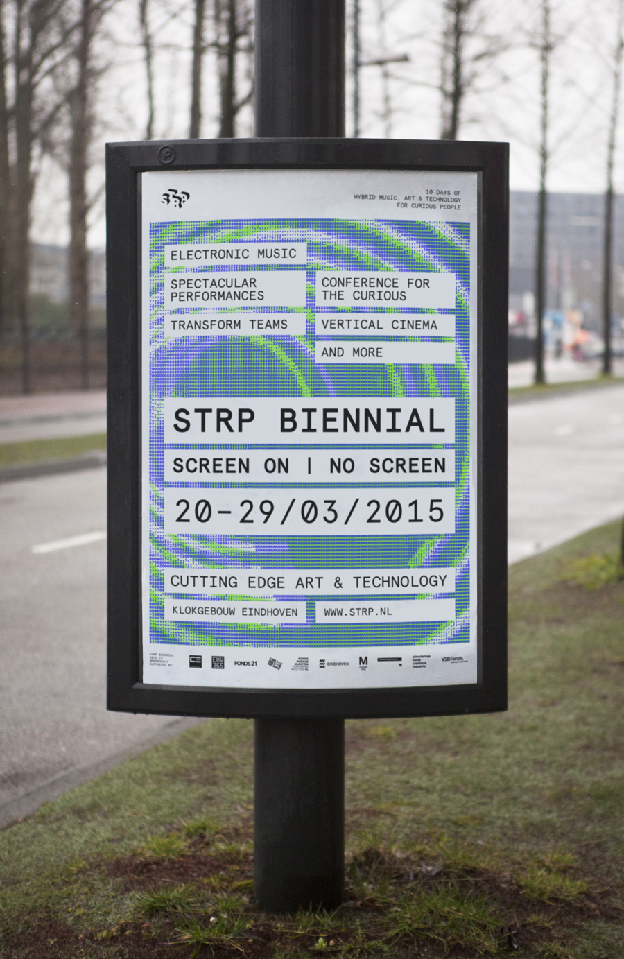
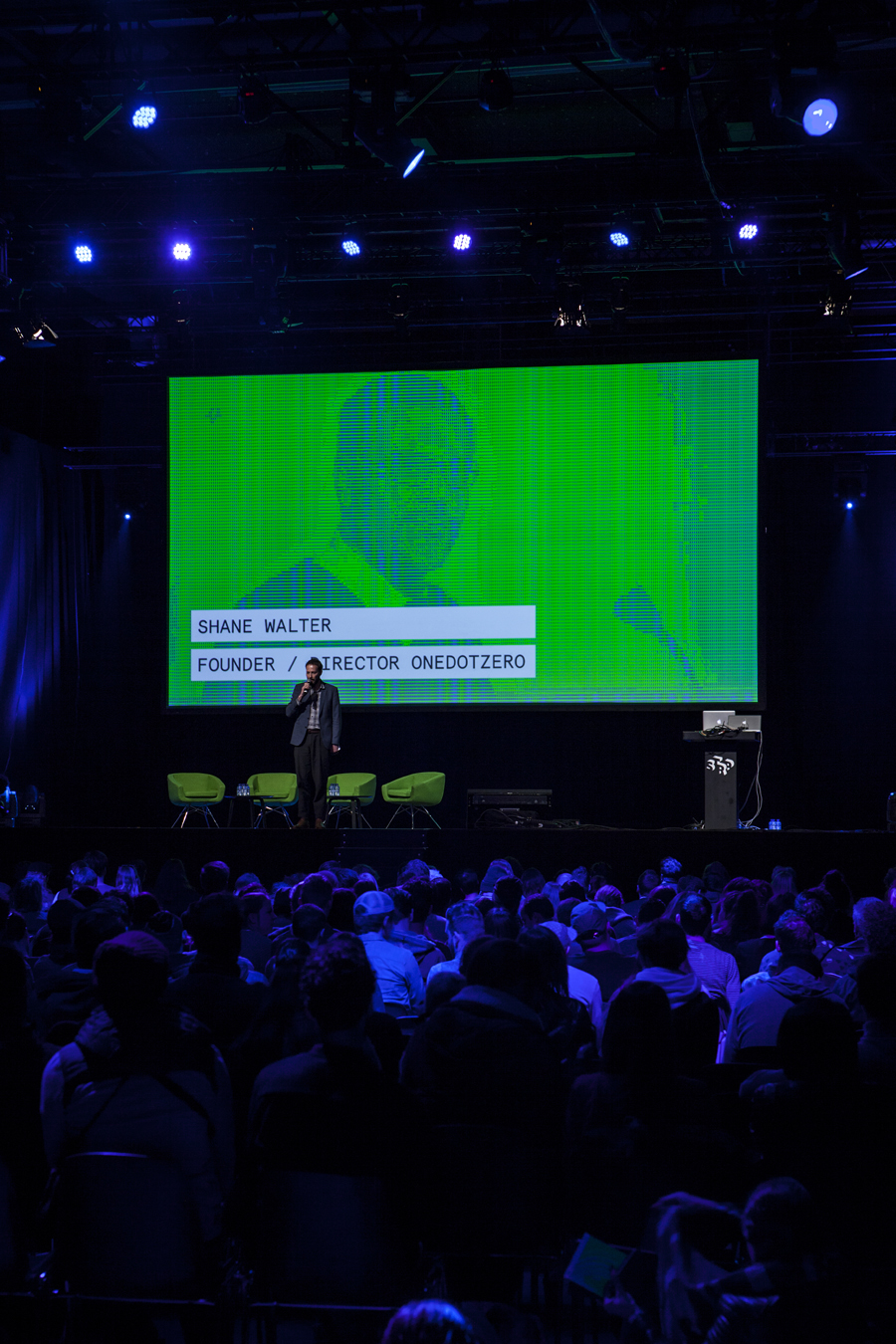
STRP brings together art, technology and experimental pop culture, and connects these to a broad audience, and through its light art, interactive art and robotic performances, lectures, workshops, music and film events, offers a glimpse into the future. This culminates with the STRP Biennial, an indoor art and technology festival that provides visitors with an opportunity to experience the extent to which new technology reaches into popular culture, the arts, and their everyday lives. This year’s biennial took place in Eindhoven, hosted over 29,00 guests, and featured a visual identity created by graphic design studio Raw Color which covered a variety of print communication including brochures, posters and business cards.
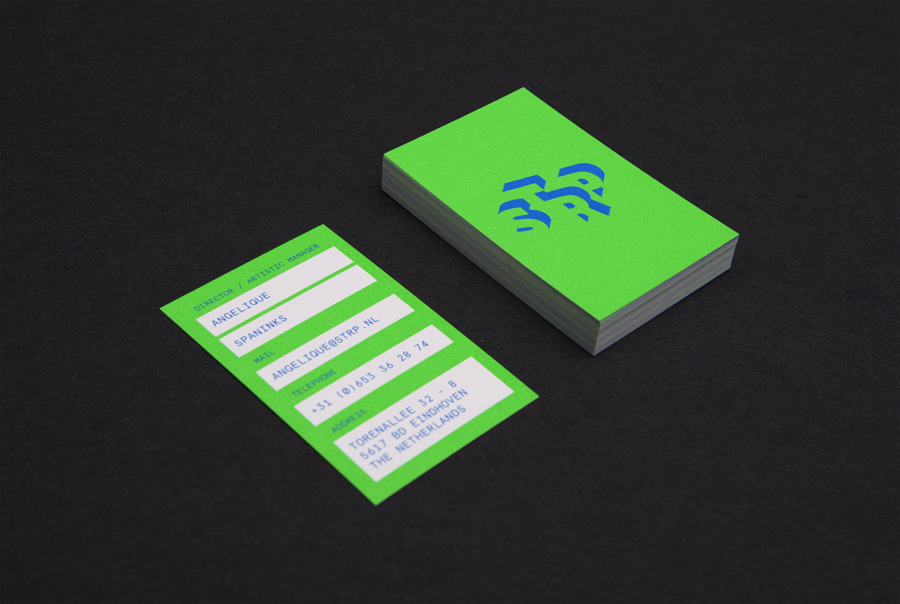
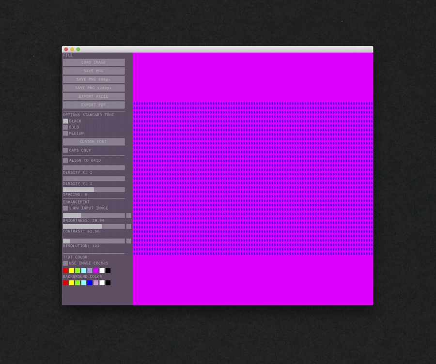
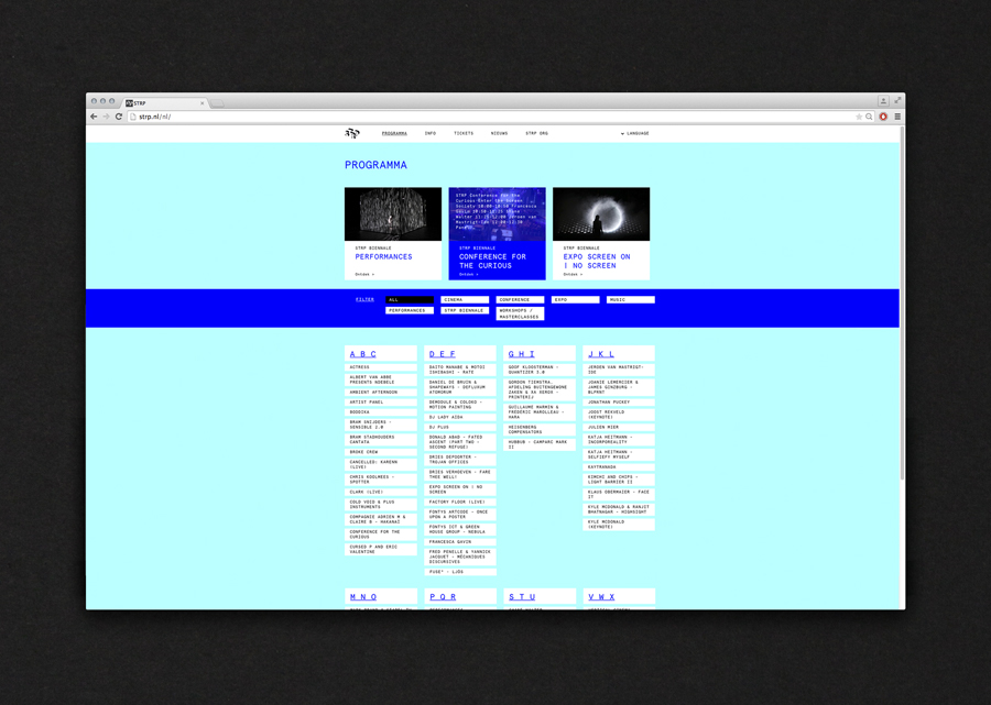
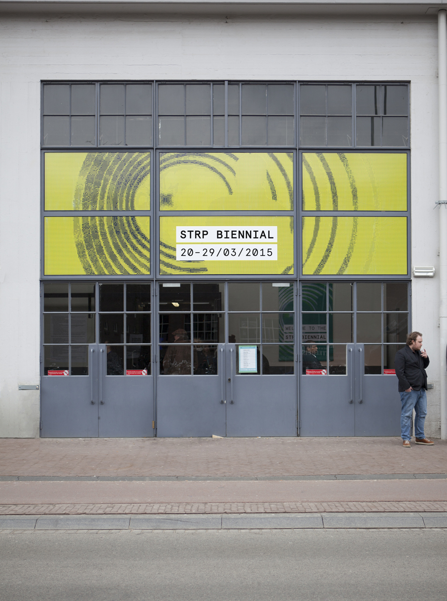
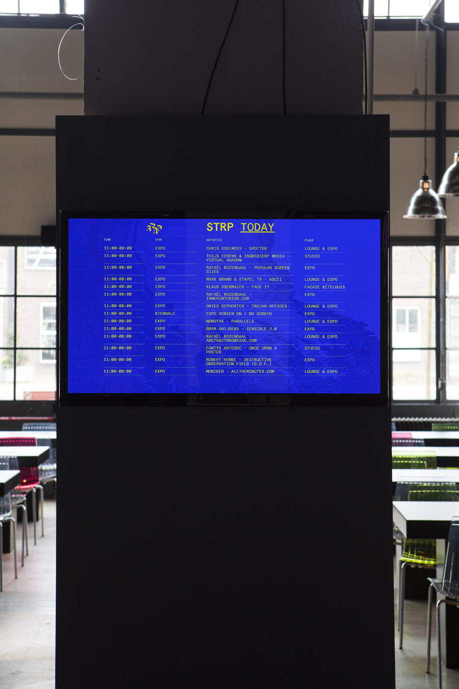
Raw Color’s brand identity draws a contemporary and compelling aesthetic impact from the technological limitations of the past, and references the visual characteristics of digital craft such as programming and coding. This manifests itself well within the mechanical qualities of the monospace characters of the more recent digital typeface Aperçu Mono, an algorithm created by Mark Brand that outputs images as ASCII code, and a vivid palette of fluorescent inks that, while distinctly current and effectively reproduced as bright neon inks, appears to draw on the web safe colours of the past.
This balance of retrospection and contemporary context, the unique aesthetic qualities derived from a combination of the familiar, and the relationship between print and digital experience inherent to today’s brand identities, provide the STRP Biennial with both visual impact, and a substance clearly tied to technological heritage, modern art and popular culture.
Design: Raw Color
STRP Image Tool: Mark Brand
Opinion: Richard Baird
Fonts Used: Aperçu Mono
