Toronto Carpet Factory by Bruce Mau Design
Opinion by Richard Baird Posted 11 December 2015

Toronto Carpet Factory is a seven building complex, constructed between 1899 and 1912, that takes up a full city block in Toronto’s Liberty Village. It is described as a mix of historical architecture, converted factories and as an iconic landmark of the city’s booming manufacturing era. Following extensive restoration and interior renovation, the factory is now a centre of creativity, and home to over 120 companies.
Working with York Heritage and Hullmark, and following interviews with partners, tenants and real estate agents, graphic design studio Bruce Mau Design developed a brand identity and visual language for the site that would unite and better define the unique character of the buildings, and those who work within them. The result is a flexible system of serif and sans-serif type, bright modular silhouettes and a website of contemporary functionality and historic insight. This extends across brochure, stationery, business cards, signage and wayfinding.

The meeting of contemporary renovation and historic structure, utility and play, manufacturing and creativity, big industry and now lots of smaller businesses, are all effectively touched upon within Bruce Mau Design’s brand identity direction.
This is effectively expressed through the juxtaposition of serif tradition and sans-serif modernity, a current and responsive website that provides historical context through words and rich photography, individual pieces making up a larger whole, bright colour, white space and a modularity.

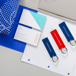
The logo, a flexible set of blocks laid out inline, as a floor plan-like rectangle or loosely scattered like toy bricks, draws its strength and value from the functionality of its individual components and a pleasing combination of colours. Although not documented here, these are said to make up an interior wayfinding system that utilises shape, colour, size and proportion to identify building, indicate distance and guide visitors through the site, and online as part of the site’s business directory.

The blocks of the logo make a connection with the history of the site through silhouette, which remain unchanged, but also, using colour, introduces significant and modern contrast to red brick. This makes for a compelling and distinctive aesthetic impact, especially over white.
Bruce Mau Design exchange industrial past for a creative, youthful and convivial present, which plays out particularly well across stationery and tote bag. The colour palette, alongside the changing composition of blocks, lightens up and makes more accessible, an imposing and utilitarian structure, and conveys its repurposing as a modern and flexible space.
Design: Bruce Mau Design. Opinion: Richard Baird. Fonts Used: Maax