Latin American Design Festival ’16 by IS Creative Studio
Opinion by Richard Baird Posted 30 March 2016
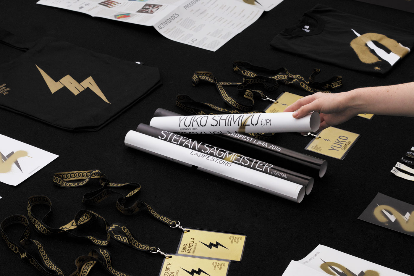
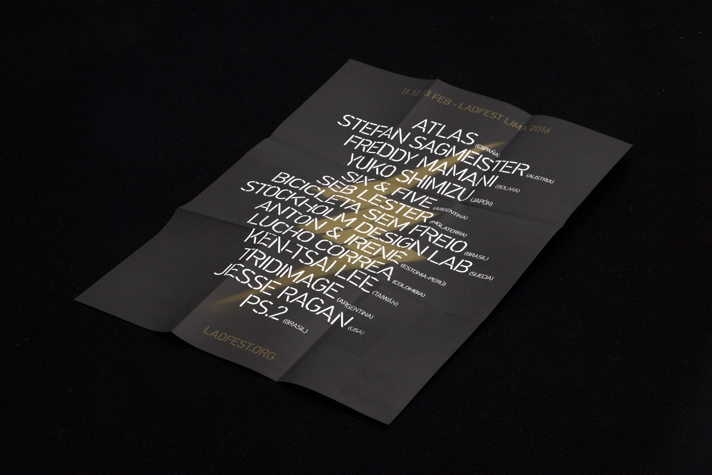
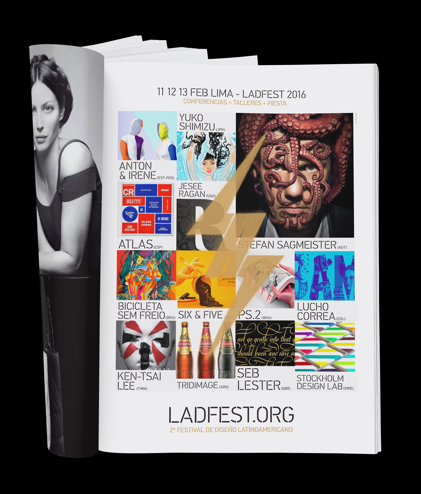
The Latin American Design Festival is an organisation that promotes Latin American Design internationally and looks to highlight the social potential of design using lectures, workshops, exhibitions and complementary activities. This year’s festival, as with previous events, took place in the Peruvian city of Lima, with guest speaks that included Stefan Sagmeister, Yuko Shimizu and Stockholm Design Lab.
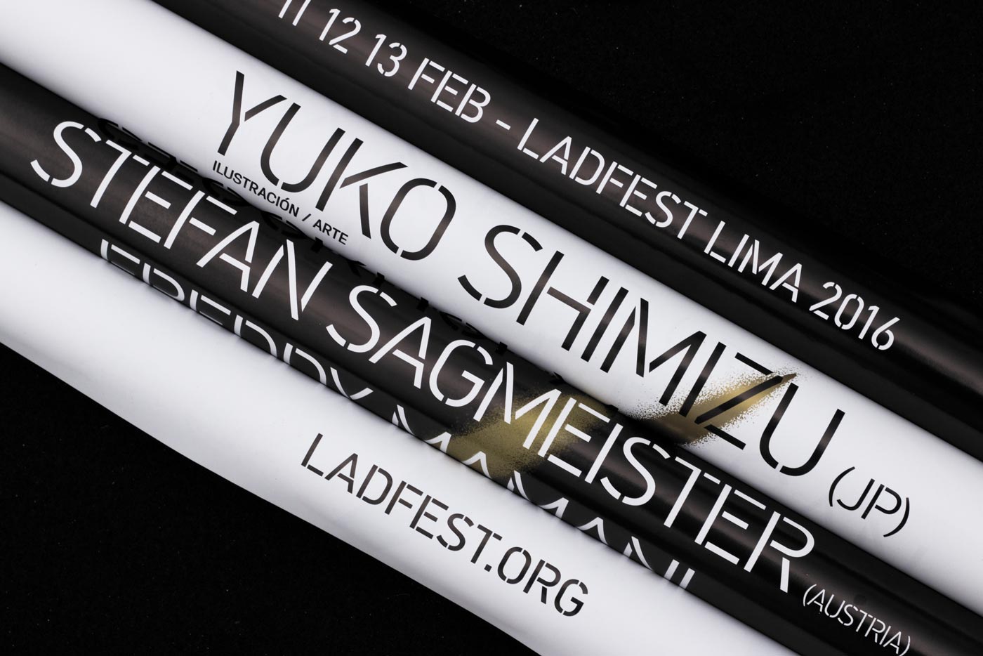
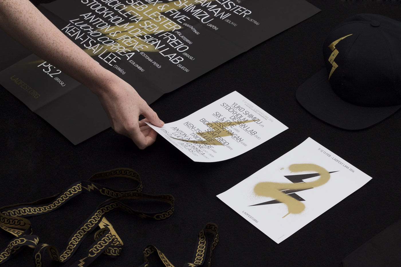
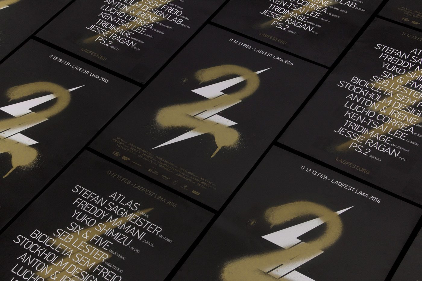
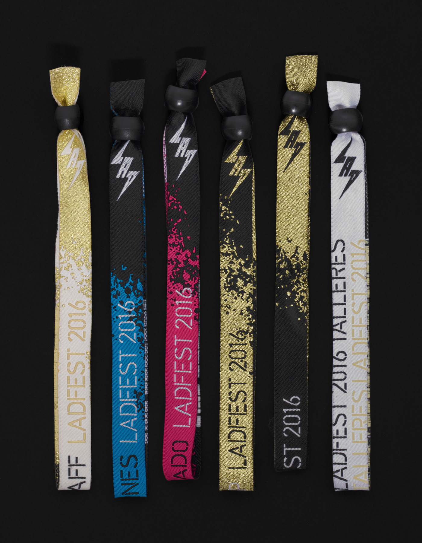
IS Creative Studio, who worked on LADFest’s 2015 visual identity, continue to collaborate with the festival, delivering a system that, in contrast to last year’s grids and neon inks, favours moments of irregularity, fewer colours, the flourish of a metallic gold and the urban and utilitarian qualities of spray paint and stencil cut type. This extends across a variety of print communication that included posters, lanyards, programmes, flyers, presentation graphics and signage.
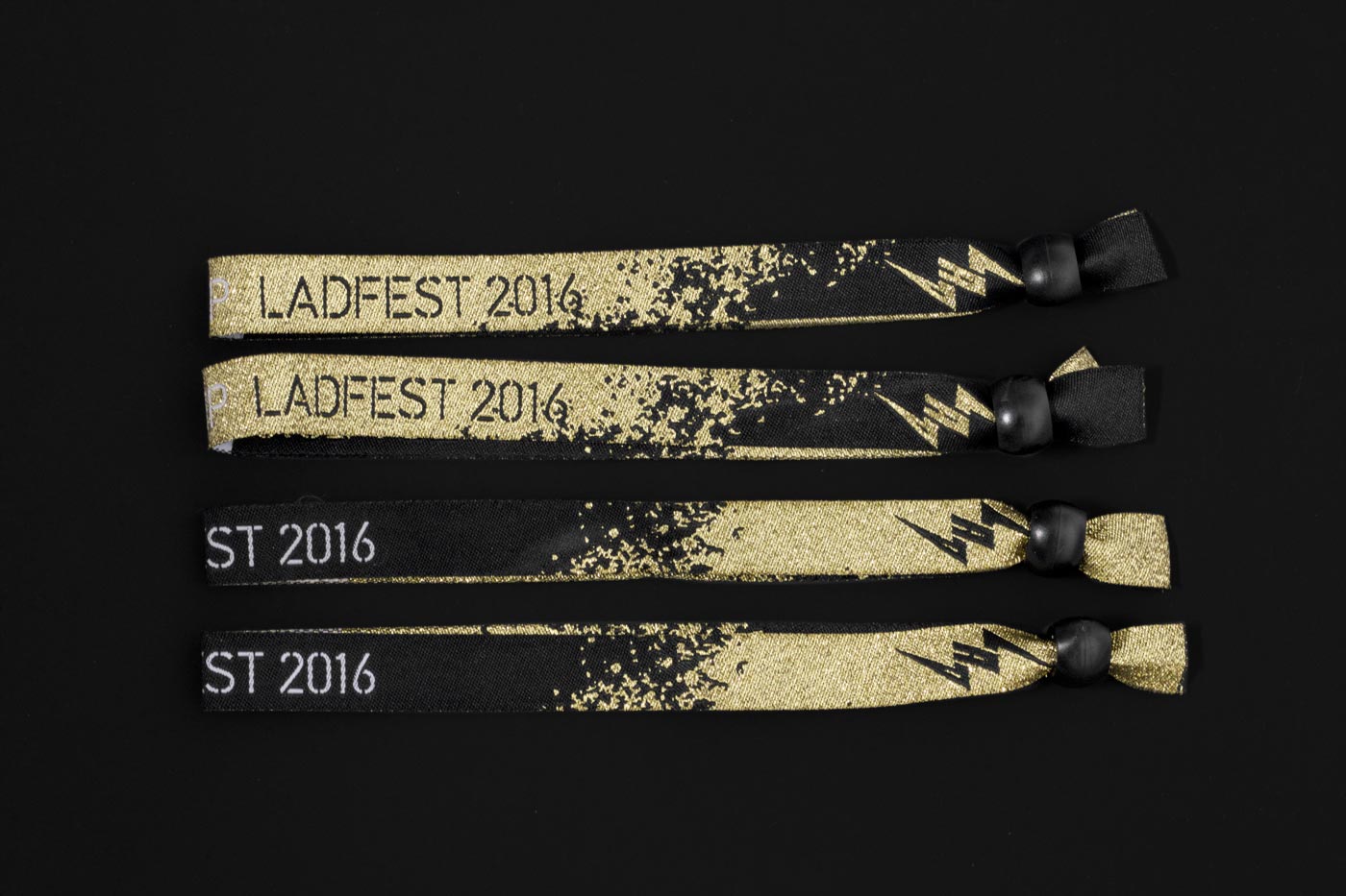
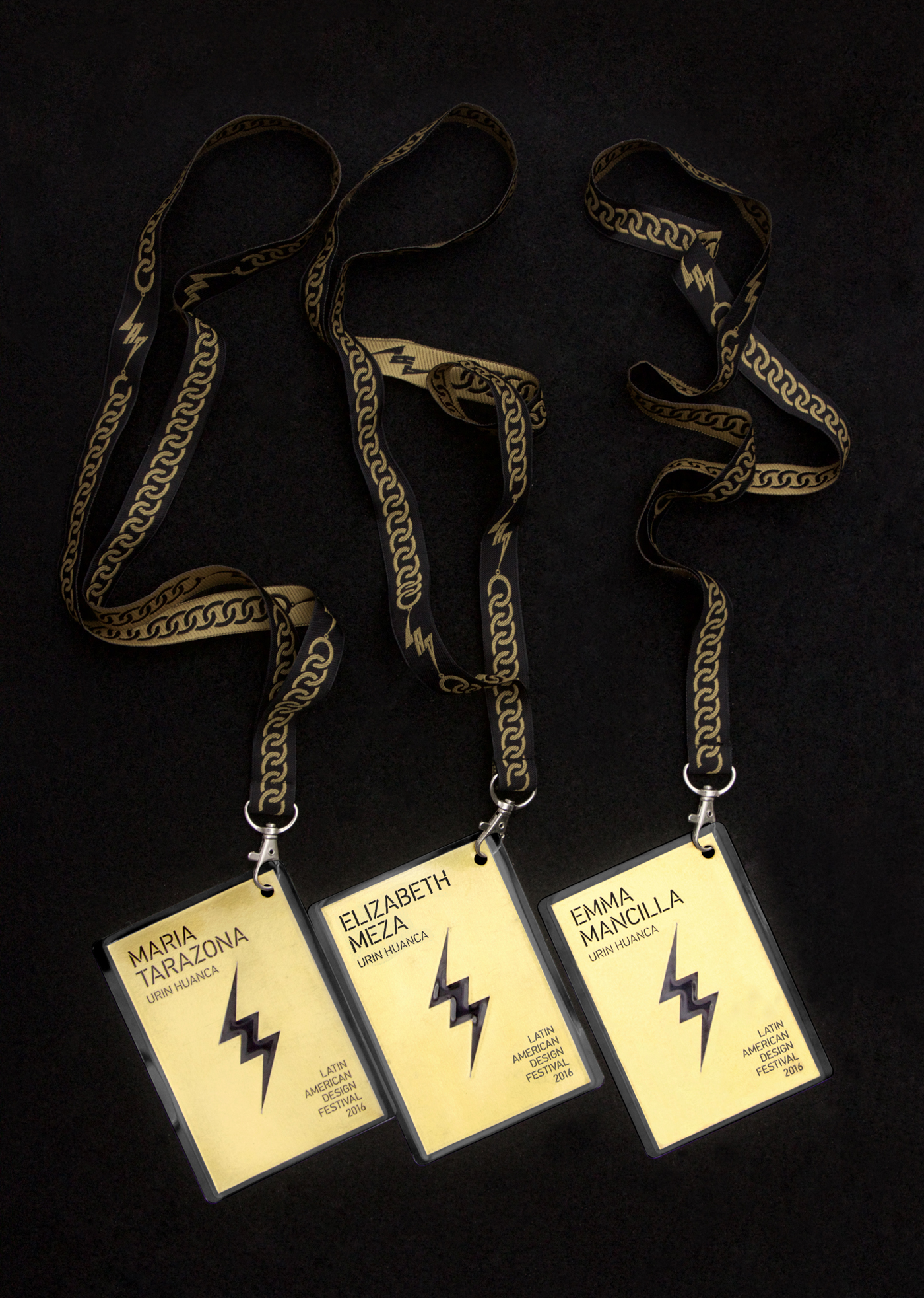
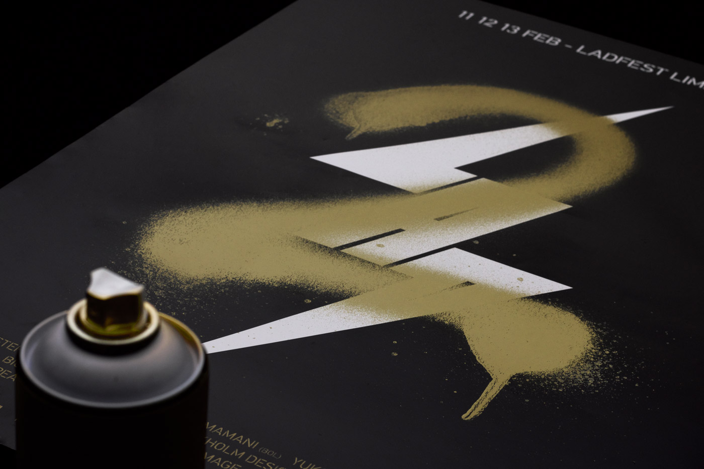
Inspired by the award-winning designers and artists participating, and the “deluxe” nature of this year’s event, as well as a more youthful positioning, IS Creative Studio created a system of print communication linked by an extensive use of gold metallic ink. Unlike last year’s ISO based system, it embraces a far less literal relationship with design practice, however, much like the use of fluorescent colour, gold ink and stencil cut type remains thoroughly current and self-aware.
For those that balk at the ubiquity and value of award-winning, and the excess of gold that this then inspires, the video, and elements such as chain link patterns, move it closer to parody and play, with a general restraint in the number of graphic components and the utilitarian qualities of type keeping it from falling into the gaudy.
A mix of horizontal, vertical and diagonal breaks in type, particularly cross the A, T, H and R, add a little variation and movement to the familiar uppercase, geometric and mono-linear qualities of type and its unwavering implementation.
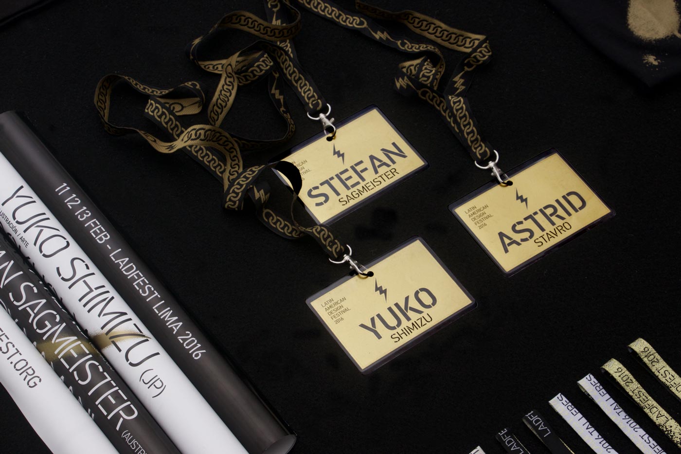
Aesthetically, there is good visual and conceptual tension between the non-conformity, expressive and irregular qualities of graffiti, which feels like a familiar but effective and communicative representation of creativity, youthfulness and spontaneity, and the uniformity, functionality and systematic qualities of stencil cut type. This is emphasised through black and white inks and boards alongside the flourish of gold, and spray paint set over formal grid-based layouts.
Design: IS Creative Studio. Opinion: Richard Baird
