Paco Rabanne by Zak Group
Opinion by Richard Baird Posted 28 June 2016

Paco Rabanne is Spanish designer and French fashion label established in 1966 with a catalogue of ready-to-wear garments, shoes, fragrances and accessories. Rather than an interest in the past, Paco Rabanne, who originally trained as an architect, has created strong silhouettes from new materials, and often rejected the spirit and art of the time.
Paco Rabanne’s creative director Julien Dossena worked with the London-based design studio Zak Group to reinterpret and express the essence of the fashion label through a new visual identity system, which would coincide with the opening of the label’s first new shop in ten years. Zak Group revised logo and monogram, devised a custom typeface and took a new approach to show invitations, lookbooks and bags, campaigns, art direction and website.
This post was updated June 2017 with images of, and insight into, Paco Rabanne’s latest lookbook and show invitations, also designed by Zak Group.
With a history that dates back to 1966, and plenty of international campaigns under its belt, the Paco Rabanne name carries a lot. The new logotype, a redrawing of the original 1970s version, does little to get in the way of this legacy, it does, however, correct the spacing issues of the previous version (above) and improves definition through increased stroke contrast (see below). Where previously logotype was both technically and optically problematic, this new iteration feels far more considered and practical, even if these changes will go largely unnoticed.
The logotype’s extended geometric forms and all-lowercase typesetting are slight in their expression, but much like its original iteration, subverts many of the conventions of the industry. Rather than the legacy conveyed by serif flourishes or the authority of uppercase characters, the Paco Rabanne logotype has always felt more urban, accessible and contemporary, and rooted in the aesthetic sensitivities, background and forward thinking nature of the designer.

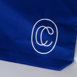
This architectural past and the strong shapes and cuts of Paco Rabanne’s garments is also reflected in the redrawing of the label’s monogram. The heavy fill is gone and replaced with the lighter and more current qualities of a single line weight that focuses on structure. It was never particularly smart in its combination of letters but did use positive and negative space effectively. This new iteration, however, feels far more appropriate, introducing a bit of contrast and visual interest in conjunction with logotype, sharper more defined and distinctive letter shapes and improved balance.
Much like the logotype, Paco Sans, a new custom typeface, combines geometric qualities with warmer human forms. Although there is an economy of expression here, there are some interesting and occasionally curious letterforms (particularly the r, drawn from the monogram). These bring a touch of character to an identity that has been distilled down to a few key assets but clearly referential in its architectural qualities. This also comes through in typesetting, the custom rubber bands, robust boards and an abundance space.
Quick note on the rubber bands. There is an interesting balance at play here. These exist somewhere between the obvious securing of loose pages, an architectural association and suspenders, which ties in neatly with fashion. Something of utility becomes a bold visual expression.
Like many other fashion labels, lifestyle, positioning and the style and structure of garments are better expressed through image. Typography anchors some distinctive art direction at the foot of the campaign sheets. Although the logotype has been drawn with a eye for ink traps and better definition at smaller sizes, and identity as a whole feels more refined with fewer but more defined assets, there is still a lot of impact drawn from these, particularly in the use of their proportion within the context of bags. Both logotype and monogram, where often you see subtlety, are applied at size creating a strong continuity between print and digital experience.

There is a pleasant tension between a reduced graphic expression and the tone set by art direction, and the way that this draws out both the detail of material but also strong silhouettes. It is perhaps worth mentioning that it is disappointing to see that a designer, with a strong focus on new materials, is still using fur!
The approach is nuanced but referential. This will be explicit if you have bought into the legacy and background of the designer. If not, there remains equity in a reductive brand expression and character of type, alongside strong campaign images and different approaches to the invitations and their fastening. Logotype and monogram hold up well as large impactful anchors across website and printed assets that, in the choice of substrate and finish, play with a materiality without undermining a strong and contemporary graphic expression.
Design: Zak Group. Opinion: Richard Baird.


Fall / Winter 2016-17 Invitation & Lookbook
Zak Group designed a series of womenswear show invitations. These are constructed from two boards that contain a fold-out a poster, and secured with a bespoke rubber X-band. The Fall / Winter 2016-17 lookbook juxtaposes the informal qualities of backstage photography inside with runway looks printed on the fold-out dust jacket.


Spring / Summer 2017 Invitation
For the the Spring / Summer 2017 show invitation Zak Group combined new campaign photograph by Patrick Demarchelier with reworked elements from enigmatic artwork La mariée mise à nu par ses célibataires, même (1915–23) by Marcel Duchamp.


Fall / Winter 2017-18 Invitation
Zak Group continue to work with Paco Rabanne, this time on their Fall / Winter 2017-18 show invitation. As with previous seasons, and within the context of the new visual identity system, the studio create another expression for the fashion brand, this time building a series of photograms that draw on Paco Rabanne’s contemporary and historical archives.