The Best of BP&O — Packaging of 2016
Opinion by Richard Baird Posted 19 December 2016

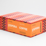
2016’s package design highlights included Bond’s work for Allsorts Black & White Edition, Bielke & Yang’s packaging for Solrug and Stockholm Design Lab’s boxes for Víspera Coffee. However, there were five projects that stood out, and have made it into BP&O’s Best Of Series. This feature brings together the most interesting, unexpected or unusual packaging systems published on the site during 2016 for another opportunity to be seen and shared. These balance a strong and appropriate concept with a compelling aesthetic that, between them play with image, colour, texture, layout, form, type and print finish. What were your favourites of 2016?


Black Estate — Circuit by Toko, Australia
Circuit is a 2014 Pinot Noir and 2015 Pinot Gris from New Zealand’s Black Estate, a Vineyard run by The Naish Family and set across three hillsides in the Waipara Valley, an area of North Canterbury with clay and clay-limestone soil. Black Estate worked with Toko on the branding and packaging of these two new wine varieties.
Toko’s “Wine Spectrum” finds a smart intersection between impactful, compelling and modern visual expression, communicating something of the nuance and flavour profile of the range and the laying of ground work for future additions.
See more of this project here

Danish Selection by Kontrapunkt, Denmark
Danish Selection is a range of high-quality fruit spreads cut with alcohol. The range includes blackcurrant infused with Jamaican rum, orange with cognac and a wild blueberry variety with Scotch whiskey. Orkla, the company behind Danish Selection, worked with Kontrapunkt to develop packaging that would clearly communicate this new concept to consumers.
Kontrapunkt’s concept is as an interesting fusion of fruit preserve and alcohol visual vernacular, where fruit content stands in for alcohol volume, and round stickers, type and typesetting appears to draw on whisky labels and beer taps. It immediately marks Danish Selection out as different and appropriately leverages cues familiar to the intended market.
See more of this project here

Brewdog Abstrakt by O Street, United Kingdom
Brewdog’s Abstrakt is a limited edition craft beer concept that has released 20 different varieties since it began in 2010. Each beer is bottle-conditioned (bottled with a small amount of yeast, providing further fermentation and maturation), brewed and released just once, individually numbered and known only by their release code. It is a concept described as more art than beer, as boundary pushing and blurring the line between categories.
O Street worked with Brewdog to create a new brand identity and packaging system for Abstrakt, informed by its creative, limited edition concept, flavour varieties, individually crafted nature and the use of release codes rather than names. This is expresses through colour, typography, print finish and structural design.
Where previously Abstrakt packaging was trite and forgettable O Street’s work is impactful and distinctive, more in line with the loud character of Brewdog but with its own more conceptual quality rather than the brewery’s no-fuss foundations. The crafted and limited nature of the range underpins the design of a custom typeface, structural design and its printing.
See more of this project here

The True Honey Co. by Marx Design, New Zealand
The True Honey Company (TTHC) dedicates itself to the production of mānuka honey, a monofloral variety produced in Australia and New Zealand from the nectar of the mānuka tree. It has a unique colour and texture, and a high level of Dietary Methyglyoxal, an organic compound with antibacterial and antiviral properties.
With a price that starts at 60.00AUD and rising to 230.00AUD per jar, and working in a market flooded with sub-standard honey and dishonest marketing, communicating the value of product and the commitment of TTHC to quality and ethical production through an impactful and engaging brand identity and packaging design was paramount. This task was given to Auckland-based graphic design studio and packaging specialists Marx Design who collaborated with Think Packaging and writer Kate Phillips.
Marx Design find a comfortable meeting point between characterful flourishes, communicative clarity and premium cues. Where you often find an unwavering consistency in visual language, or a modest graphic expression—the new shorthand for authenticity in the modern luxury landscape—Marx embraces variety but continuity, effectively utilising illustration, newsprint, editorial design, copywriting, tone of voice, structural and graphic design to build out a visually and information rich brand language that clarifies positioning and enhances value.
See more of this project here

Forgotten Boardwalk Brewing by Perky Bros, United States
Forgotten Boardwalk is a New Jersey microbrewery producing uniquely flavoured, year-round and seasonal craft beers. It was set up by Jamie Queli, one of the youngest female brewery owners in the US, and draws its name from the folklore of the Jersey Shore Boardwalk. This is the foundation of an extensive new brand identity, designed by Tennessee based Perky Bros, which brings to life the sideshow oddities, historic events and darker side of the boardwalk’s past through quirky and well-realised illustrative detail and storytelling component.
Boardwalk sideshow attractions, history and stories provide a wealth of period imagery and association to draw from. Although not specific to New Jersey, nor does Forgotten Boardwalk have a genuine heritage, the concept and hand drawn aesthetic successfully works together an East Coast provenance and the traditional craft practices of today’s microbreweries. It is rich and distinctive in its imagery and engaging in use of storytelling.
See more of this project here