Campus by MultiAdaptor
Opinion by Richard Baird Posted 10 August 2017

Campus is Google’s network of co-working and event spaces for the many start-ups it has and continues to help fund. These are located in London, Madrid, Warsaw, São Paulo, Seoul, and Tel Aviv, with another to open in Berlin soon. The Campus community has over 80,000 members and collectively received over $537 million in funding which has created more than 11,000 jobs. Campus is described by MultiAdaptor, the design studio behind its recent rebranding, as being positioned slightly away from the main Google brand. The studio’s brand identity design for Campus reflects this. It also captures and expresses the startup spirit and energy of the entrepreneurs and founders, employees and investors, who make up the Campus community through a DIY aesthetic of words, images and colour. This approach intends to be democratic in nature and invite participation.


MultiAdaptor’s brand identity system is the result of an 18 month partnership with the Campus global team and their local marketing managers around the world. It covers, alongside a new logo, a variety of digital and print-based touch points. These include social media channels and website consultancy, merchandise and integrated marketing campaigns, signage and welcome packs.

Logo is tiny but useful component, it evolves the work of Instrument, retaining the C and representation of space, but favouring a wireframe with a more architectural and technical quality. It functions well as both a static mark, although not hugely unique, and gains distinction in its animation, both stylistically, but also thematically, touching on the viewing of problems and products from a variety of directions. There is an energy to it that feels in line with a hub of activity. Although much of the other work is static, these share something of the logo’s energy in the composition of image and words, often with little free space and having the qualities of a busy pin board of ideas and references.


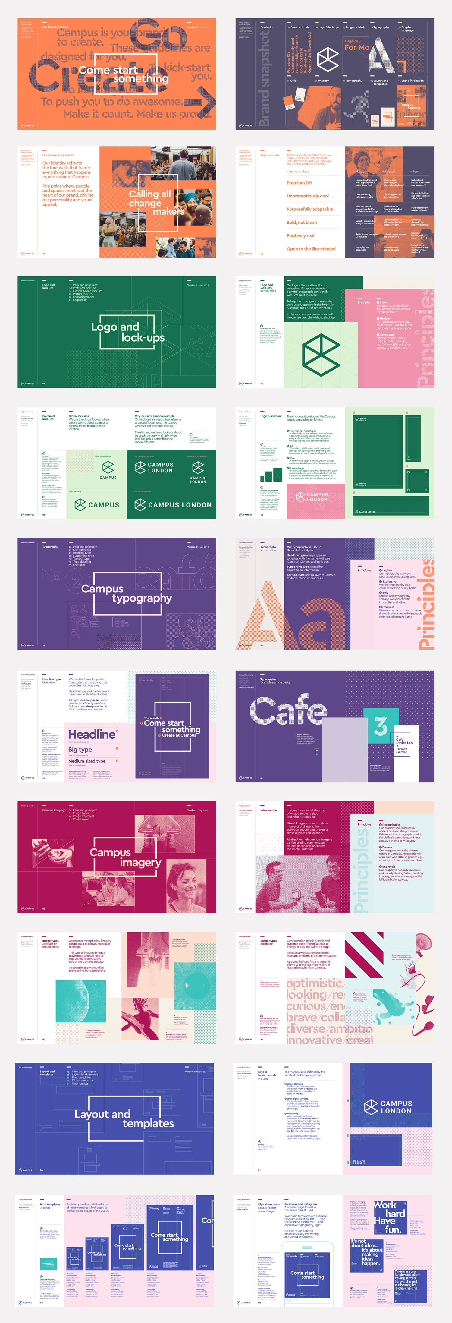
MultiAdaptor’s work is characterised by a stylistic busyness. There is a rough and readiness to this that captures something of the start-up spirit, but a clear systematic quality underpinning it, holding together a visual variety. Type, colour and image are weaved together, with the themes of space coming through in language, the three-dimensional nature of the logo and a framing device, often placed at the heart of each piece of communication, either framing creative image or linking expressive language. This also serves to anchor much of the work, drawing the eye inwards, within the context of a visual abundance.

The mix of halftone effect, the tinting and cropping of images, the running of words off the edge of pages, different sheet sizes, the use of full bleed, the absence of free space, construction paper colour, collage-like compositions in the intersection of pages and stencil cut letters of Cera Stencil Pro establish a sense of creative play, an industriousness, youthfulness and energy.
There is a strong material quality to brand identity. This does make its way online as motion graphics/brand expressions, but less so within the context of the Campus website. There is a slight disparity. The frame remains, as does the dots of the halftone, but the overlaying of colour and image, and the stencil type is absent.

It is busy, this is largely down to the absence of space, but this is the thing that gives it impact, a sense of life, character and a personable quality that clearly separates it from Google’s Material Design language. This is not about a polished end product, but an expression of collaboration, creative process and play.


There are some neat techniques mixed in with the brochure. Highlights include the use of white bordered photography, the use of proportion and colour to break up pages, and the interplay between the very personal (image), the industrial (type) and creative play and design craft (colour, material, cuts, binds and finishes). It is professional and considered, but there is a pleasant and unexpected scrapbook quality to this.


There is plenty of variation but bound by recurring visual cues, stylistic techniques and discernible themes (space, creativity and community) that hold it all together. Elements are rearranged, dialled up or down to better suit context, be that a striking visual image or piece of copywriting, the practical nature of wayfinding, or digital or print-based contexts. There is a strong visual style, but the components are well-defined within a clear system that serves to connect worlds of physical space and digital products.
Design: MultiAdaptor. Opinion: Richard Baird. Fonts: Cera Pro, Cera Stencil Pro & Roboto.