Port of Mokha by Manual
Opinion by Richard Baird Posted 23 November 2017

Port of Mokha is a coffee, sourced from Yemen, that is said to be the rarest, most expensive and best tasting in the world. As a brand it is critically acclaimed, winning awards and receiving the highest ratings in blind cuppings, and mindful, helping to support local communities.
Port of Mokha’s story begins with the return and daring escape of Yemeni founder and San Francisco-based Mokhtar Alkhanshali from war-torn Yemen on a fishing boat with coffee samples which made international news in 2015. This story forms part of Port of Mokha’s unique mythology and visual identity, alongside geographical allusions and material value across the limited edition Yemen Trilogy Box Set which was created by American design studio Manual.

Coffee has interesting beginnings in Yemen. It is the world’s oldest land to cultivate coffee, which benefits from a unique climate and distinctive geography 2150-2500 meters above sea level. When you roll in Mokhtar Alkhanshali’s story, a San Francisco-based Yemni returning to his homeland to befriend farmers and help with quality development, only to escape conflict by boat with coffee samples, you have a compelling and genuine story. One of unique geographical and historical provenance and personal adventure.


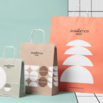
The Yemen Trilogy Box Set is a limited edition roasted coffee sold direct-to-consumer. It contains three varieties, each from Yemen, packed in 4-ounce boxes that retail for $158. This places it firmly within the luxury category.
Packaging is a concise visual expression of story, product provenance and value, expressed using a simple boat motif, colour and blind embossed topographical / water ripple detail, and in the material flourishes of dyed and textured paper and the finish of a copper block foil.
Although there is some obvious material expense at play here—a series of choices that are visually and materially pleasurable—these gain real value in the story that influences them. These are brought to life, appropriately for a premium product, not entirely on pack but more appropriately through the richness of image and the detail of words online.
Copy Opinion by Seth Rowden
There are brand stories that are fabricated in a mid-afternoon workshop, and those that are born during a seven-hour trip in a fishing boat across the Red Sea with a couple of suitcases of coffee on board after escaping a civil war. Mokhtar Alkhanshali’s journey from war-torn Yemen to scoring a 90+ rating at the SCAA in Seattle a few days later for Port of Mokha is nothing short of extraordinary.
One of the obvious strategies for brand naming is to ask questions like: Where is it from? What does it do? In this case, the name comes from Port of Mokha. This is the world’s original coffee trading port and the place Mokhtar Alkhanshali went to flee the country when the war broke out. The brand name leads into Mokhtar’s story and ties in with the boat motif used throughout its graphic identity.
There are three main components to the brand message. There is the taste – they have won many prestigious blind taste awards against coffee from world-renowned farms. The second is the rarity, which is entwined with Mokhtar’s story of adventure and danger in Yemen. And the third is the positive impact the company has had in the region. They have promoted best practices and gender equality, helped to break debt cycles for farmers, and steered them away from khat growing by achieving up to 33% higher prices for their coffee.
So, which message should they lead with? For me, it’s taste – closely followed by rarity. The extreme journey to Yemen is remarkable, but this is no guarantee of quality and nor is the company’s sustainability efforts. The testimonials are more persuasive, with figures in the coffee industry describing Port Mokha as ‘other-worldly’, and one claiming it ‘tastes like angels singing’. This dramatic testimonial works because the metaphor uses another sense (hearing) rather than taste for the comparison, which implies there is nothing on earth like Port of Mokha coffee.
One of my favourite lines on the website is the simple statement: ‘It’s a miracle this coffee is here.’ It’s confident and provokes questions, drawing the reader in. Backed up by taste, it even sounds vaguely spiritual or religious – which I suppose is how some people feel about coffee – and leaves me with a strong desire to taste the voices of singing angels.

It is worth taking the time to appreciate the structural rigour of packaging. The neatness of the lines and surfaces, how well the individual boxes appear to slot into case, the weighting of card, the contrast of colour, use of opposing textures (pattern and irregularity), the gloss of a copper block foil over a matt stone grey, as well as the opening of the case, its presentation of boxes and their own build and opening. Price point demands this attention to detail when the graphic and material are reduced down to the communicative essentials.
The boat motif, where packaging and type are simple, offers contrast in its pleasant illustrative rendering. It offers difference where there is a trend towards the monolinear or the geometric. There is also a neat away motion rooted in story, and the ripples of waves share something in common with the topographical qualities of the blind embossing of boxes, and comes through in copy which talks of ripples of positive impact.

Solid blocks of contemporary colour, the finer detail and pattern of what looks like a Buckram emboss, the irregular blind embossing of lines that call to mind topography, the use of simple forms in structural design and unusual motif feel well-balanced and well-intentioned. It is a reductive approach but distinctive and concise combination of graphic design and materials, story and ideas, very much in line with modern luxury. These work well to draw the mind towards, and help foster enquiry into, key details of the story and elevate the quality of experience. More from Manual on BP&O.
Design: Manual. Opinion: Richard Baird. Fonts Used: Trio Grotesk.