Rimowa by Commission
Opinion by Richard Baird Posted 25 January 2018

Rimowa, an abbreviation and then compound of founder Richard Morszeck Warenzeichen name, is a Cologne-based manufacturer of luxury luggage. It has a significant history, beginning in 1898 as a travel and leather goods maker known for its innovative approach, and growing to become an international brand with a distinctive line of polycarbonate and aluminium products.
Rimowa’s first fully aluminium designs were created following a fire in 1937. This destroyed all the materials except for the metal and led to the development of durable and lightweight aluminium product which is now complemented by an equally lightweight and durable range constructed from polycarbonate. Both feature Rimowa’s distinctive ribbed relief across their surfaces.
To help reaffirm Rimowa’s position as a global leader and celebrate its 120th year, Commission worked with Chief Executive Alexandre Arnault and Chief Brand Officer Hector Muelas to develop a new “timeless” and “stylish” graphic identity to support future activities and deliver a considered and cohesive brand experience for Rimowa customers.
Commission introduce a monogram, new typographic style, colour palette and pattern motif to the wordmark designed by Munich-based Bureau Borsche. And through graphic identity, material language and mechanism link a variety of touch points. These include packaging, retail experience and in-luggage items, as well as gift boxes, retail bags, owner manuals, guarantee cards, luggage tags, dust bags and liquids bags.

Rimowa is an innovative company with a modern and high quality product range. It blends material quality and detail-orientated craftsmanship with durability and functionality, and expresses this outwardly through design language; in colour, shape and the ribbed relief across both aluminium and polycarbonate ranges. Commission take these qualities—legacy and craftsmanship, modernity and utility—and convey them through a concise combination of graphic expression, materiality and mechanism.
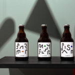
The new typographic language of Rimowa forms a useful and timeless anchor, a centre point at which past (20th Century German type design) and present (luxury through restraint) meet, and touch upon the company’s provenance, enduring legacy and the utility and quality of its products. The new monogram, inspired by Rimowa’s earliest branding and still present outside their Cologne store, applies similar thinking.
A consistent line weight, the monogrammatic interplay of letters, allusions to the iconic spires of Cologne Cathedral in its vertices and soft rounded corners weave together elements of modernity, craftsmanship, origin and the distinctive forms of product. These references are not literal interpretations but well-intentioned reference points that inform design, and establish a continuity between graphic identity and product, whilst also hinting at legacy.


The material qualities form a crucial part of identity. Graphic design, while referential, is visually simple and used sparingly. Papers and print finish layer these with a tactile subcontextual language. There are the familiar intersection of the graphic and the material in the blind embossing of monogram and the black block foiling of the wordmark, however, it is details such as the shopping bag with ribbon handles secured by rivets bearing the monogram, and the common proportionality and relief of ribbing—forming a continuity across luggage, print and packaging—that are the real highlights. These neatly play with luxury, heritage and an industriousness in a subtle and inferred way.

It is fair to expect that while leveraging a visual lightness through colour and an absence of a graphic abundance or communicative excess, materials are likely well-weighted (in thickness and in the mechanism of their construction) and have a feeling of robustness in the hand. Much like the pairing of a cool light grey and white boards, or the ribbed motif, these materials and finishes employ a similar design language of the luggage itself, a utility and quality, ideas and implementation, the qualities that BP&O often describe as characterising the modern luxury market.
The result is a sophisticated and well-weighted material and visual language, brought into sharp focus through precise assets a concise communicative intention. Commission blend both literal and subtle references, and amplify their intent, detail and thoughtfulness through an abundance of space. More work by Commission Studio on BP&O.
Design: Commission. Wordmark: Bureau Borsche. Photography: Luke Evans. Opinion: Richard Baird.