PopTech by Collins
Opinion by Richard Baird Posted 14 June 2018
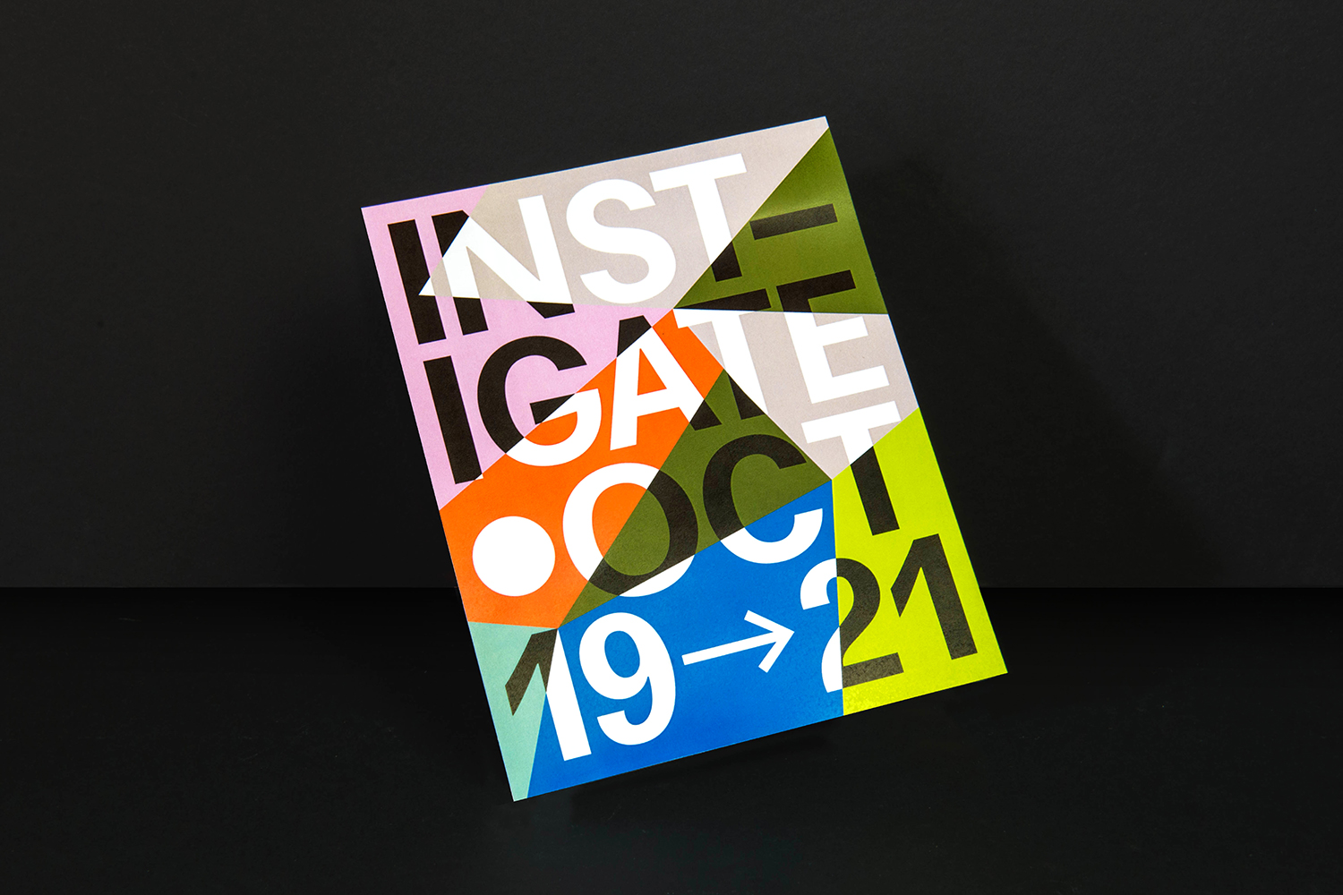
PopTech is an annual three-day conference that takes place in October in the American town of Camden, Maine. It is an occasion where people from across many different fields meet with the intention of discovering and exploring a shared potential that reaches far beyond individual aspirations and goes on to inspire positive collective action.
Attendees include scientists, technologists, humanitarians, designers, artists, innovators, academics, corporate and governmental leaders as well as those that defy conventional categorisation. The conference is made up of presentations, interactive sessions, dinners, chats and debates, movie screenings and music-making. Featured speakers have included tech pioneer Tim O’Riley, cultural philanthropist Stephanie Coontz and behavioural economist Dan Ariely.
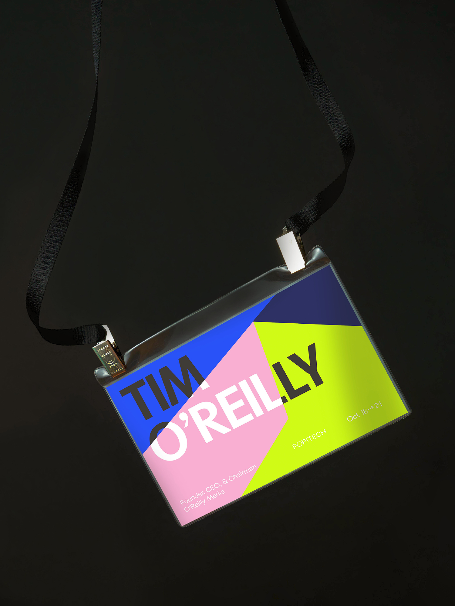
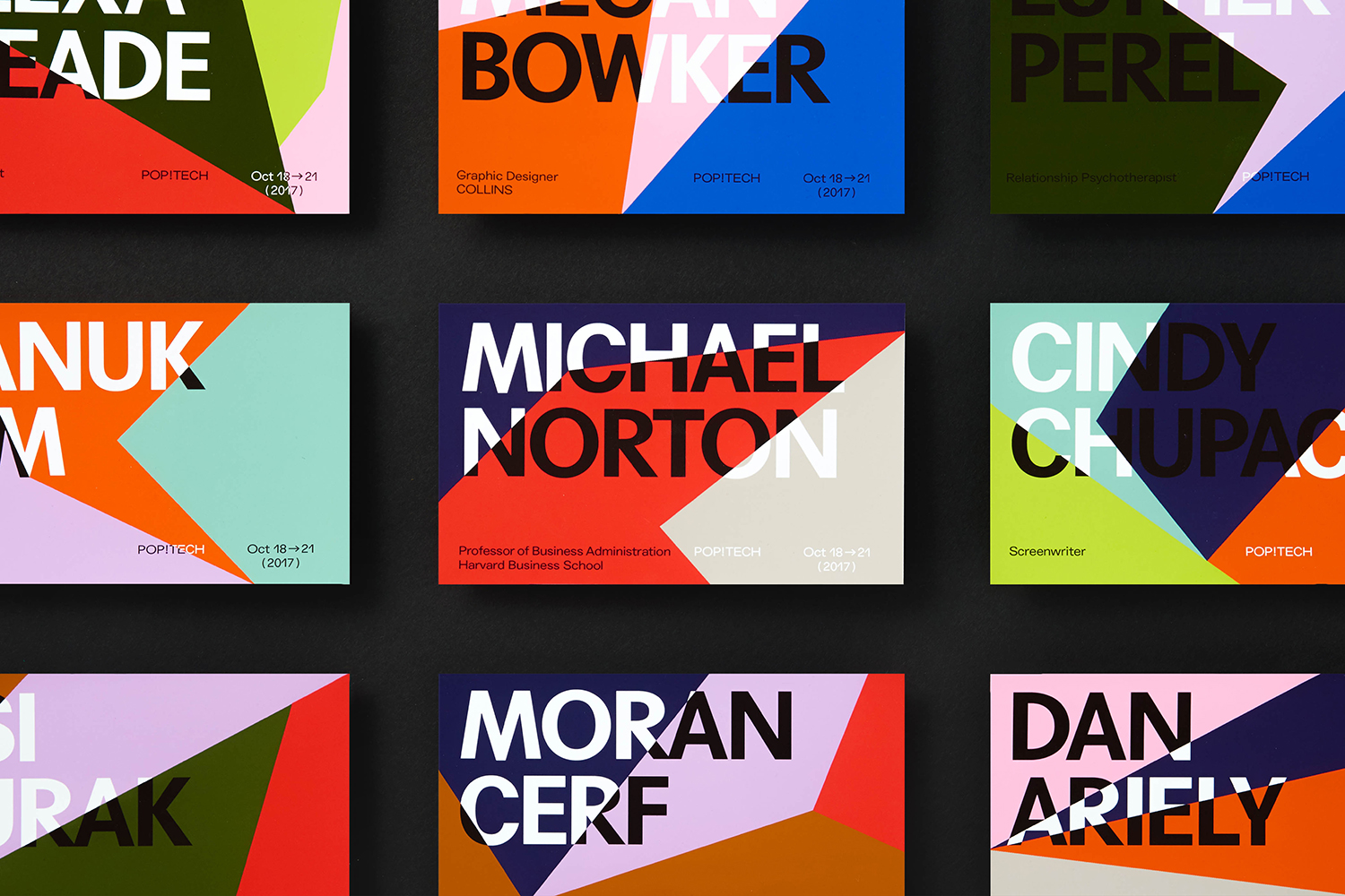
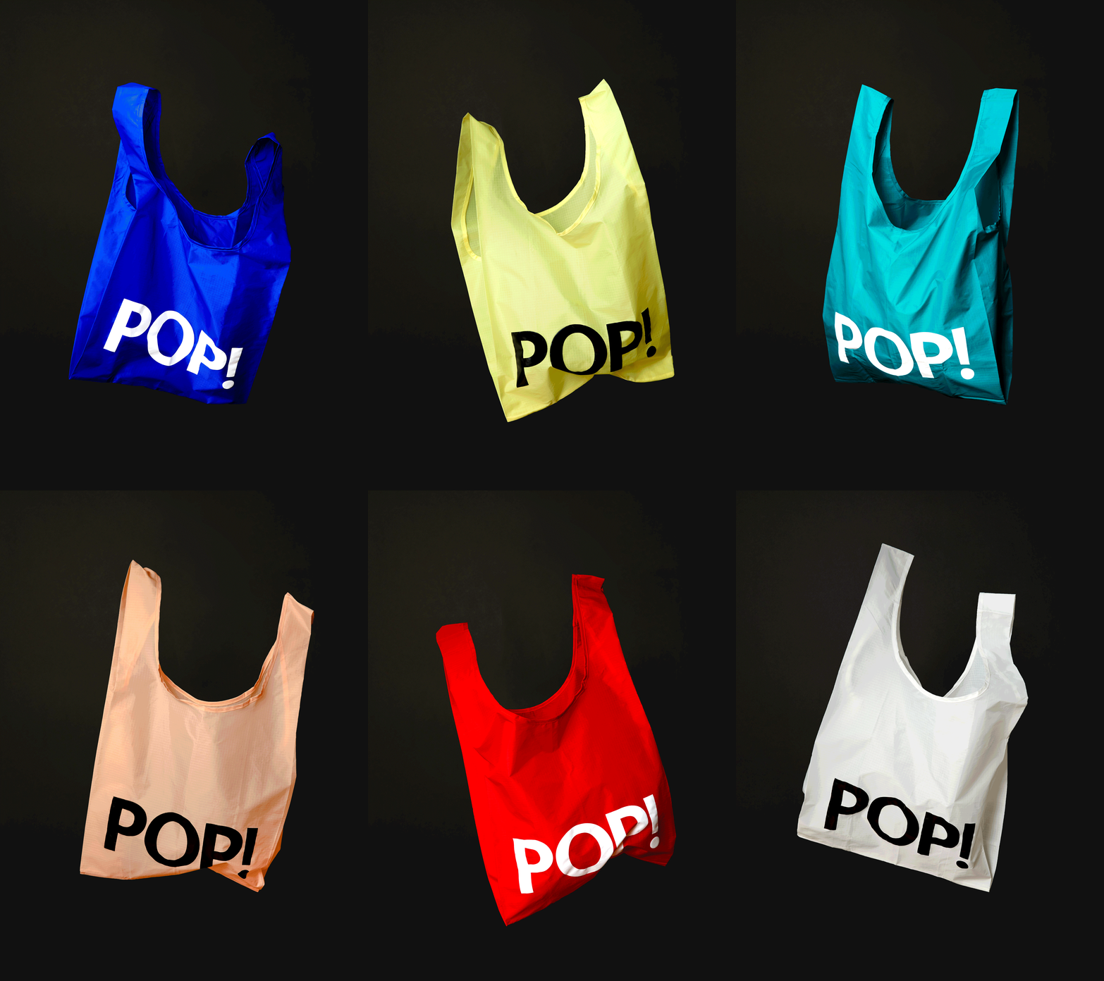
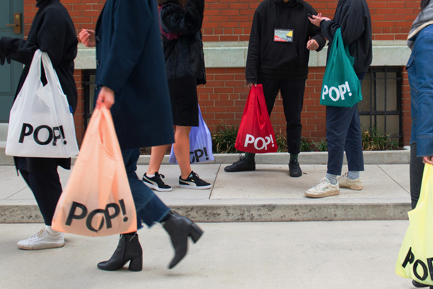
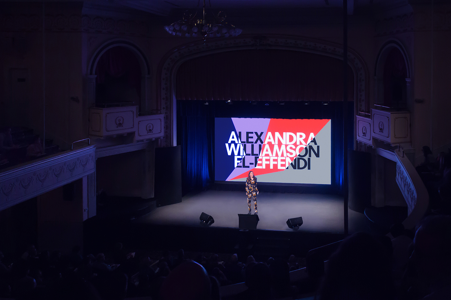
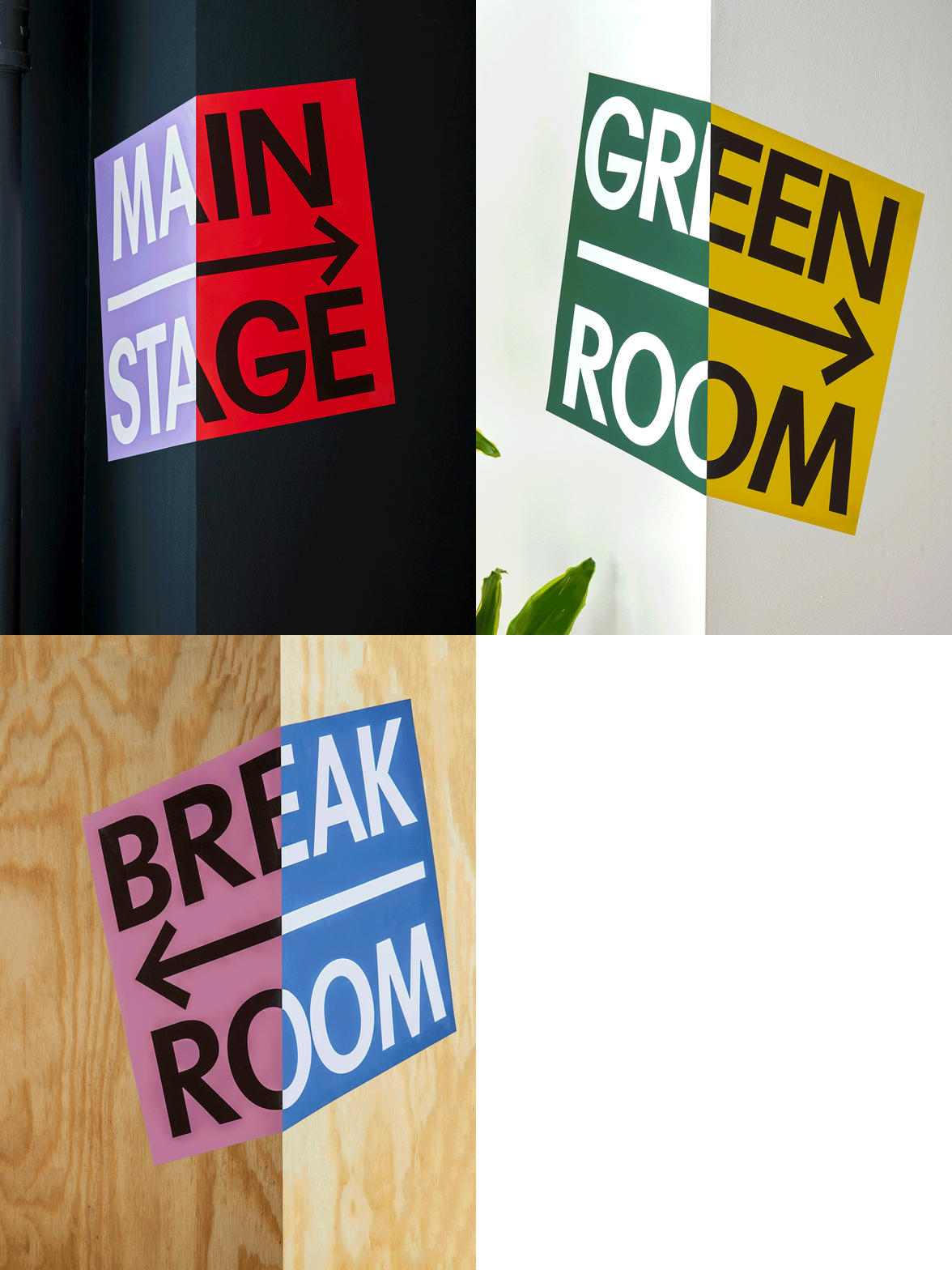
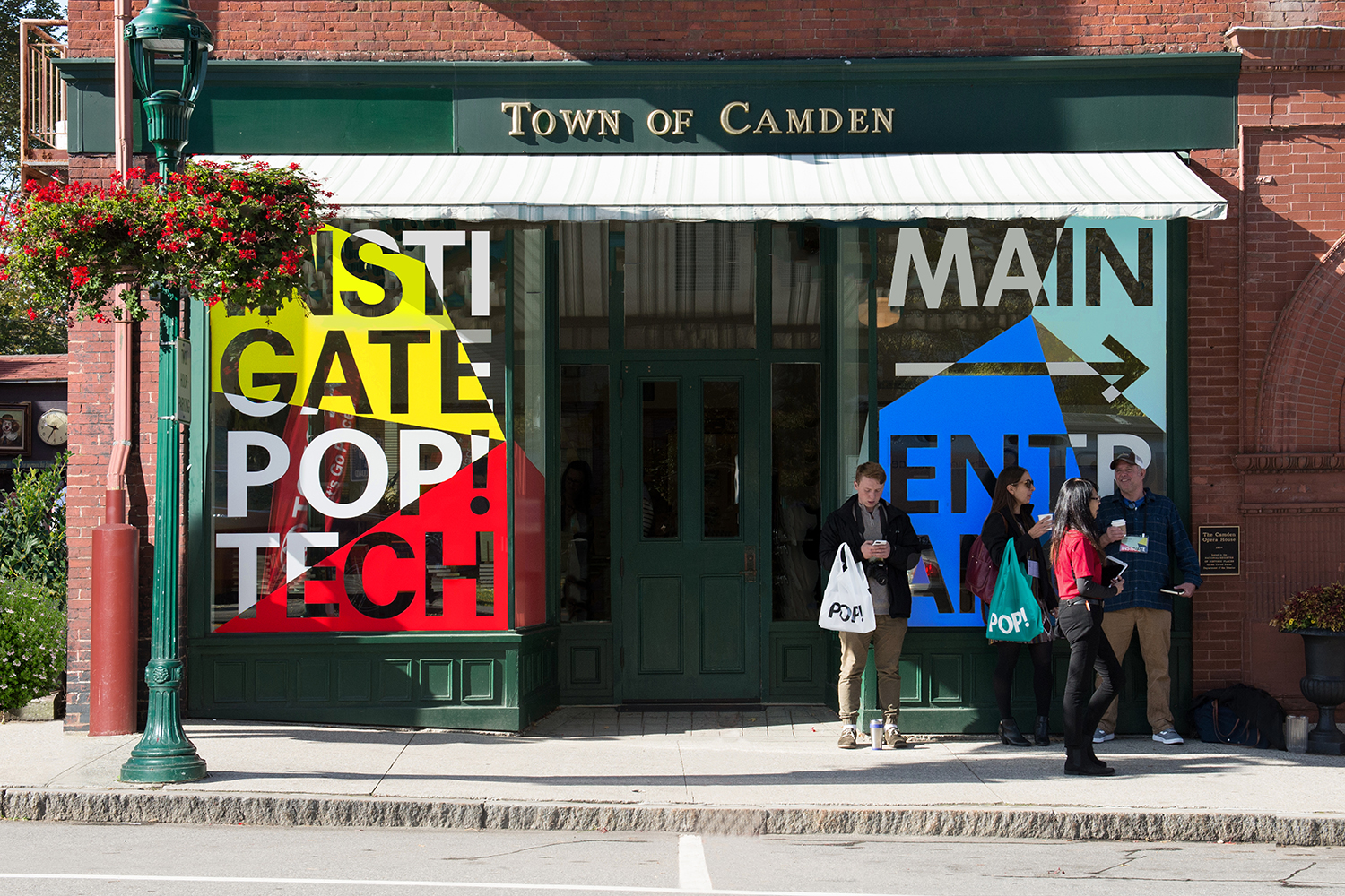
New York based Collins worked with PopTech to design and creative direct the 2017 conference, to build this around the theme and potential to “Instigate”. This manifests itself visually in the intersection of form and colour, in the bisecting of type and the implications of convergence. This links a variety of assets that included posters, supergraphics, lanyards, motion graphics, video, bags and event brochures and programmes.
Collins’ video does a lot to cover the critical intentions of the conference in a compelling, playful and conversational manner, and gives this a metaphorical foundation and an associated visual manifestation. The formation of Everest serves as a useful metaphor for the collision of ideas, a sense of scale and the potential for significant, tangible and world-shaping change, which is also well-served by words, pacing, and music.
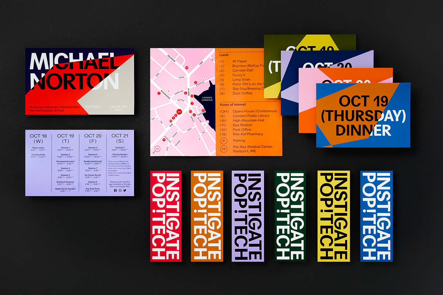
Under the theme instigate; to incite forward-thinking change rather than simply adapting to the current climate, and emphasise the idea of subjective views, shifting perspectives and the frictions that can lead to new ways of thinking, Collins developed an immediate visual expression of type, colour and form. There is a sense of the systematised yet also an unknowable potential. It gains a lot from its quiet town context. The intersection of the two feels like a sharp, unmissable and intentional provocation, a call to action that demands attention as do the challenges the conference intends to address.
As the conference intends to engage with a broad group, those that take an academic, technological or creative approach, identity could have potentially sort out a more conservative position, however, in colour breadth (individuality), type continuity (collective), proportionality (voice) and use of form (action), brings to light a common spirit (instigation) and realises this visually to great effect.
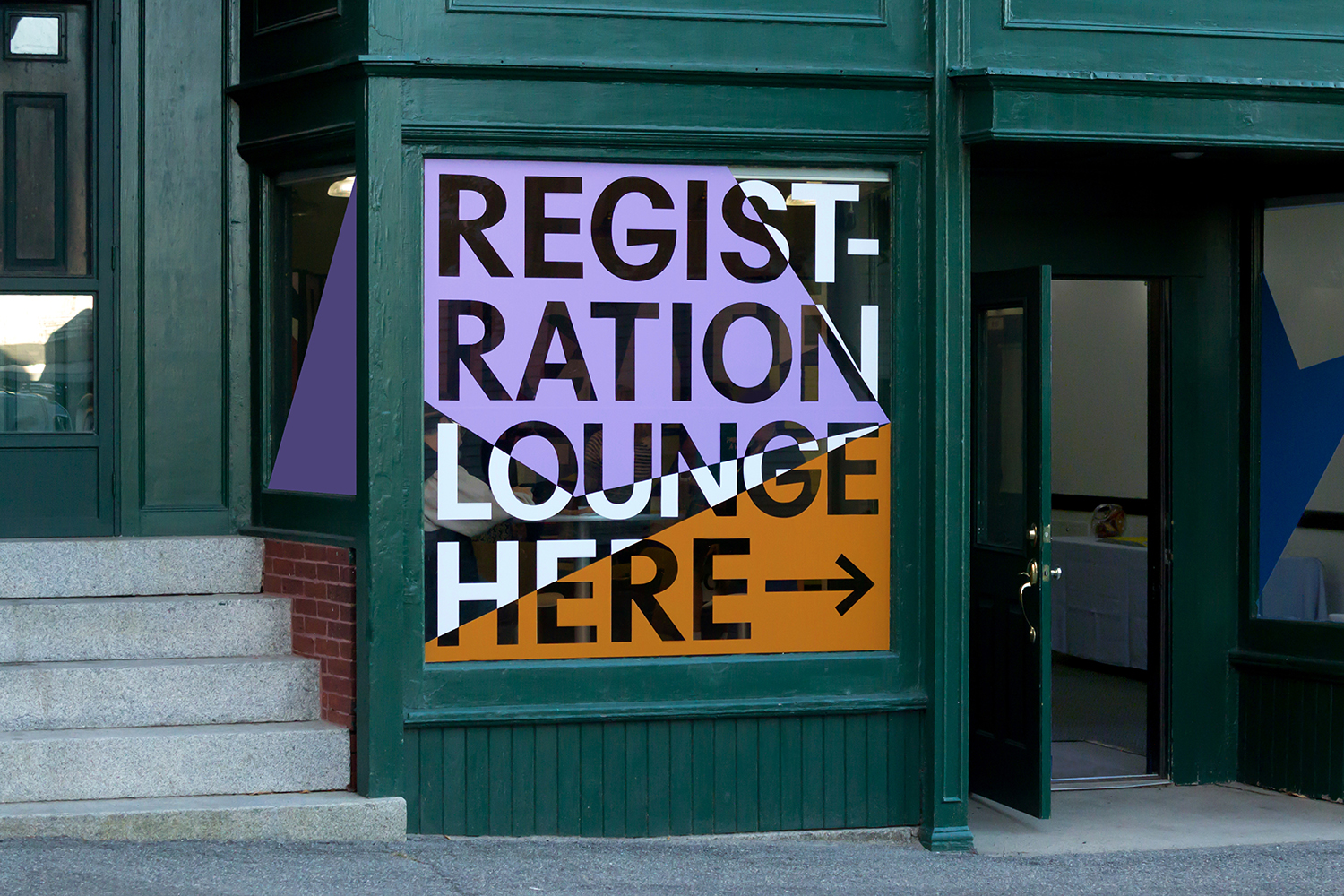
Facets, lettershape, proportionality and arrangement, positive and negative space, colour contrast and a directional and collisional quality all speak of the current and the energetic, intersections, variety and opposition. These all well-suited to a conference that demands a diverse people speak up and make cross-discipline connections and creative leaps. Although much of the visual language is one of contrast, of abrupt transitions in form and colour, stylistically it feels singular and resolved in its communicative expression.
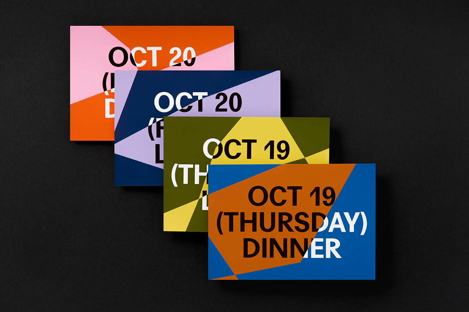
Type, in lettershape and typesetting, alongside copywriting and a little of the vernacular of protest and campaign in some printed contexts, Collins’ work speaks of action, of individual and collective voices, with a volume and an enthusiasm. As an annual conference, able to be reconfigured yearly, to be both an individual and sequential project, there is the potential to be responsive to the moment and the urgent but also present itself as an ongoing activity with momentum.
Copy Opinion by Seth Rowden
The dialogue reads like a WhatsApp conversation or a Twitter thread, with the video frame acting as a visual metaphor for each message. Sentences appear as if typed and later give way to short bursts of individual words in moments of excitement, mimicking an instant message style of writing (notice the ‘dot, dot, dot’ after the first question to suggest the second voice is typing).
This back and forth exchange presents a problem – how to give the characters a voice. The decision to use words instead of illustrated characters, for example, is what makes this piece so captivating. The absence of identity is consistent with the anonymity of online conversations, particularly social media, and makes the voices more relatable. However, at the same time, there is a sense of characterisation.
The screen switches between a black and a white background to represent the two voices until we can tell the characters apart by their tone and personality. Does black and white represent good and bad, young and old, naive and experienced, or even people of a different race? Perhaps. But, as the conversation unfolds and we see the use of bold colours, this device arguably becomes a metaphor for how we think about global issues. Answers are either black or white.
Except they’re not. In abstract work, metaphors can be useful to create an image in someone’s mind. The video contains only one image (Everest), and yet it holds my interest. Mount Everest demonstrates how magnificent things can come from opposing forces. The push and pull, the type momentarily tearing apart and the dual colour emphasises this point and shows the collision, power and potential violence of ideas.
There’s an awareness that the content is heavy and could feel overwhelming at times. The humour acts as a relief, breaking up the torrent of words. The confusion between Everest and the pyramids, and the divisive (but trivial) choice of whether bacon belongs in a peanut butter and banana sandwich, help to lighten the message. These mix-ups humanise the voices and show that everyone can be involved in these conversations – and their opinions should be treated with respect.
In the background, there’s a restless drumming. A building of suspense that feels like a tsunami of anxiety and uncertainty that comes from thinking about such topics. The use of music is used to control the pace. I particularly like how Everest is brought back in at the end to describe the size of ideas and how the type evens spills out of the frame at this moment. The drumming, which threatens to end with a bang, instead ends with a POP! The perfect end.
Font: Agipo
