The Clydeside Distillery by Manual
Opinion by Richard Baird Posted 15 June 2018
The Clydeside Distillery was set up in 2014 with the intention of reviving distilling in Glasgow and telling the story of Scottish Whisky through a visitor’s centre. The distillery was set up by the Morrison’s, a family with a century-long history within the Scottish Whisky industry as both owners and operators.
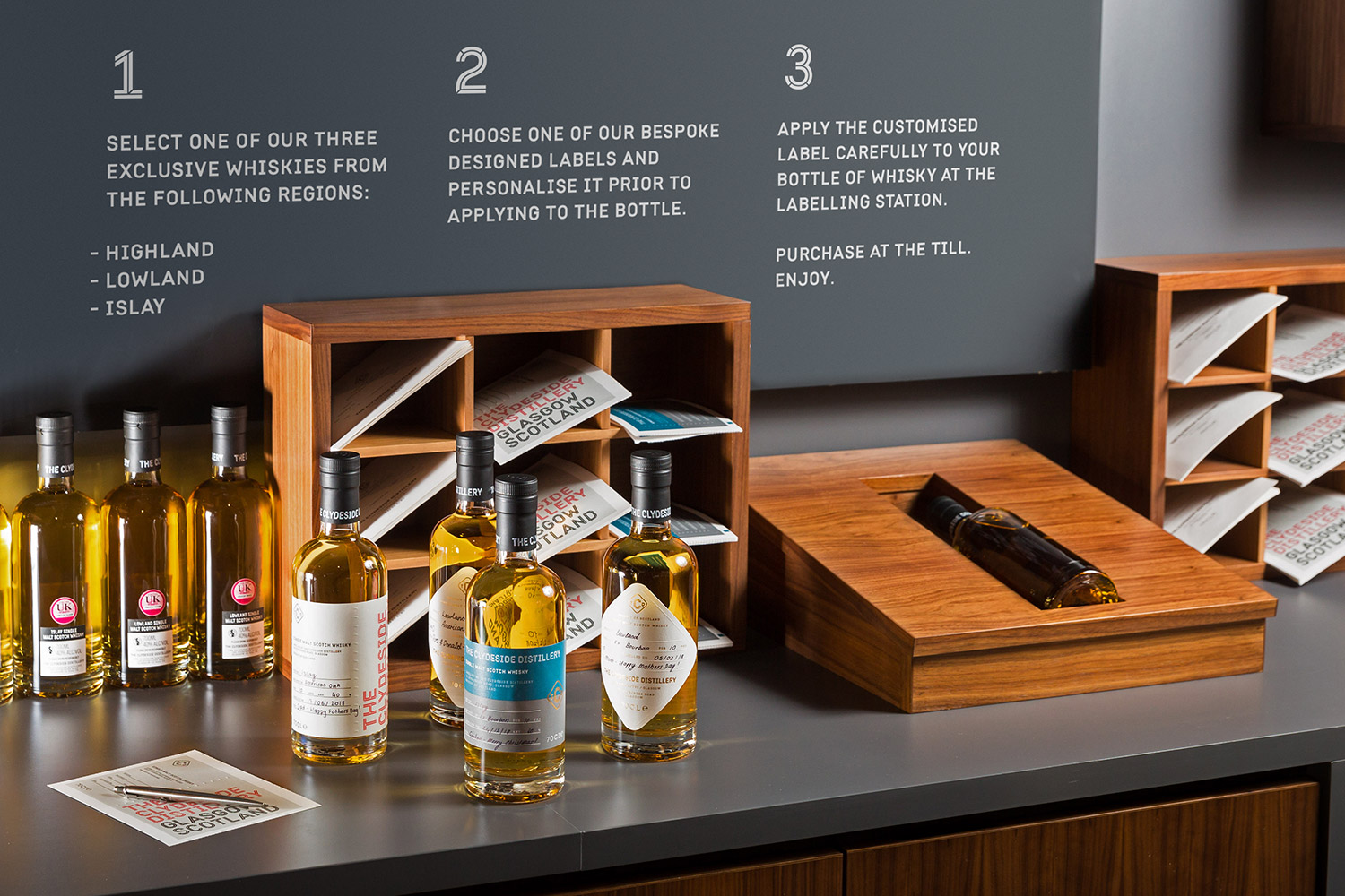
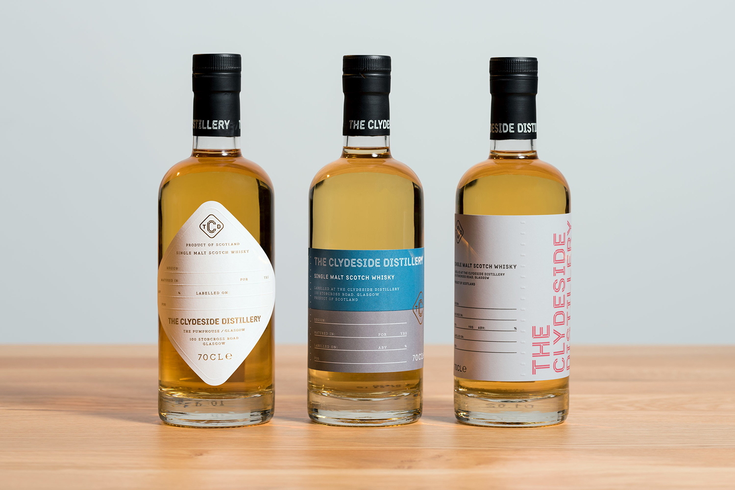
San Francisco based Manual travelled to Glasgow to work closely with founders, architects and experience designers over a three year period to develop a brand that would live up to and bring to light a rich city heritage of industry and export through a broad variety of visual communications and material experiences. This included logo and a custom typeface, packaging and signage.
Meta–Past and present, historical reference and continued relevance is a central part of The Clydeside Distillery brand and experience. Its value is in a genuine continuity of story; of Scottish Whisky, shipbuilding that facilitated its export, and the family’s continued contribution to the city and its industry.
Macro–The distillery, its location at the mouth of the River Clyde, a historic place that provided hydraulic power to the Queen’s Dock and supported shipbuilding and trade around the world, functions as a rich, compelling and unique confluence of whisky, export and industry. Further, and rather serendipitously, a Morrison, three generations prior to the opening of the distillery, had been contracted to work on the same site when it was in-filled to create the Scottish Exhibition and Conference Centre. So, alongside whisky, export and industry, there is an element of familial relevance that also exists.
Much of the work done was clearly on research and strategy. The ease at which these foundational exercises are visually represented and coalesce belies that front end effort. Historical reference and a modern system, one built around a custom typeface developed in collaboration with Colophon Foundry, serve as an appropriate, distinctive and practical anchor for broad experience and the material surfaces of an exhibition, labelling centre and packaging.
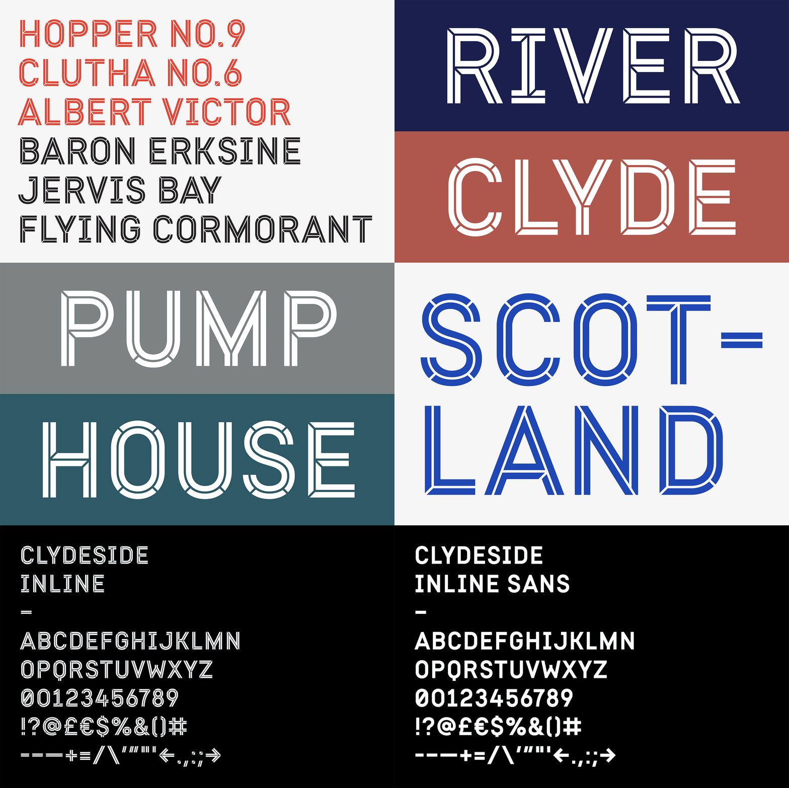
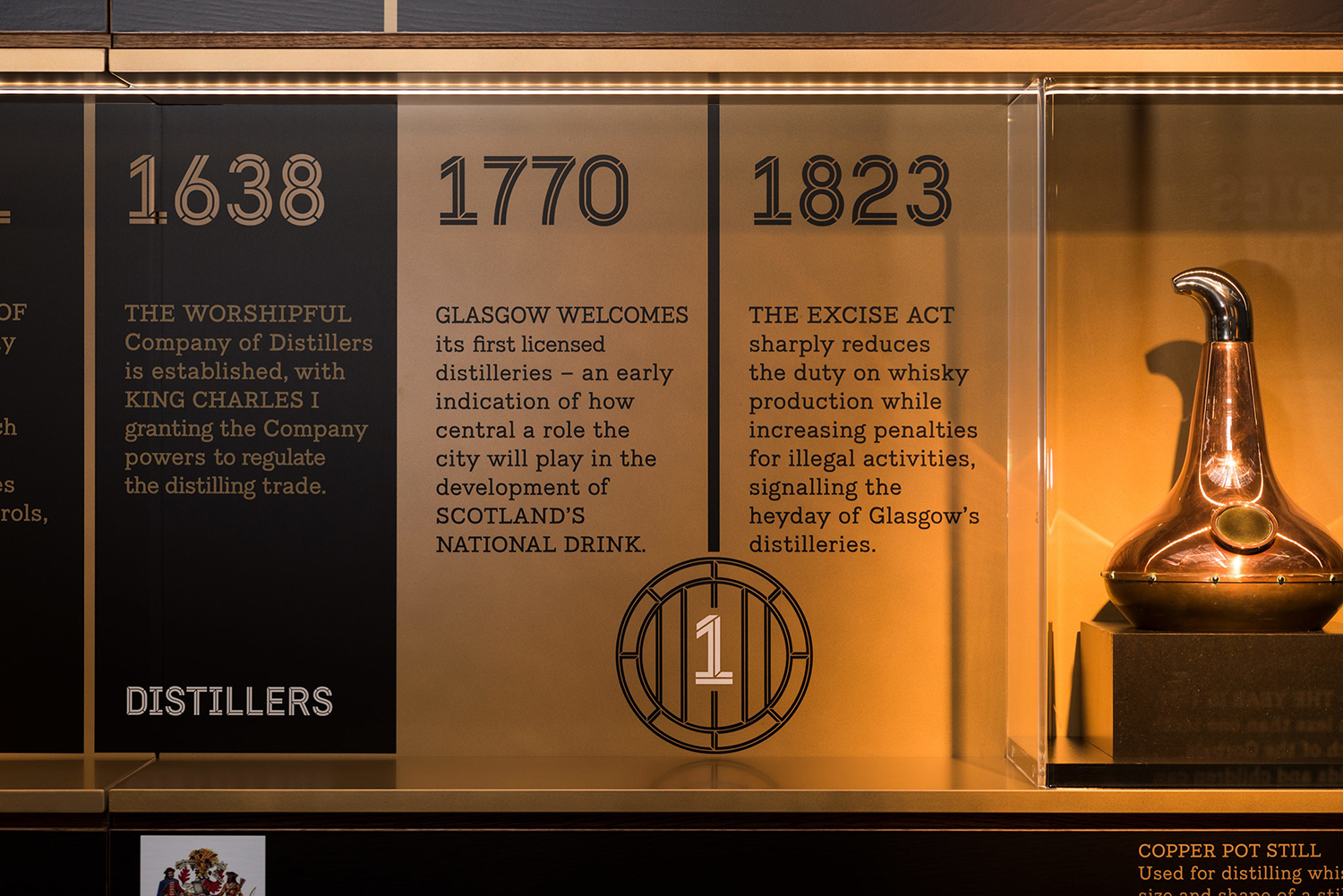
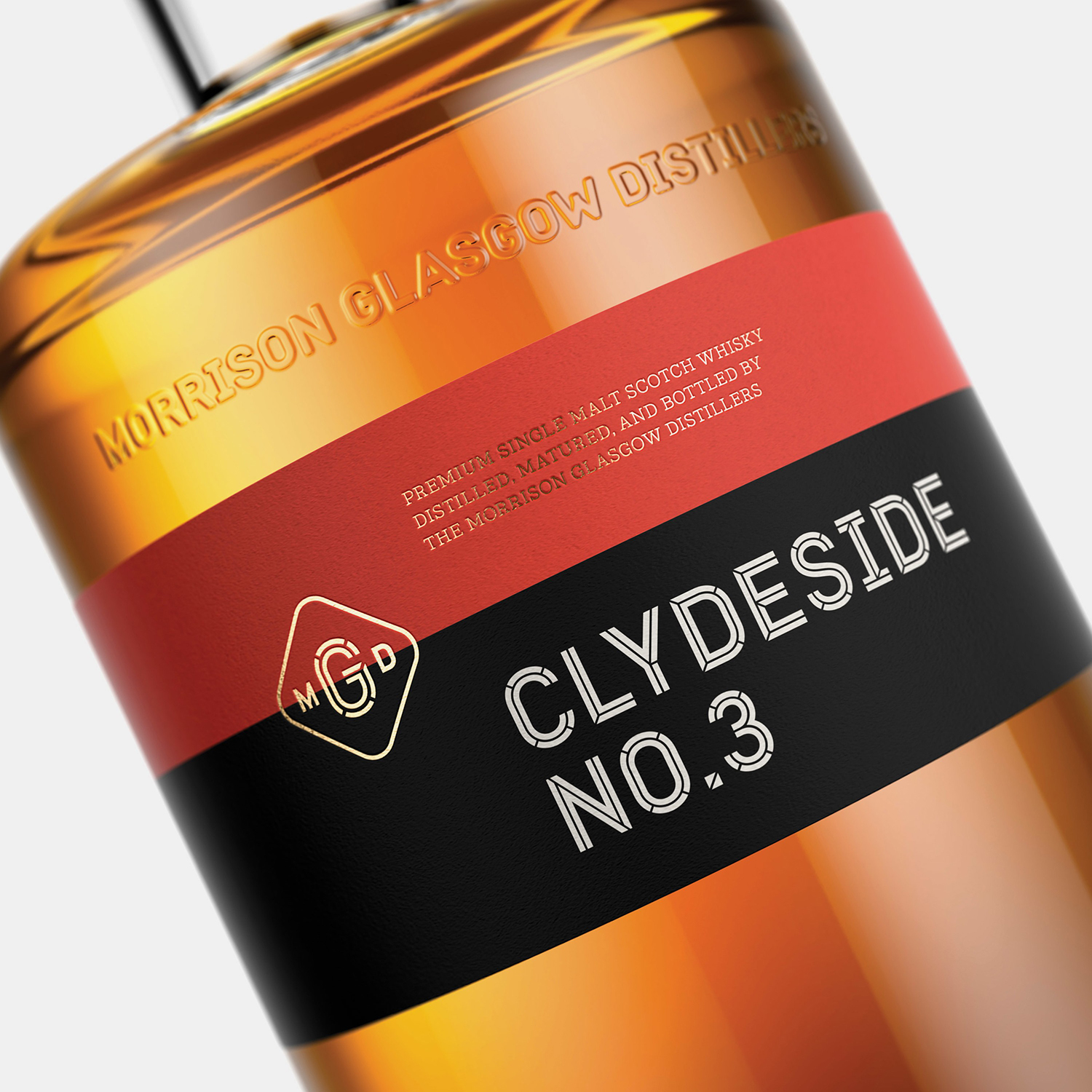
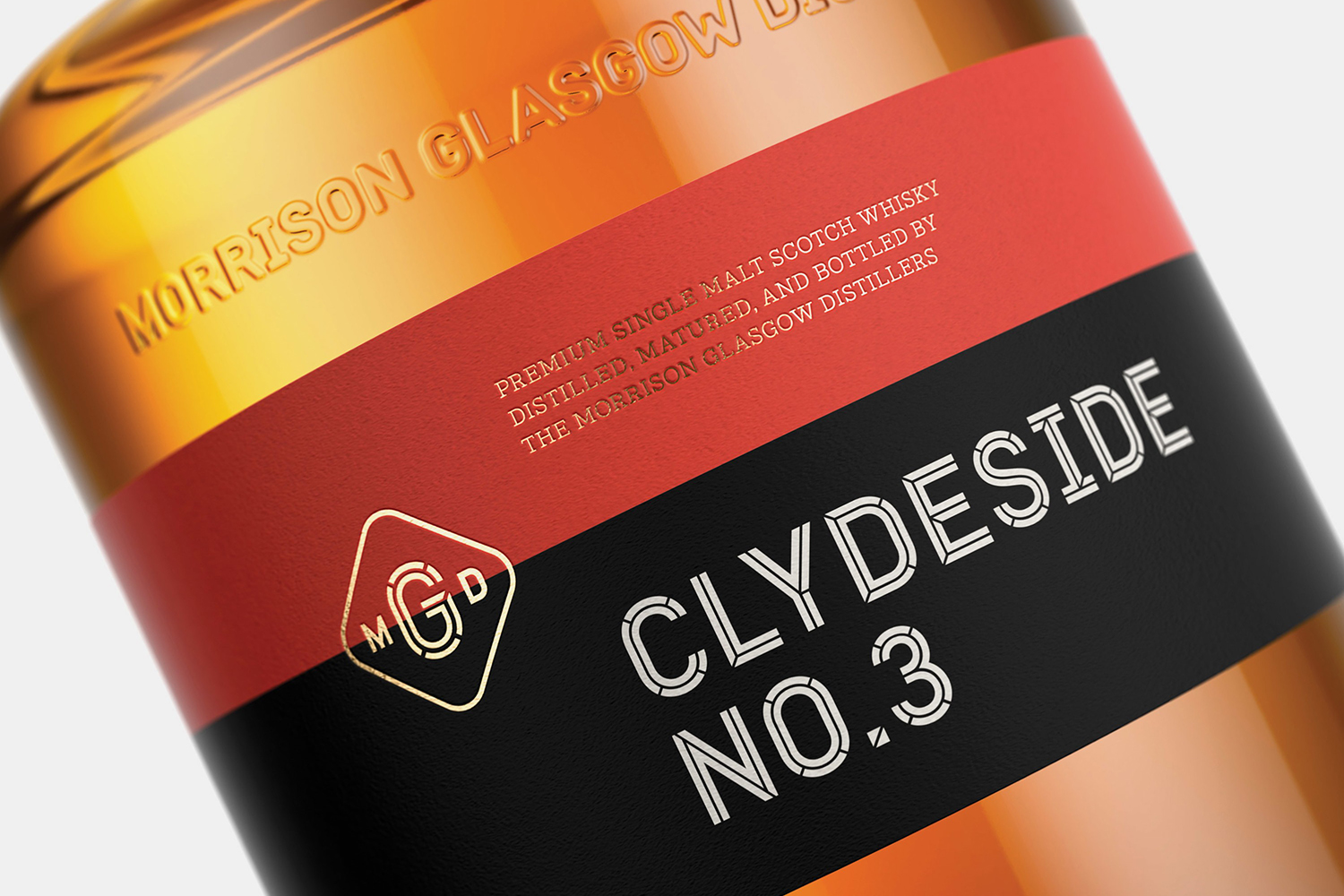
Micro–The inline display typeface effectively plays with stencil cut utility and industriousness. It stands out for its blend of period and modern letter shapes, and the unusual points at which lines are broken that lends it further character. Clydeside Inline and Inline Thick, exists between traditionally carved signage and stencilled hulls and the crates of import and export. Lettershape serves as an identifiable focal point that links Clydeside Inline and Clydeside Sans.
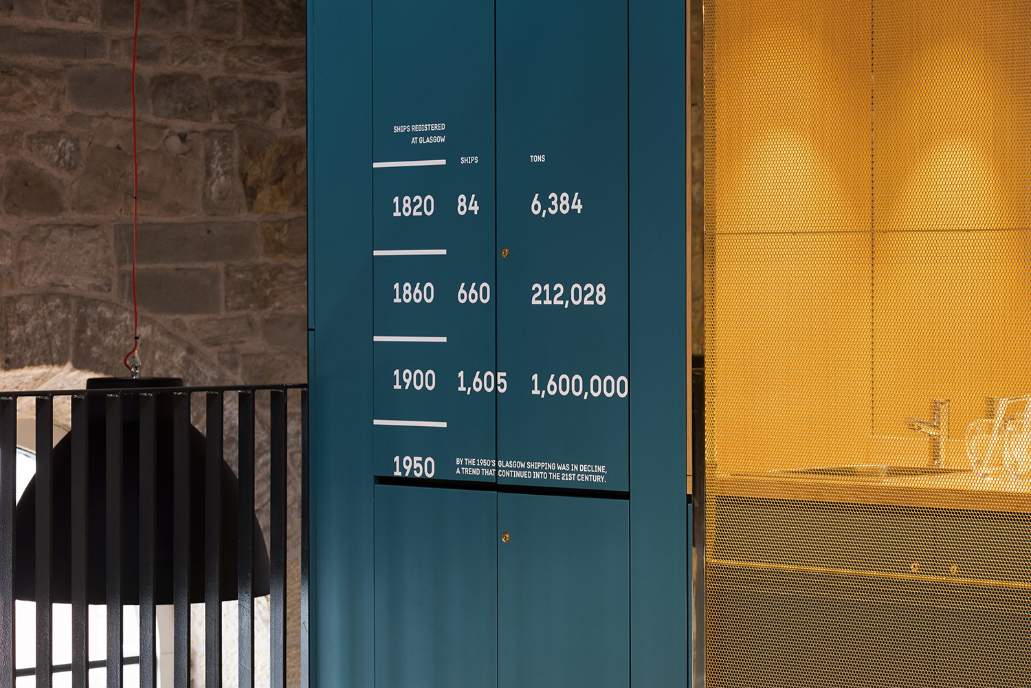
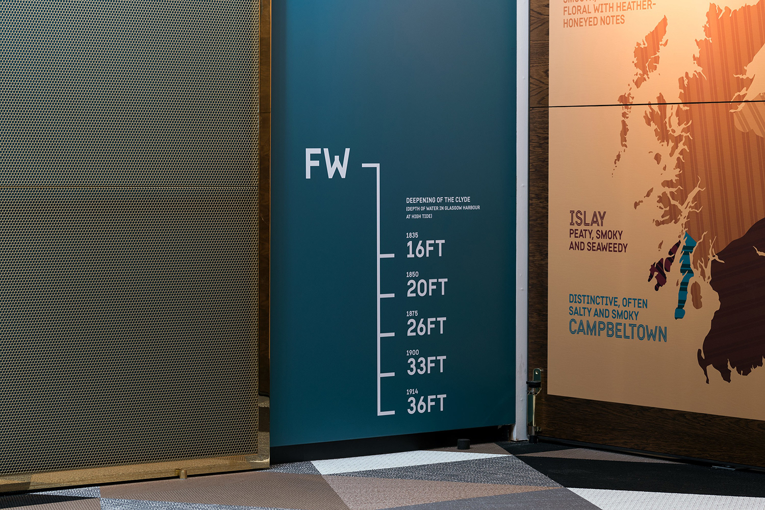
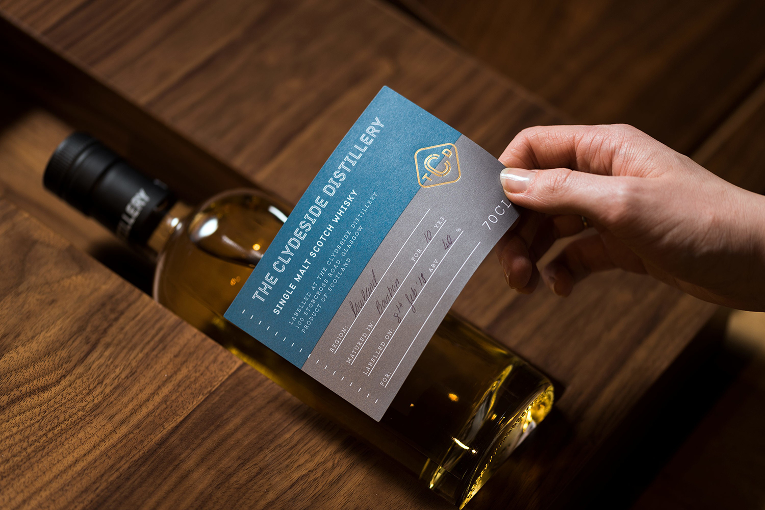
Colour and the pairing of colour similarly plays with the idea of intersection (past and present, tradition and modernity), but leans further into shipbuilding, of painted hulls and waterlines. The waterline, and the iconography of water height and displacement makes a smart move into exhibition space, and used to denote time. It is the ease at which these associative transitions are made that is a real highlight.
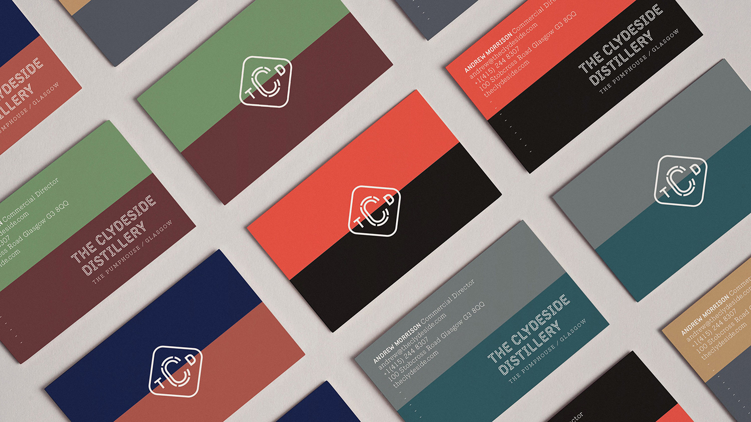
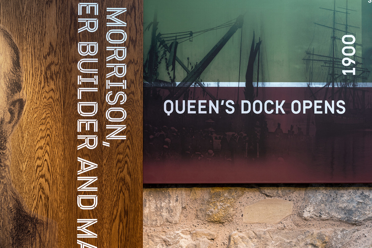
There are a bunch of other subtle and pleasant details. The use of wood sends the mind back further in time to early international shipping but also the wood casks of distilling, another dual motif that really lends the work a thoughtfulness and conceptual weight.
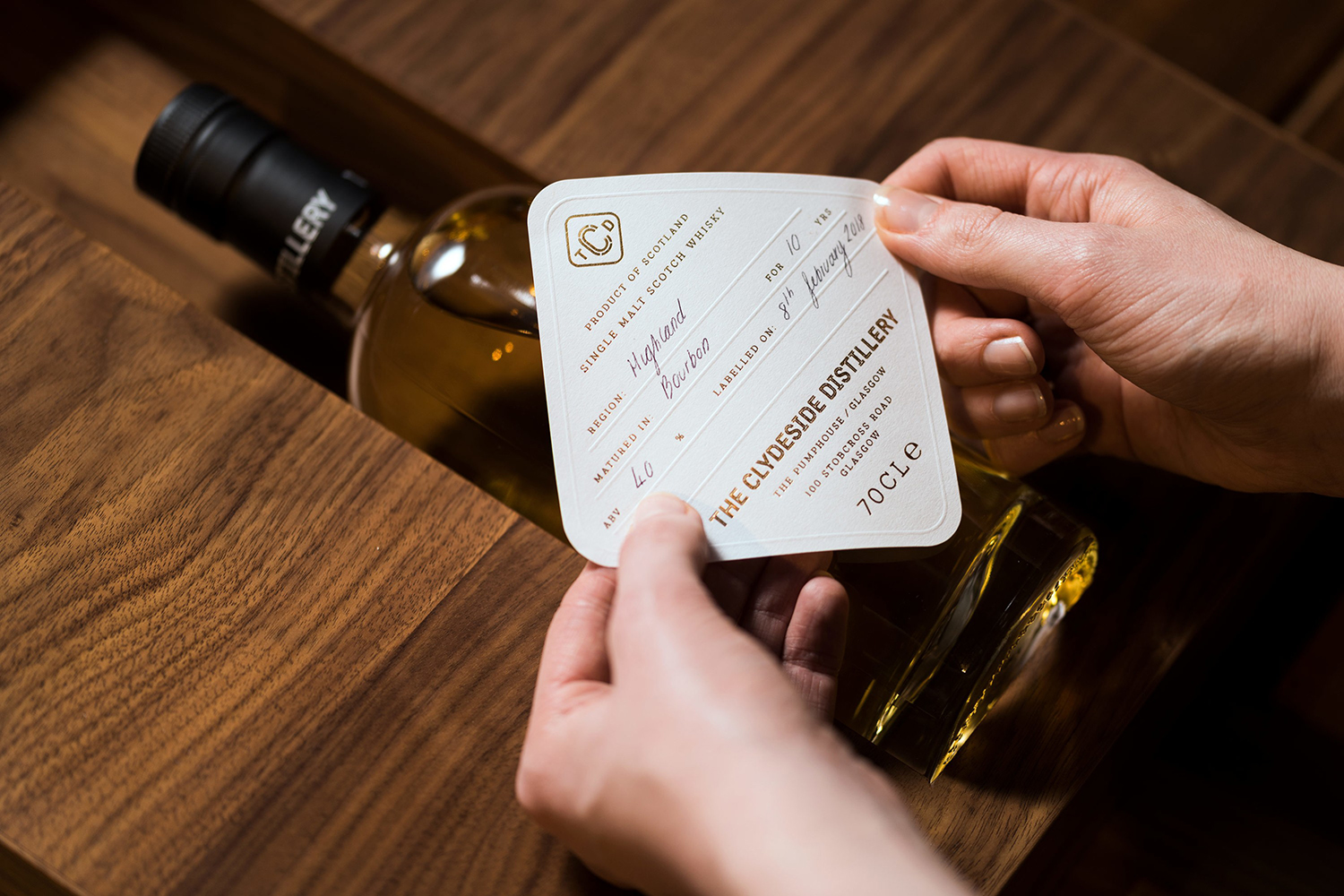
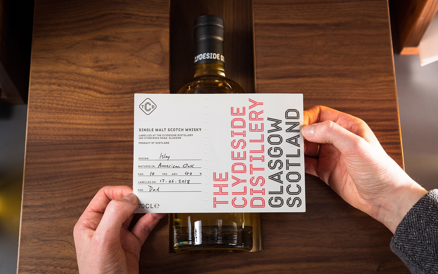
The label design and labelling station within the visitor’s centre pushes engagement (the filling in of details) over the need for shelf impact or storytelling (as the experience does this in a richer and more thorough and sequential way). In that sense, labelling has a contextual sensitivity that differentiates and ties itself to a personal moment in time, of learning, and fostering a deeper connection with brand, more than any shelf label could manage.
Further, a copper block foil mirrors the copper stills, and an architectural vision that plays with contemporary glass-box structures and the red brick of the location, as well as open views of the River Clyde and copper stills, weave together the past and present in a material way and visceral way.
Design: Manual. Interior Architecture & Exhibition Design: Bright 3D. Typeface Development: Colophon Foundry. Opinion: Richard Baird.
