Watercolour
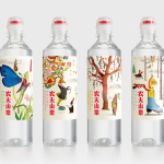
Nongfu Spring Mineral Water by Horse
Nongfu Spring is a bottled mineral water brand and a leading Chinese beverage business. Nongfu worked with British design studio Horse to develop a new package design treatment that, using labels illustrated by designer Brett Ryder and a distinctive structural design with a slim profile and proprietary leak-free sports cap, would engage the youth market....
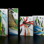
Marbella Club by Pentagram
Marbella Club is a hotel, spa and golf resort located in the Spanish coastal city of Marbella, on the shores of the Mediterranean sea. Built as the private residence of Prince Alfonso of Hohenlohe-Langenburg, and converted by the prince into an exclusive, private hotel and retreat in 1957, Marbella Club has a significant heritage, one that has played host to royalty,...
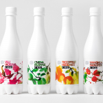
Olvi Cider by Bond
Olvi is Finnish independent brewery that produces a broad range of beers, waters, juices, and soft drinks. Their latest range of dry, light and sweet ciders, branded and packaged by Helsinki based design studio Bond, working in collaboration with Stina Persson, were developed to have ‘a strong shelf impact with natural and pure design which stands out from competitors green bottles’....