Yoosli by Together Design
Opinion by Richard Baird Posted 11 June 2013
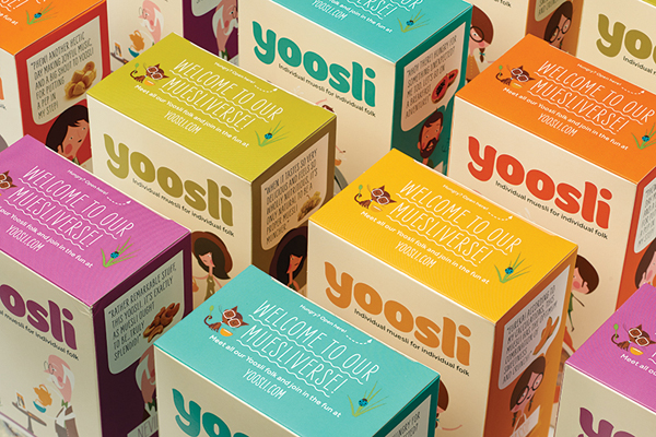
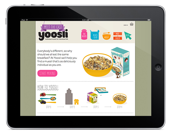
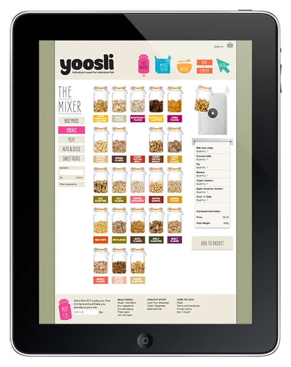
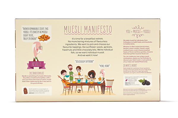
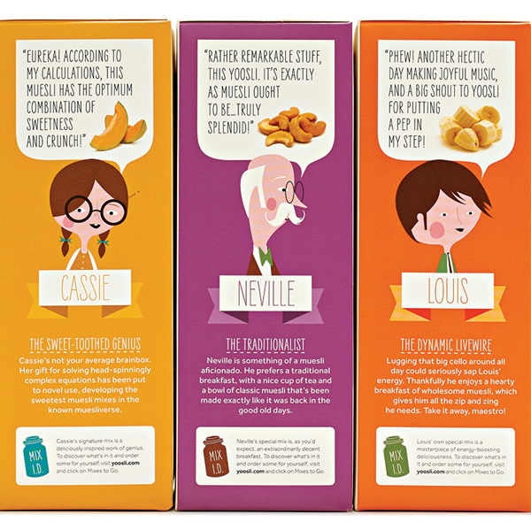
Yoosli is a new online service that enables customers to create their own muesli mix from a choice of over 65 ingredients delivered as a one-off or subscription service to their work or home address. UK-based studio Together Design – commissioned to develop Yoosli’s brand identity and e-commerce website – created a cast of what they describe as eccentric characters, “each of whom represents a different personality and muesli flavour”, alongside a conversational speech-bubble device to convey the ‘joyful’, personalised and ‘creative mixing experience’ provided by the service.
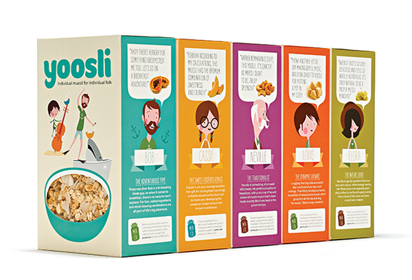
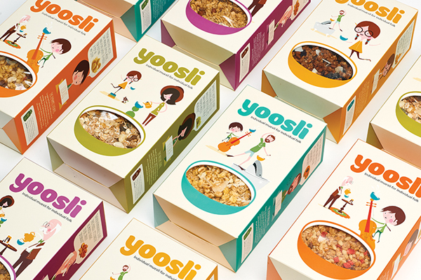
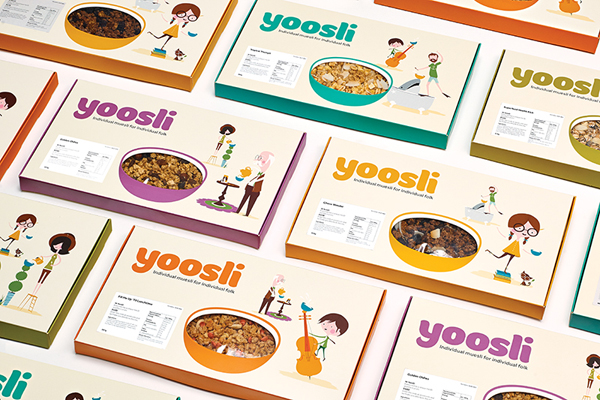
Together Design’s identity and packaging solution makes the most of the on-line proposition by removing the formalities and promotions typically associated with supermarket packaging to establish a clear and spacious canvas to communicate from. It does not reinvent the cereal industry – the illustrative approach, speech bubble, pack window, hand drawn type and colour palette are familiar – but it does however bring new life to a category that has frequently relied upon farm-house style imagery, with a broader and more inclusive approach that leverages the often humorous and discordant personalities that make up modern families to convey variety and appeal to both adults and children alike.
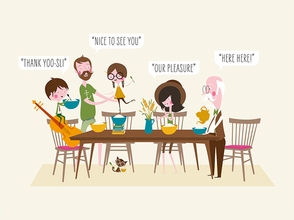
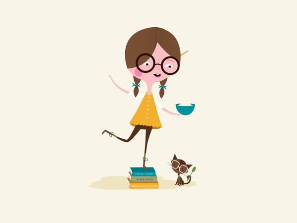
The illustrative work of artist Andrew Bannecker looks fantastic. There is a subtle 50’s sensibility in their flat almost paper cut quality that neatly avoids the synthetic computer rendered 3d characters of children’s cereals whilst appearing original and contemporary. The smart use of multiple generations, playful situations and humour alongside a sense of honesty, fact in the typography and wholesome activity that neatly resolve the themes of growing up, traditional values, family, energy, shared experience and positivity that tie well with the healthy nature of the product and the event of breakfast without appearing overtly idealistic. By mapping out individual personalities through a conventional but communicative speech bubble device you get a richness you might associate with storybook characters that extends past illustrative division and their shared aesthetic – a cohesive diversity if you will – that really elevates the concept beyond the conformity and consistency of other brands.



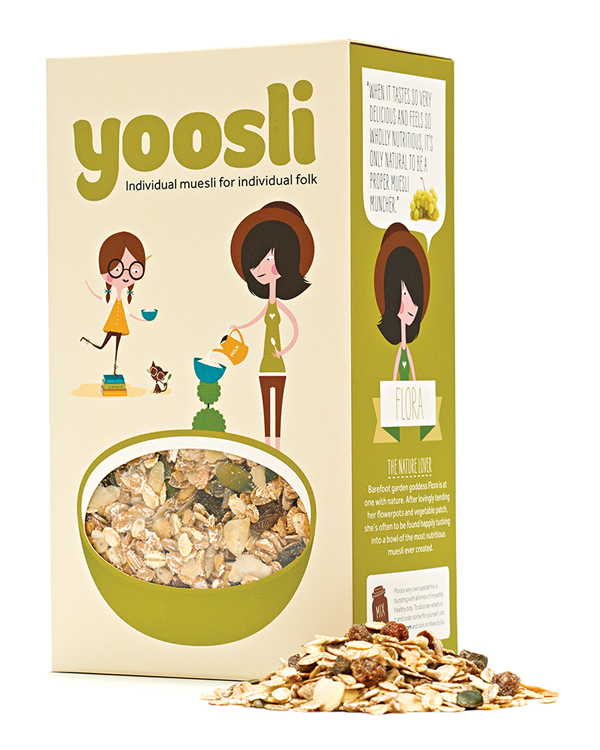
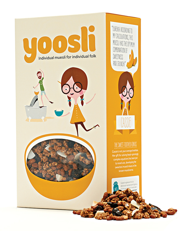
The logo-type’s bold, well-spaced lowercase letterforms and the small sweeping details across the terminals look friendly, distinctive and proprietary. The strap line below has a formality and introduces contrast but for me feels a little like an afterthought with a conformity that struggles to fit with the concept of customisation. The secondary typeface, a tall, uppercase and hand drawn sans-serif, delivers an on-trend, storybook and conversational tone of voice in conjunction with a speech bubble device. This provides an openness and child-like honesty that while not massively original functions in a clear and concise way for a broad audience.

The use of a bowl as a pack window across both the regular and mailbox structural design is a smart device that suitably utilises the natural quality and texture of the product to add detail to the flat colour of the illustrative work and reinforce the open and honest tone of the typography and speech bubble. These are complemented by a colour palette that appropriately complements, conveys and blends the earthy tones of cereal and nuts with the bright colour and sharp flavour of fruit.
