CooperVision
Opinion by Richard Baird Posted 22 March 2011
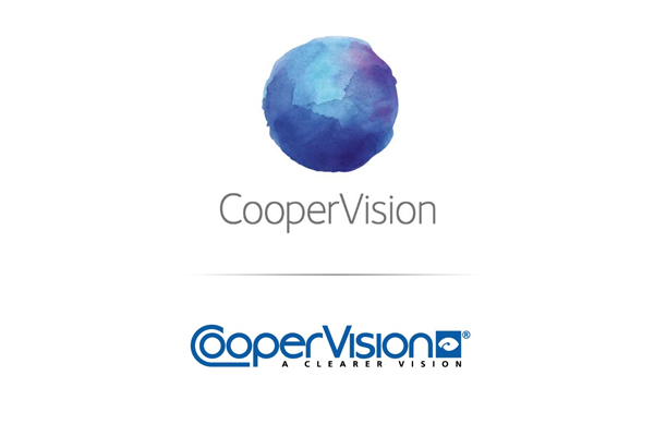
CooperVision is a US manufacturer of contact lenses which was founded in 1979, based in California it has grown to become the world’s fourth largest developer. Following a record year in 2010 CooperVision rolled out a new brand identity which they say “brings a refreshing perspective to the market.”
First off this is a remarkable change. You can see that Coopervision have fully embraced a new direction both visually and strategically. The original logo had so much going on it resulted in a confusing union of ideas which failed to communicate anything other than the obvious eye and water messages. The custom type changes, in an effort to create a lens case from the ‘c’ and the two o’s, was wholly unnecessary and awkward. The strap-line has some over-enthusiastic tracking while the small and generic eye logo-mark tacked on the end adds nothing and simply furthers the already obvious ‘eye product’ message.
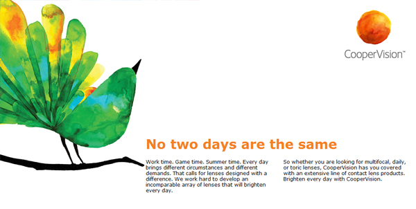
In comparison their new identity is a significant change in direction, “Our new brand positioning reflects our commitment to bring a perspective that creates real advantages for our customers and wearers,” “We appreciate that no two eyes, no two patients, and no two days are ever the same. That’s why we take a different approach to contact lenses in terms of how we develop and produce our lenses and how we partner with our customers.” – Dennis Murphy, CooperVision President
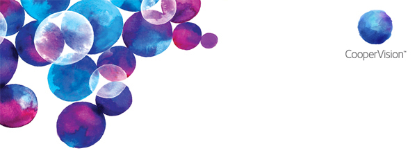
The over-designed and cluttered lock-up is gone and replaced by a set of four watercolour circles combined with a clean modern typographic solution (possibly Aaux Next Light or something similar). Although you can attribute almost anything to a circle it still remains a very suitable representation of the eye while also symbolising their desire to be inclusive.
The watercolour style (although a bit of a trend) is a fitting choice to capture the essence of their products which are predominantly water-based. The changing colour choices express the wide spectrum the eyes see as well as the diverse global nature of their business, these are complimented by a set of vivid and well rendered watercolour paintings which hopefully should make it onto their packaging.
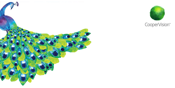
CooperVision has managed to blend the technological and clinical aspects of the pharmaceutical side of their business with the lifestyle approach of cosmeceuticals. It must be noted that the visual style is very reminiscent of Pearl Fishers Keystone Florals for Crabtree & Evelyn so while not entirely original it still offers a fresh new approach to contact lens products.
“The new watermark logo was designed to represent a blend of scientific precision with the vibrancy found in everyday experiences. The spectrum of colors and fluid nature of the design reinforces CooperVisions perspective that the world is a vibrant, ever-changing place. It also provides a unique take on water and comfort valuable qualities of the CooperVision lenses that are key ingredients in our wearers daily lives. In addition to an updated marketing portfolio and packaging, the marketplace will experience a much energized CooperVision, building on its commitment to the eye care practitioner and the hard-to-fit patient with an ever expanded offering of its more widely used lenses such as Biofinity.”

