Thorntons by Purple Circle
Opinion by Richard Baird Posted 23 March 2011

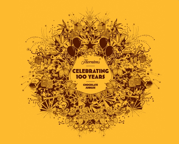
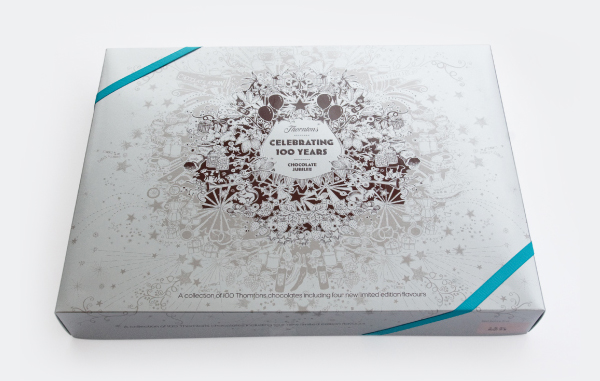
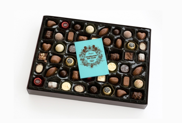
Thortons is a UK based confectioner and retailer specialising in chocolate, established in 1911 by Joseph William Thornton it has become the largest independent confectioner in the UK. As a celebration of their 100th year they commissioned Nottingham based Purple Circle to develop (alongside their in-house team) a ‘Fantastical’ theme that would adorn there product range and retail spaces.
“The branding centres around charming and intricate illustrations by Johanna Basford, whose “inky black and white wonderland” has adorned the Edinburgh Fringe festival programme, the iconic canvas fabric of Converse shoes and even the pages of Vogue.” – purple Circle
“It started with a detailed brief from Thorntons and a brainstorm, where we came up with a number of possible creative routes. This fantastical execution needed to be flexible enough to be applied across any size or shape – from tiny badges to huge pieces of 3D point-of-sale. The resulting work has been applied to all manner of items by Thorntons’ in-house design team – see it now in a store near you!”

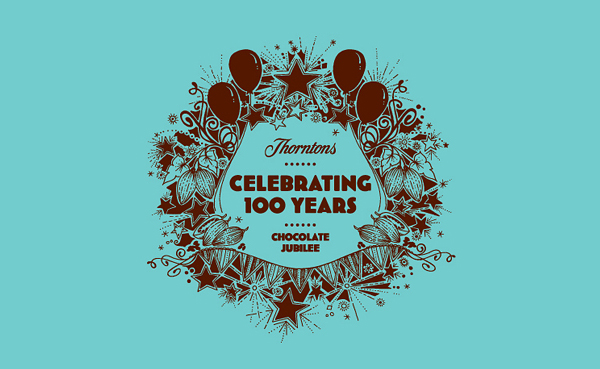
This is a truly wonderful piece of brand work capturing a sense of exploration, discovery and celebration. The execution of the illustration is perfect while its application shows great restraint and is combined with an interesting colour palette. An interesting point to note is how the illustration can be broken down into different sizes, shapes and complexity adding a level of flexibility to the overall concept. The typography is a fair choice and suitably represents the historical aspect of the celebration.


