Eurostar by SomeOne
Opinion by Richard Baird Posted 29 March 2011
Eurostar is a high speed train service through the channel tunnel linking London, Paris and Brussels, owned by Eurotunnel it was opened in 1994. With expected growth this year through acquisitions and line extensions Eurostar have announced that they will be re-branding the service to suitably reflect this new expansion.
The original logo designed by Minale Tattersfield represented the original three destinations and formed the letter ‘e’, the star albeit a little obvious represented the united countries provided for by a single service. The typographical choice was strong and suitably expressed the speed of the service although the angles on the mark and type didn’t quite match there’s was still lot of movement carried in the overall lock-up.
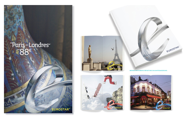
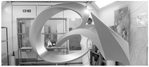
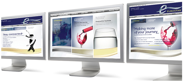
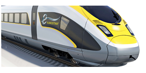
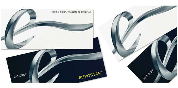
The re-brand managed by UK design agency SomeOne has removed the three lines in favour for a single flowing line allowing the logo-mark to represent more than the original three services. The ‘e’ is well executed and captures the sense of a train speeding into a tunnel. The typography has been flipped with the logo-mark set as lower-case against an upper-case word-mark with a newly proportioned lock-giving it a more premium feel (possibly reflecting the segmentation between leisure and business customers). The gradients on the logo-mark give it a sleeker appearance much like automotive logos and look fantastic presented in print. Much like the Rio 2016 Olympic Games logo the mark has been designed to be represented in 3D space and along with logos based on algorithms seems to be the new trend in identity design. As a sculpture this looks wonderful, there’s a lot of movement and grace while looking neat from a number of different angles. I’m not too sure about the changing colours in the printed collaterals but a fantastic job nonetheless.
