Florian Stephens by Disengised
Opinion by Richard Baird Posted 14 April 2011

Florian Stephens is a London based designer producing high quality 3D visuals and animations for a variety of industries including television. With high profile clients such as the BBC, MTV and the Telegraph Florian Stephens approached London based brand specialists Disengised to develop a sleek clean cut branding concept that would reinforce his professional approach and would become a suitable metaphor for his versatility as a 3D designer and artist.
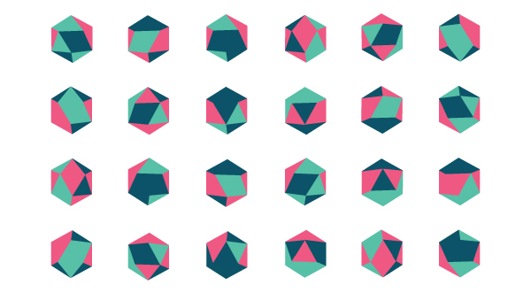
“The basic brand-mark consists of an icosahedron, a solid of 20 identical equilateral triangular faces with 30 edges and 12 vertices, which is coloured in dynamically. Different colours and shades make every iteration of the logo unique. The basic shape of an icosahedron was chosen due its interesting and versatile characteristics. Its perimeter shape for example is the same as that of a 3D cube portrayed from of the top left or right corner and it is only one of five platonic solids. Throughout Florian Stephen’s branding, from his website to his business cards and invoices, the logo coloration is chosen individually to create the effect of the logo being unique to every single interaction between Florian and his customers. With over 1,700 possible permutations, Florian’s dynamic brand-mark attempts to reflect the very multidimensionality of 3d design.” – Mathias Vagni
The result is an interesting and unique logo-mark that utilises its geometric shape in a flexible and evolving way. Coupled with Gotham the overall lock-up is simple, clean and subtly blends a technical/architectural sensibility with that of fashion and creativity captured in a cool green and pink colour palette.


