Tennessee Honey by Cue Inc
Opinion by Richard Baird Posted 19 April 2011

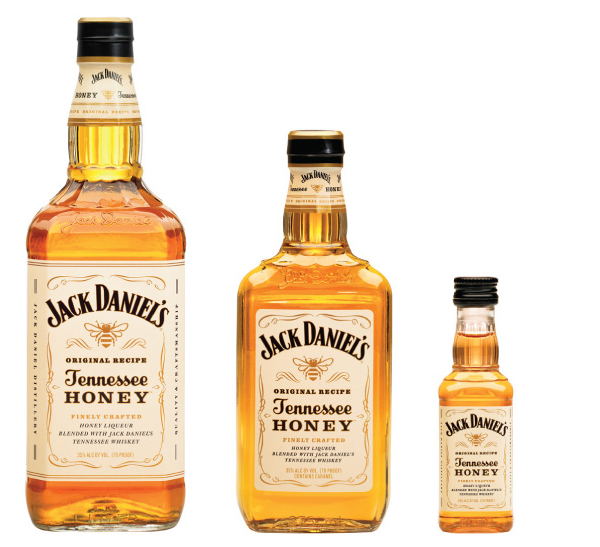
Jack Daniels is a popular brand of whisky produced in Lynchburg, Tennessee and has been owned the by Brown-Forman Corporation since 1956. In a bid to broaden its portfolio and attract new consumers Jack Daniels engaged with brand and packaging specialists Cue Inc to design their new product Tennessee Honey, a whiskey and honey based spirit that is naturally sweet and easy to drink.
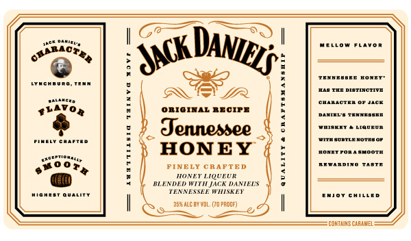
“Drafting off of the core Jack Daniel’s brand, the label is built around familiar brand elements to communicate product authenticity. New elements connect the brand story to the Tennessee Honey proposition and signal its flavor cues.”
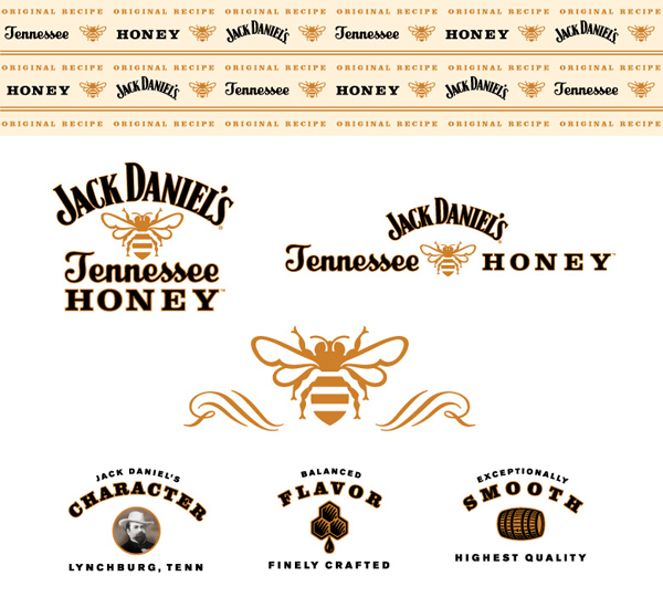
“The identity system for Tennessee Honey references the core brand expression, but adds iconography and messaging to create a proprietary brand language for the new product. The primary logo and extended visual palette balance Tennessee Honey’s energy, natural ingredients and smooth taste.” – Cue Inc

Cue Inc have done a fantastic job in translating Jack Daniel’s key proposition and visual style to the new branding and labels. All the additional visual elements blend perfectly into the current brand architecture. The new illustrations are well weighted and shaded while the additional typography is consistent. The choice to almost invert the brands colours is a bold move and really makes this product stand out while retaining the key visual cues that are associated with Jack Daniels.


