Ogilvy’s Honey
Opinion by Richard Baird Posted 23 June 2011
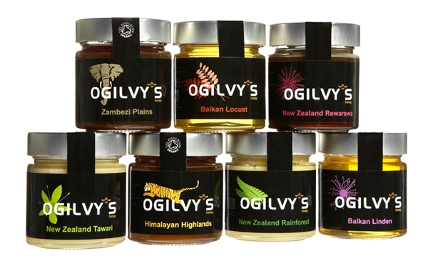
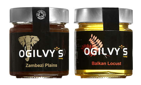
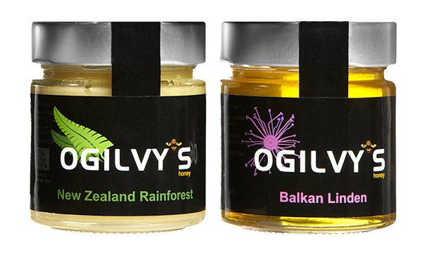
Ogilvy’s is a UK based importer of pure, unblended, traceable and sustainable monofloral and polyfloral honey varieties from beekeepers all over the world. The company approached Maximum Designs to translate this unique proposition into a pack design that ties each variety to its origin with a colourful and playful illustration.
I think this is a really neat (and in most instances subtle) way of communicating the global nature of this product in a consistent and playful way. It is nice to see an alternative style that (for the most part) avoids the visual clichés of honey packaging. The illustrations never verge on stereotypical, suitably conveying the environmental origins of each honey. The juxtaposition of bright colourful illustrations and black backgrounds is a clever harmonisation between premium and accessible, delivering a simple and well-considered aesthetic that could easily be expanded in the future.
The Ogilvy’s logo-type feels clean and modern but is let down slightly by the bee apostrophe which appears awkward and unnecessary while the word honey is too small. The product could have benefited from a slimmer label to allow the variety of honey colours to come through more and reinforce the distinction in a natural and visually organic way.
This is a refreshing new direction, both as a product proposition and as a visual style that should stand out against the barrage of other honey products.
