Booki.sh by A Friend Of Mine
Opinion by Richard Baird Posted 27 June 2011
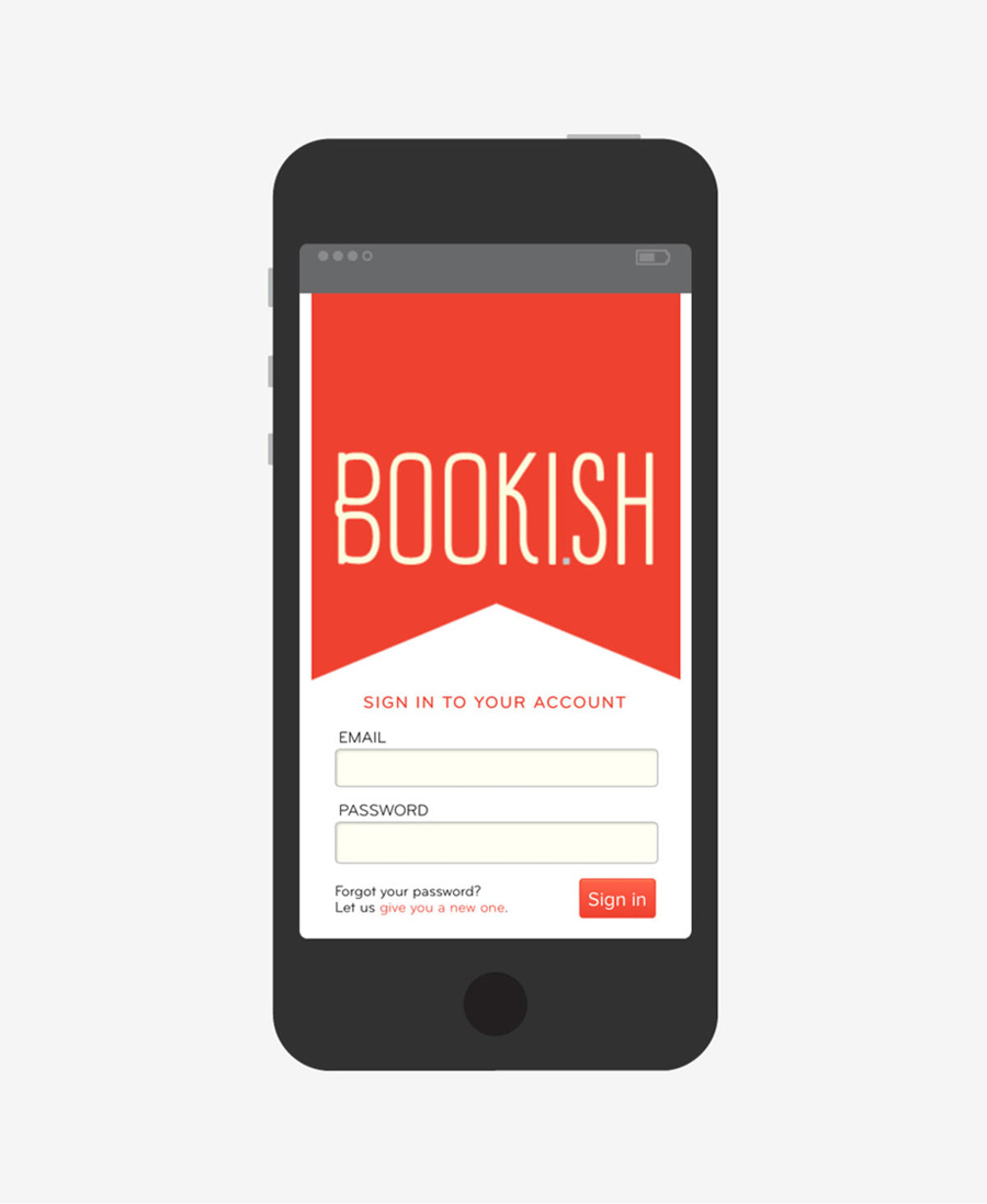
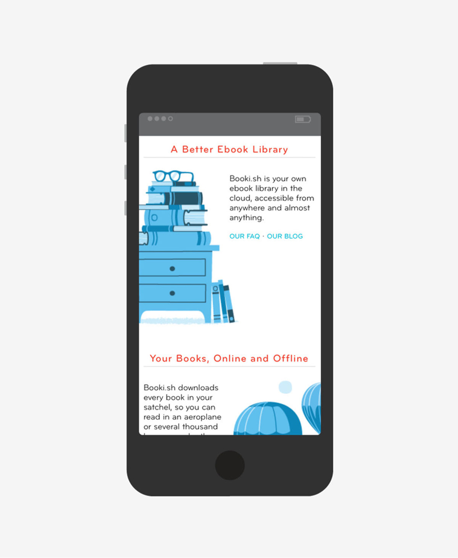
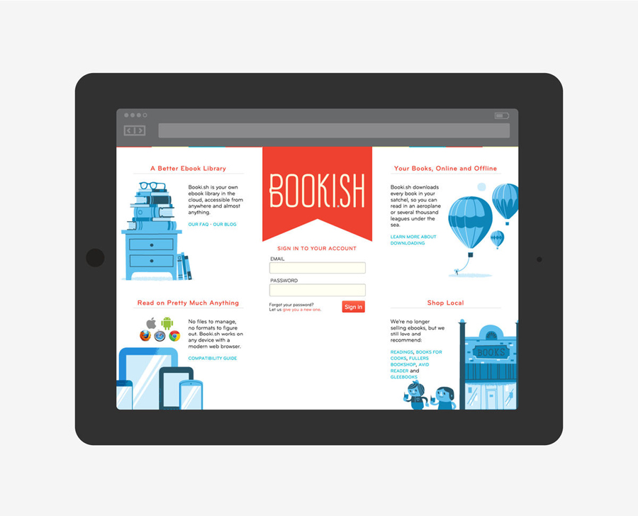
Booki.sh is a simple to use facility for the reading and purchasing of ebooks that works across a multitude of platforms. Their new brand identity, developed by Melbourne based design agency A Friend Of Mine created an open aesthetic that blends an illustrative charm, the functionality of the internet and the accessibility of ebooks.
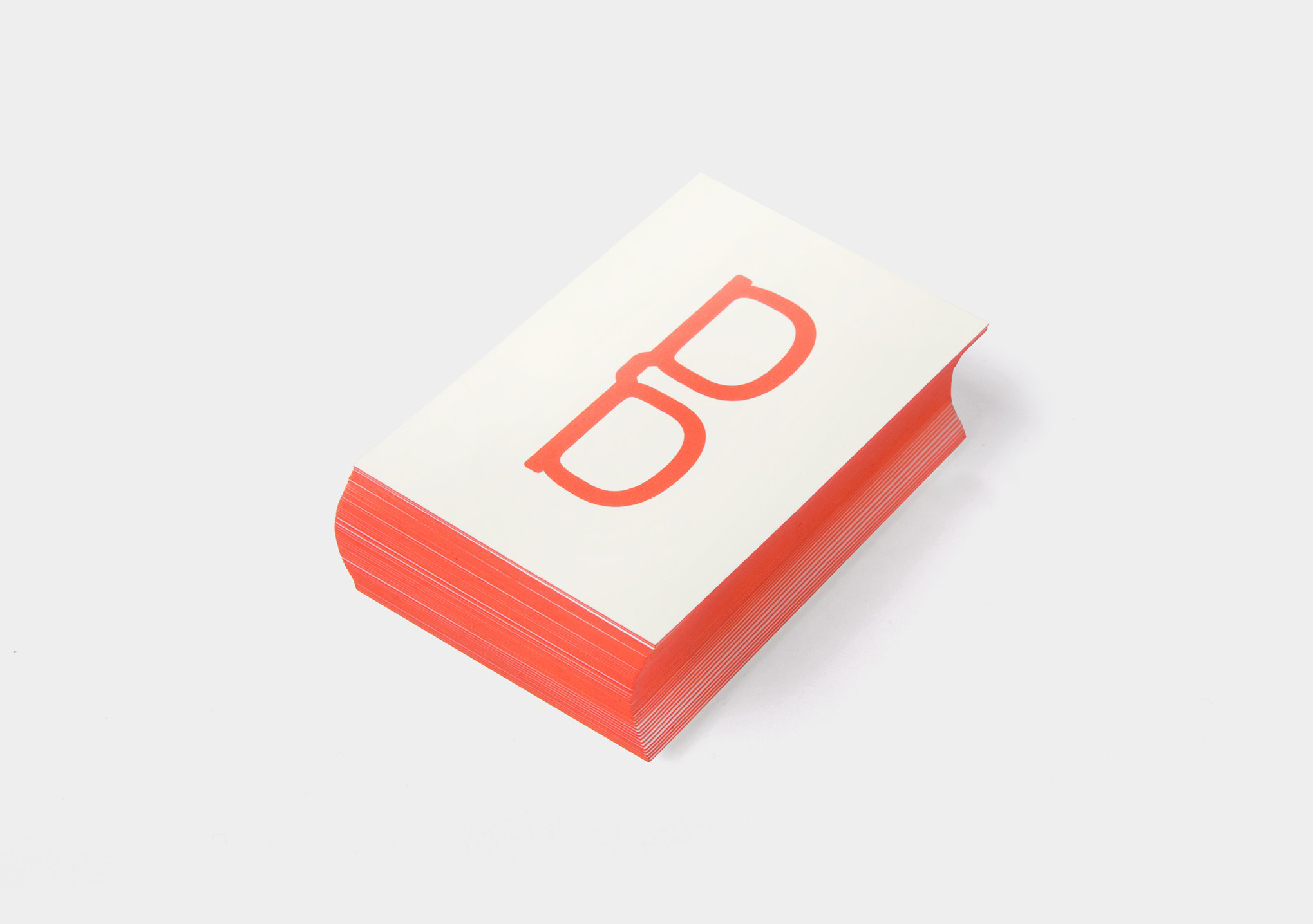
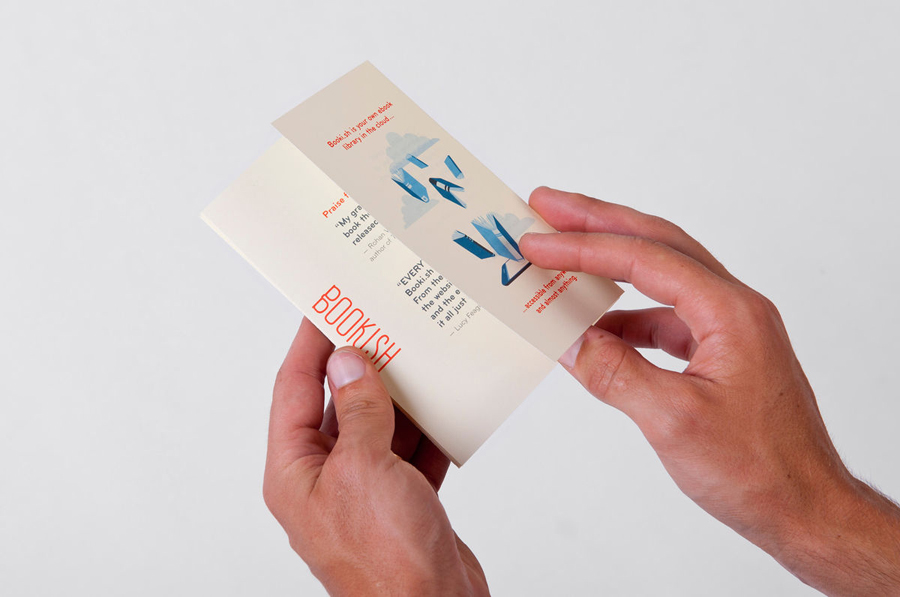
“The identity had to reflect this ease in a warm and welcoming manner. A quirky bespoke typeface based on a pair of spectacles was created, lending a playful approach which was flexible enough to work as a stand-alone mark and housed within a ribbon device. We took reference from classic literary production techniques such as gilded page edges on the side of books as a nod to the past and used bookmarks as promotional collateral, adding a whimsical sense of irony to the identity.” – A Friend Of Mine
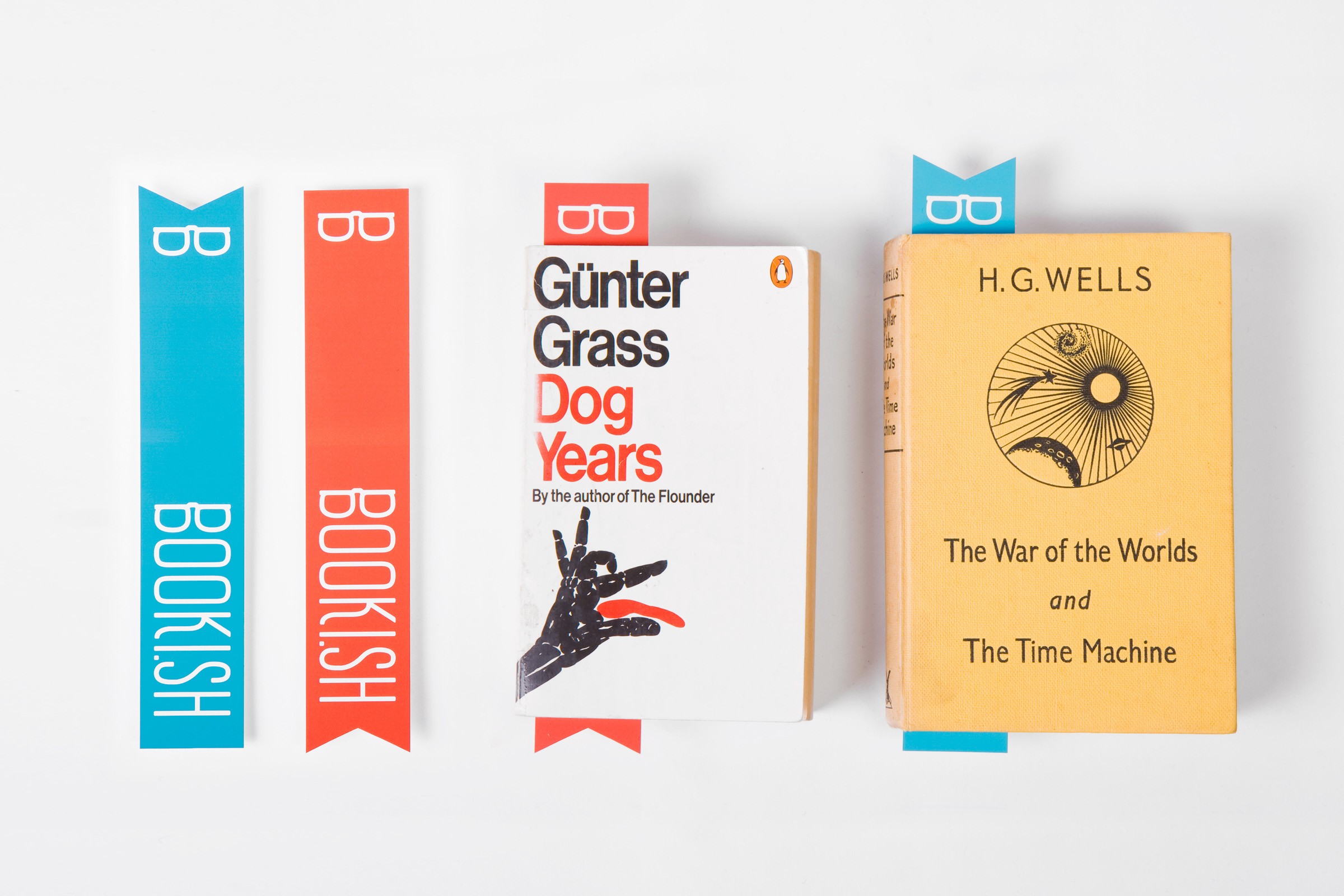
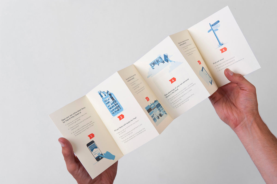
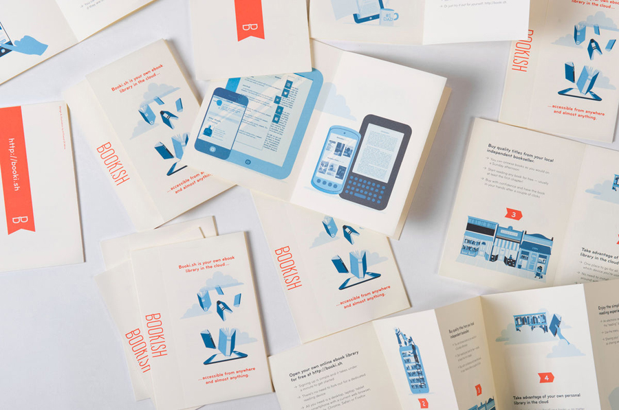
There is a very playful sensibility to this identity that has at its centre a well realised glasses/B logo-mark and while it does utilise a slightly stereotypical visual it feels more quirky than generic. As a stand alone piece the mark feels modern, iconic and quite fashionable with very much a character of its own. In the context of the word-mark the glasses have a distinctly looser expression that is perfectly integrated into the accompanying letter forms giving it a very successful dual roll. The type choice stands out as both informal yet sensible delivering a familiar, friendly and accessible tone of voice. The single red and blue tones are very reminiscent of early colour book publishing which is further reinforced by an interesting selection of illustrations created by Lachlan Conn and Ben Sanders.
The Booki.sh name and URL is a great idea and really gives it a clever and modern foundation that balances a playful and vintage aesthetic.
