3angrymen by Build
Opinion by Richard Baird Posted 28 June 2011

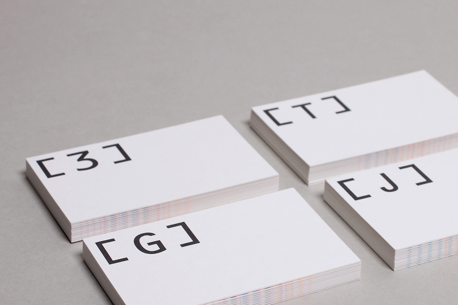
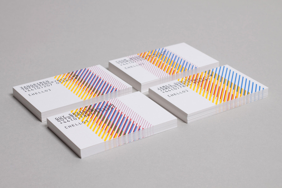
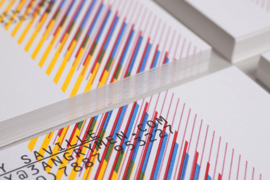
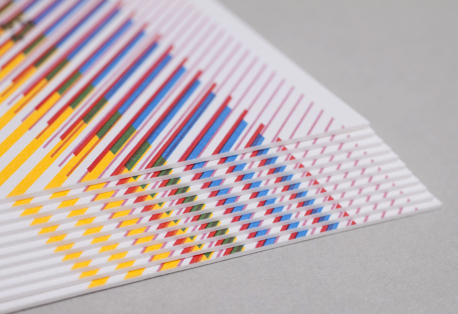
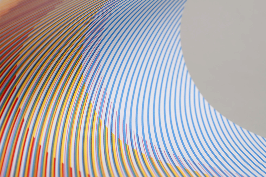
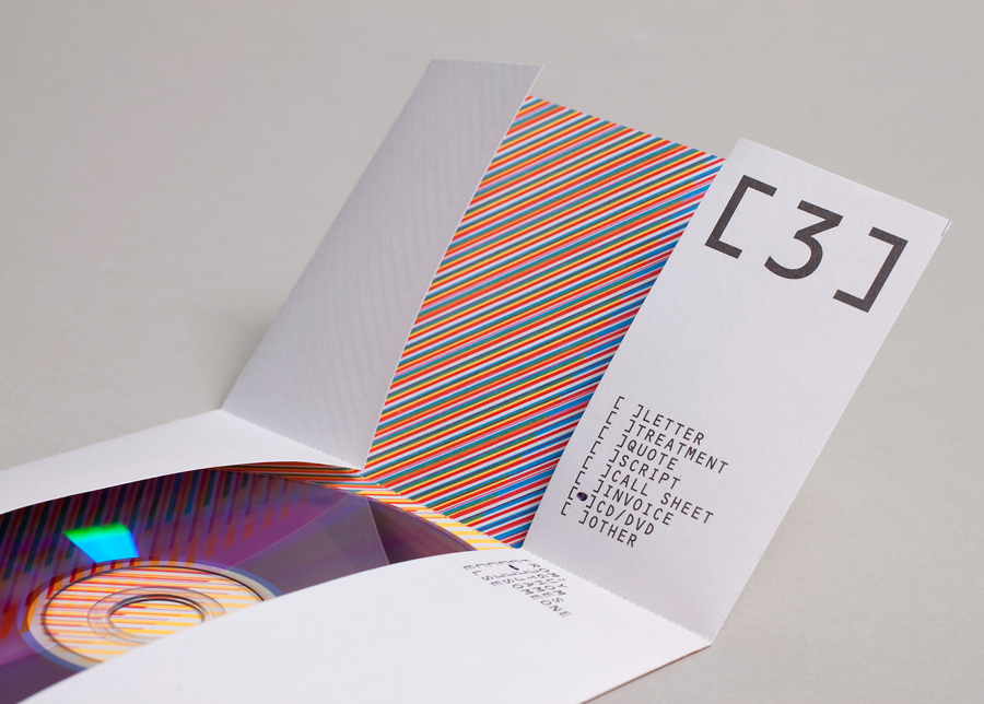
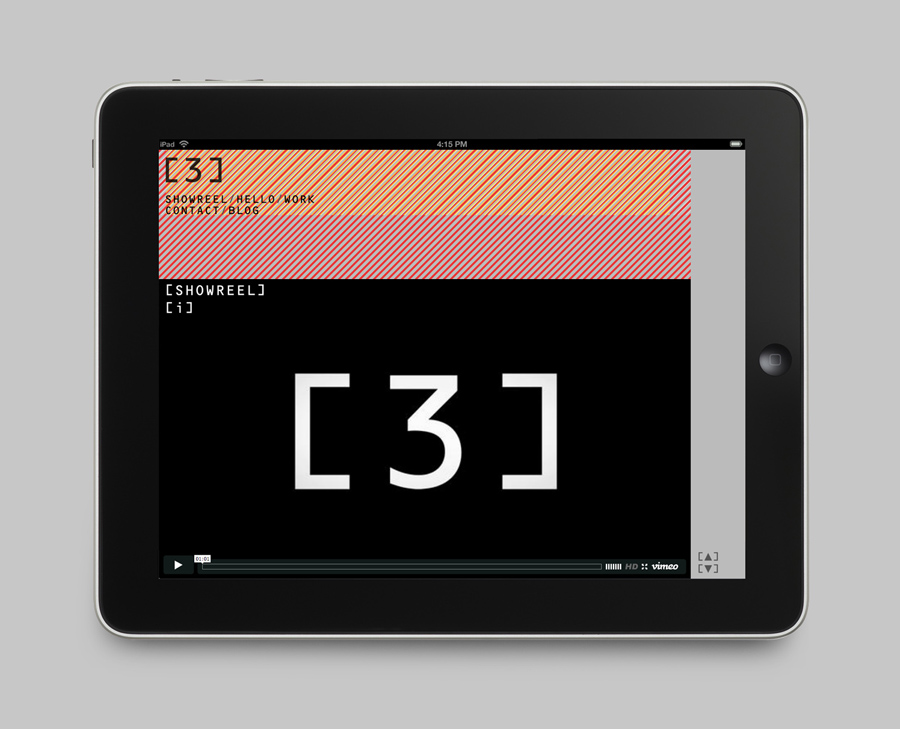
3angrymen is a London based production and digital content company with a client list that includes the NSPCC, ChildLine, Barclaycard, Hovis, Palmolive and TKMaxx. Their new brand identity, designed by Build, draws out the fine colour bands of their previous logo to craft a new, contemporary and sophisticated scan line pattern. Paired with a monospace type choice and contemporary monograms Build’s solution manages to balance creativity, technical ability and consistency.
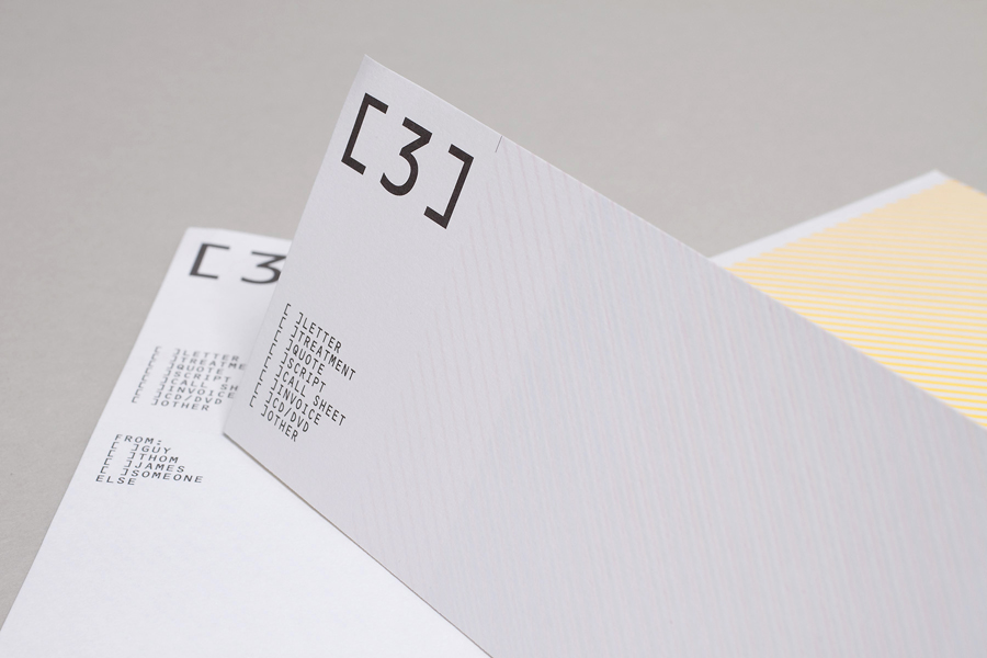
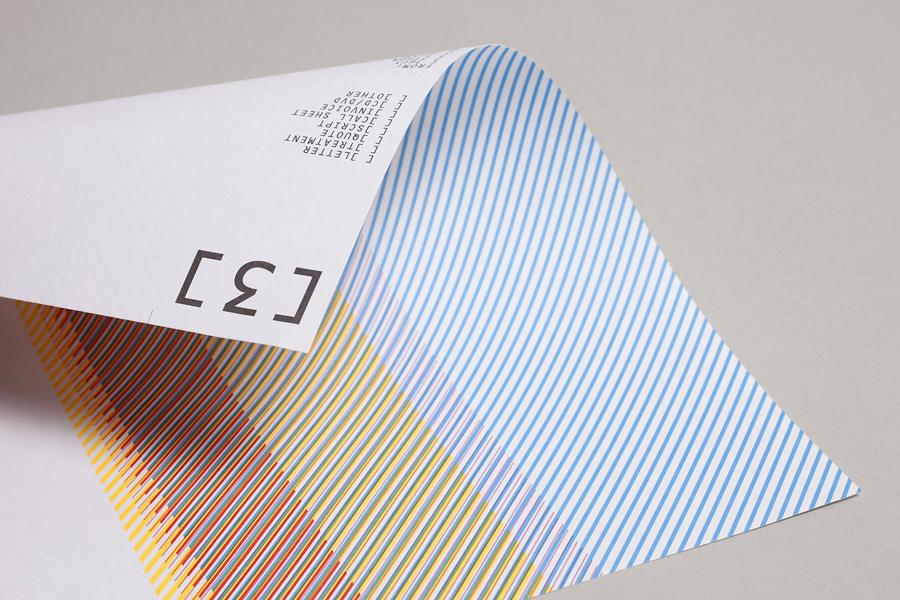
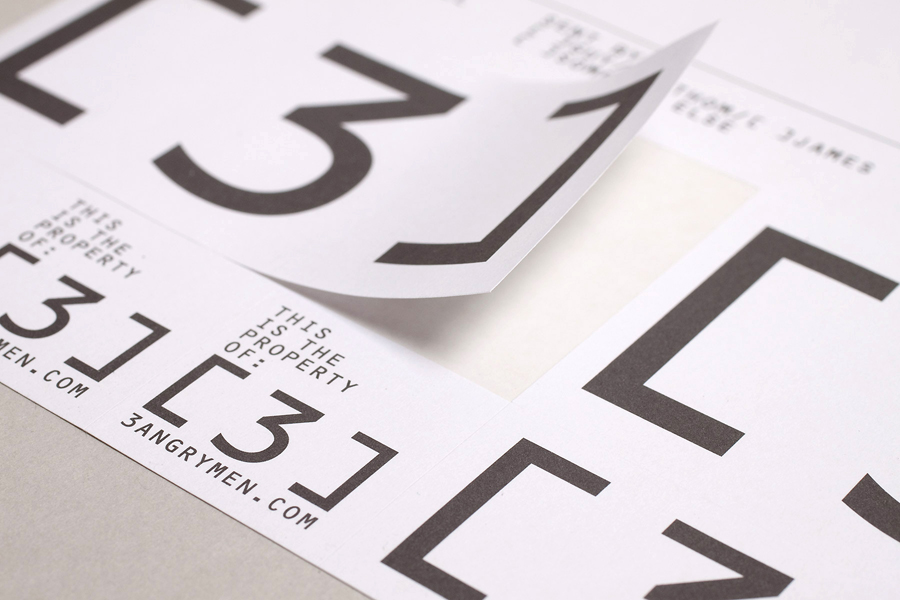
“Alongside a new marque (a bracketing device based on a screen) we devised a dynamic system of patterning that can be used in a never-ending combination of ways enabling the team to continually look fresh. A full stationery set (multi-use A4 sheet, business cards, address labels with accompanying templates + bespoke envelopes) was designed for maximum effectiveness whilst keeping print costs to a minimum.” – Build
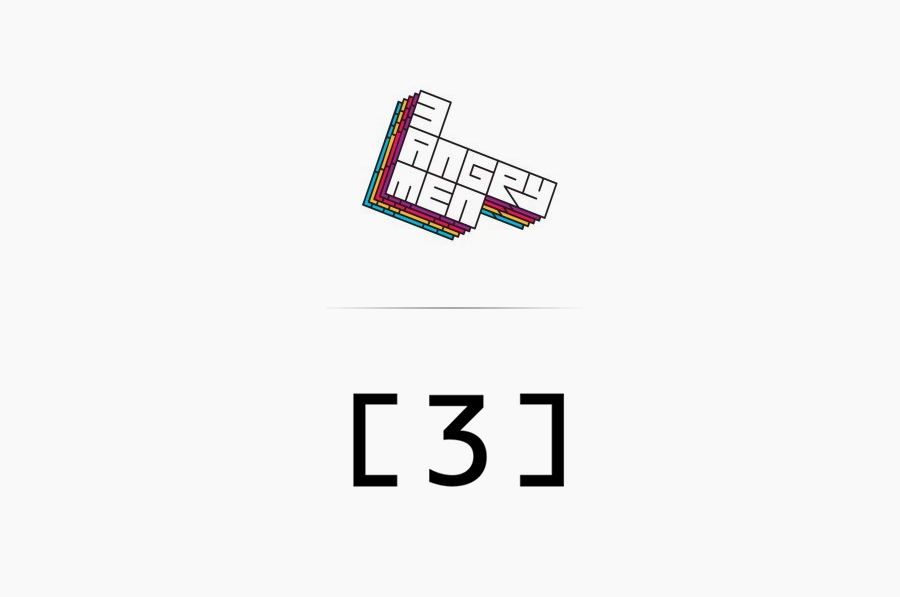
The original identity was colourful and playful with an urban graffiti sensibility but it struggled to really capture the sophisticated and mature nature expected from a growing production company.
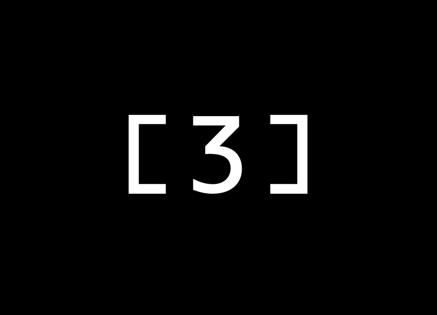
The new [3] logo-mark resolves a lot of these issues. It works well to convey the framing aspect of TV production and the wider aspect ratio of modern interfaces and displays and frames the more personalised detail of the business cards with consistency. The coloured stripes of the original identity have been neatly extracted and turned into an interesting and evolving pattern that contrasts well against the black type, white backgrounds and the simple logo-mark.
It may not convey the more urban or youthful aspects of their work in the way the previous identity did but this is surely going to deliver a far more professional sensibility that can cover a broader scope of work.
