100th Post – Top 5 Brand Identity Projects
Opinion by Richard Baird Posted 29 June 2011

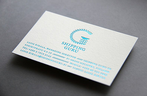
The Shipping Guru is a Finnish consultancy specialising in ship-broking and sea logistics, their new identity developed by Helsinki based brand development agency Werklig, blends a clear maritime sensibility with an iconic ‘G’ logo-mark. Continue Reading.
There is a strong Nordic feel to this identity in the simplicity of its execution which I think is effective both visually and conceptually. The application of a blue foil on the business card cuts nicely through the icy white background and really captures the essence of a glistening azure sea.

Will & Jamie’s is a new joint venture between Welsh dairy farmers Will Prichard and Jamie Adams producing and distributing a range of fresh yoghurt drinks. Their new name and identity was designed and developed by London based design agency Designers Anonymous. Continue Reading.
A very playful identity that delivers both a sense of openness and honesty with a clean visual sensibility. The collaterals cleverly balance and utilise illustration and photography to great effect blending fun with a real world consideration to sustainability.

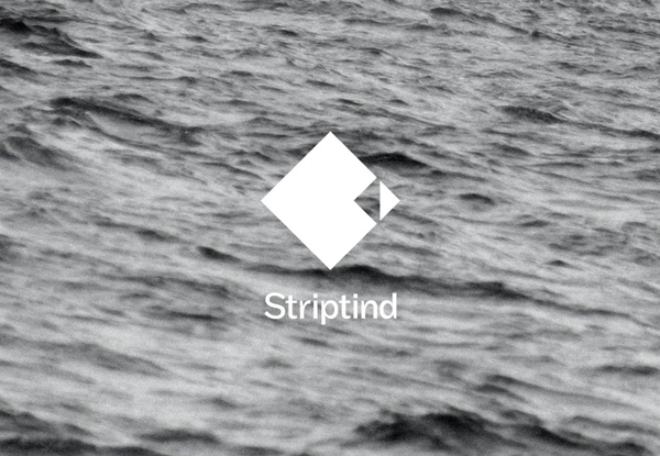
Striptind is a provider of guided deep sea fishing experiences based in the Artic surroundings of Kjøllefjord Norway. Their new minimal identity designed by Neue (famous for their interactive Visit Nordkyn work) was inspired by the exclusive nature of halibut and the prospect that there is ‘always a bigger fish to be caught’. Continute Reading.
Another Nordic identity that delivers on simplicity with a strong visual structure that captures the raw environment and the premium nature of the experience.

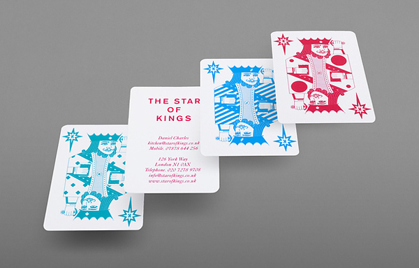
The Star of Kings is a pub and live music venue located near Kings Cross, London and the sister pub of The Star of Bethnal Green. As part of their recent renovation they approached creative design agency Bunch to develop their new identity, stationary and promotional materials. Continue Reading.
This identity cleverly blended the aesthetics of a classic playing card theme and a modern editorial visual style. The strength of concept is matched by the illustrative skills required to seamlessly fit this into a deck of cards.

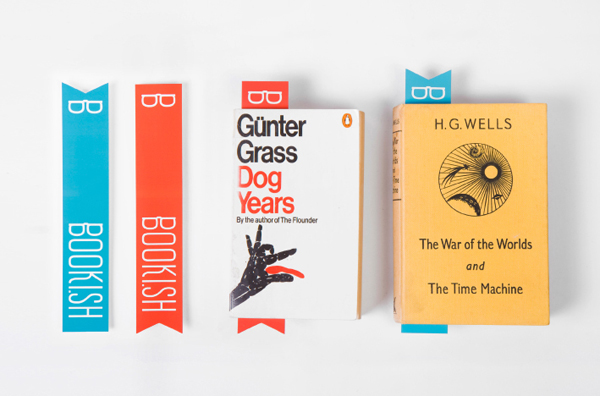
Booki.sh is a simple to use facility for the reading and purchasing of ebooks that works across a multitude of platforms. Their identity, developed by Melbourne based design agency A Friend Of Mine created an open aesthetic that blends an illustrative charm, the functionality of the internet and the accessibility of ebooks. Continue Reading.
This is a clever identity that takes a playful and vintage approach to the modern world of e-books that delivers a friendly and approachable aesthetic with inclusivity at its heart.


