Znaps by Amore
Opinion by Richard Baird Posted 4 July 2011
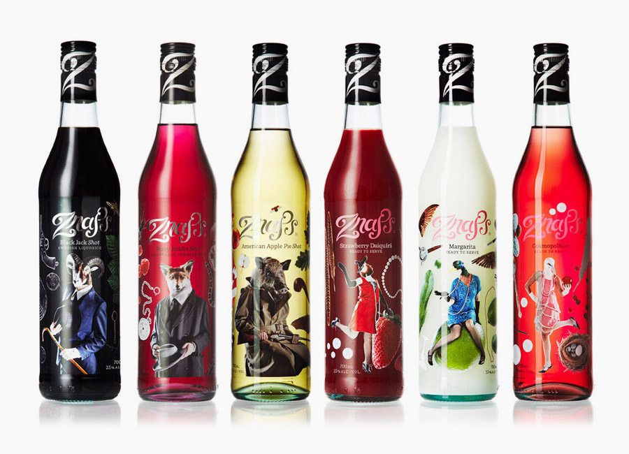
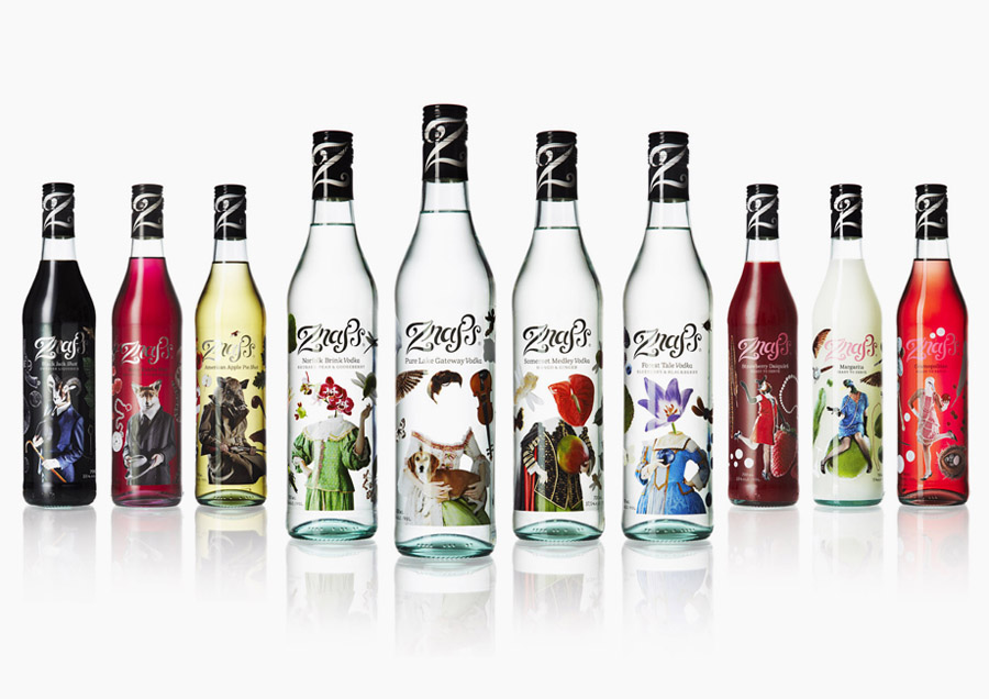
Znaps is a Swedish range of premium vodka, shooters and cocktails created in 2006 aimed at bartenders and mixologists. Their branding and packaging, designed by Stockholm based Amore was updated this year and visually captures the creativity, fun and surprise involved in blending different flavours together.
“The design was founded in the mysterious Swedish nature seeping into urban nightlife with surreal imagery and storytelling.All objects are photographed telling dreamlike stories, backed up with illusory naming and poetic tales surround a hand drawn logotype. We call it The Surreal Deal” – Amore
Based around a quirky photo montage style the concept is by no means unique but the execution is remarkably good with each composition being well shot, and put together. The choice of historical clothing in the primary range sets a theatrical tone while the flowers add a strange and exotic twist that results in a very curious and playful narrative style. Each bottle has a distinct identity and subtly introduces visual elements that represent the variety of flavours, these are never overt and sit nicely within the compositions.
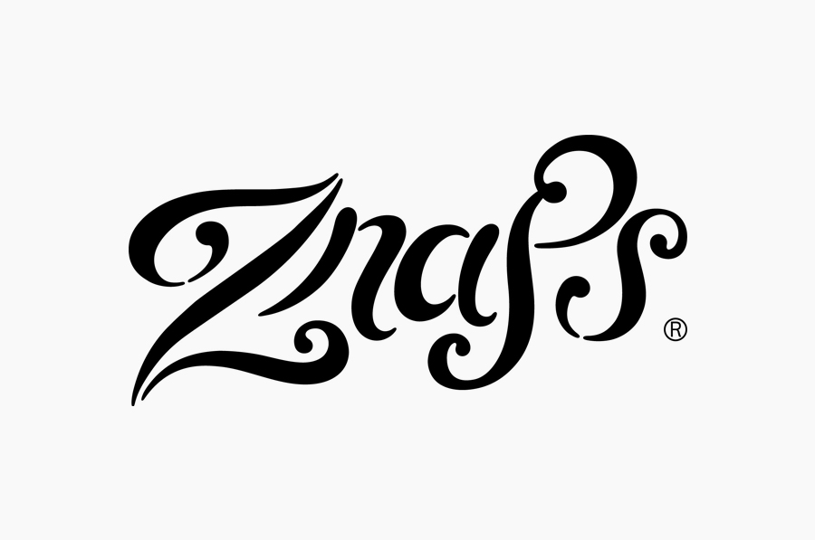
The hand crafted logo-type is well rendered and has a fluidity that suitably conveys a whimsical and experimental sensibility complimenting the surreal aspect of the brand. The colours and foil treatments work well to separate the varieties while the secondary typeface adds to the premium nature of the range and helps to balance out the exuberant imagery.
Collectively these look really neat and should have a strong impact in a bar envirnoment while individually desirable enough for the general market.
