Fluid Money by Buddy
Opinion by Richard Baird Posted 5 July 2011
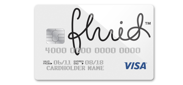
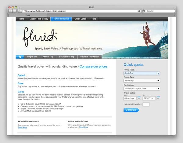
Fluid Money is a simple and affordable personal finance service and travel insurance provider. Their logo, designed by Exeter based Buddy, characterises the name and fundamental brand proposition with a single free-flowing typographical solution.
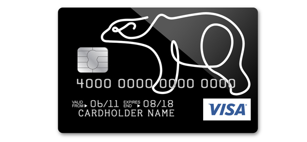
The monoline script aesthetic (or signature) works well to convey an open, straightforward and personal approach to financial services. The slight imperfections in the line suggest a human individuality that should set them apart from other institutions. The word money is a little bland in comparison but adds a more formal tone and fits neatly underneath the logo-type. Its application on-line and across the debit cards is simple and the colour choices have a low-cost affordable perception. The bear illustration is neatly done matching the logo-type style and weight, while also delivering a nice metaphor for security and protection.
In the past couple of years the trend for overlays provided the visual cue necessary to represent an honest transparent service and helped to counter the increasing distrust of the financial sector (see PwC). Following this idea there is an increasing utilisation of script based logos to capture a more sincere and genuine sensibility (see Milliken). The Fluid identity is one of these such logos and while it is elegantly executed its success will entirely depend on whether this matches the attentiveness of the actual service.