All Of My Friends by Berg
Opinion by Richard Baird Posted 6 July 2011
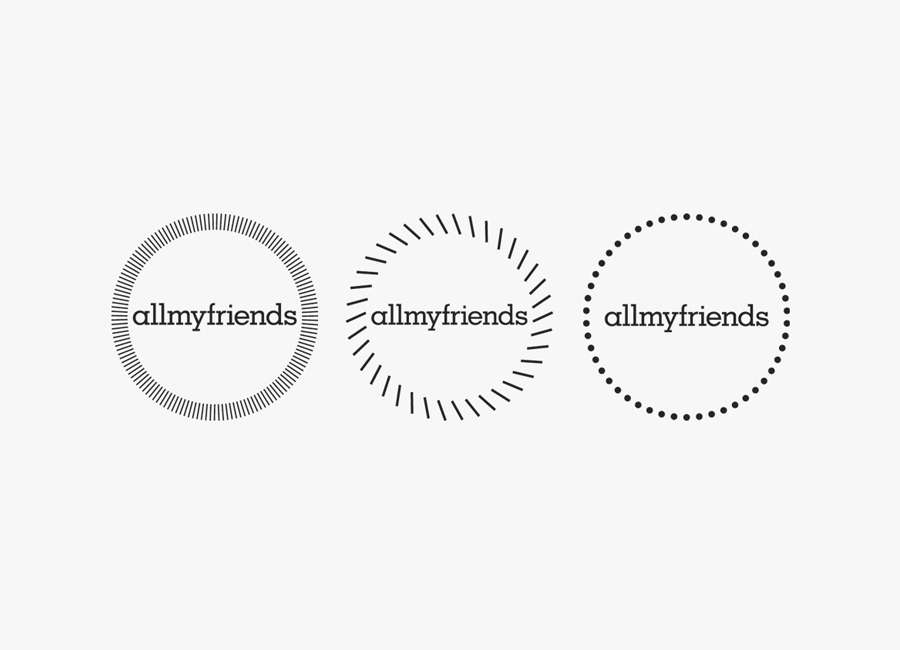
All Of My Friends is a London based production studio that writes, directs and produces short films. Their identity, developed by studio Berg, now Freytag Anderson, contrasts the theme of mass production and individuality unifying it under a circular logo-mark that represents the collaborative nature and totality of their service.
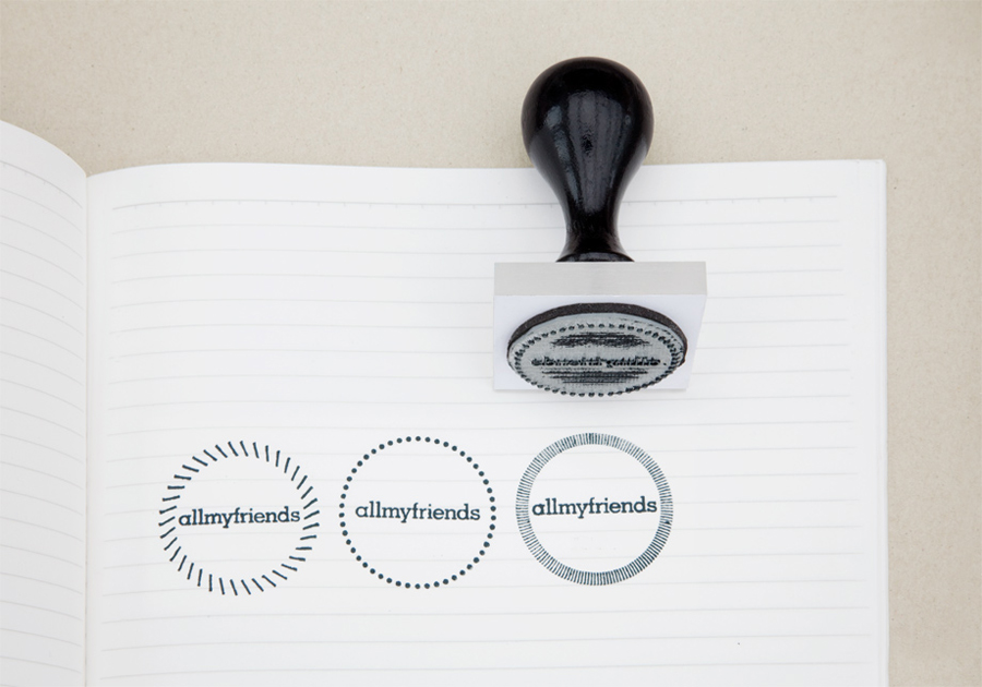
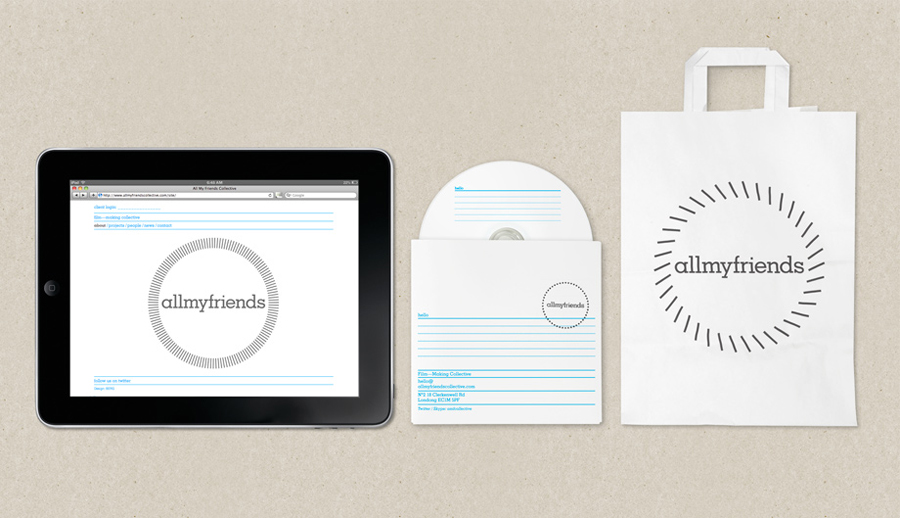
“Our concept was based around the idea of analogue vs digital or perhaps more accurately; bespoke vs mass-produced. To communicate this idea we came up with a two-part identity consisting of a bespoke element, represented by a set of three logos applied using a rubber stamp. And a mass-produced element – a strict grid based typographic layout. When combined the imperfections of the rubber stamp contrast strongly with the utilitarian form-like texts. Allowing us to communicate the individual personalities within the collective whilst creating a uniform and consistent brand.” – Berg
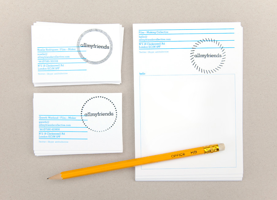
I love the tactile, human interactive nature and finality of the stamp application within the context of this identity. The playful and modern quality of the logo-mark across a rigid document aesthetic is an interesting style that delivers a message of confident (but approachable) authority and know-how. Built from a large number of individual components the three marks fittingly symbolise the community aspect of the company while also having a degree of motion reminiscent of film or video reels. Two rather than three variations might have been a more suitable solution to reinforce this idea.
The single colour choice, typographical solution and layout all deliver a distinctly utilitarian treatment that contrasts well with the imperfections of the stamp resulting in a modern looking and conceptually interesting identity.
