On The Fly by Hatch
Opinion by Richard Baird Posted 7 July 2011

Originally an eCommerce business, On The Fly opened its first store in San Francisco during 2008, positioning itself as ‘the brand for the finer things in life’, retailing a wide range of luxury men’s goods. On The Fly approached design firm Hatch to help develop their identity to reflect this proposition and extend it across a variety of touch points.
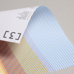
“…Hatch designed a cohesive identity system that featured in-store signage, a completely refreshed website…business stationary and gift packaging that evokes an earlier era of charm, sophistication and urbane wit.” – Hatch
The Victorian gentleman’s boutique aesthetic has been nicely realised with plenty of detail that helps to define the quality aspect of the store and products. The typography and typographical treatments have been well selected and are very reminiscent of old-fashioned pub signs while the line work has a traditional suit makers sensibility. The iconography carries much of this theme through on-line with some neat representations of the product categories that mix both classic and modern graphic styles with a distinctive medal characteristic.
The brand carefully manages to weave a number of masculine visual aspects (medals, pubs and a male dominated era) and blends it with quality and detail subtle enough to avoid being generic.