The Lollipop Shoppe by Studio Makgill
Opinion by Richard Baird Posted 21 July 2011

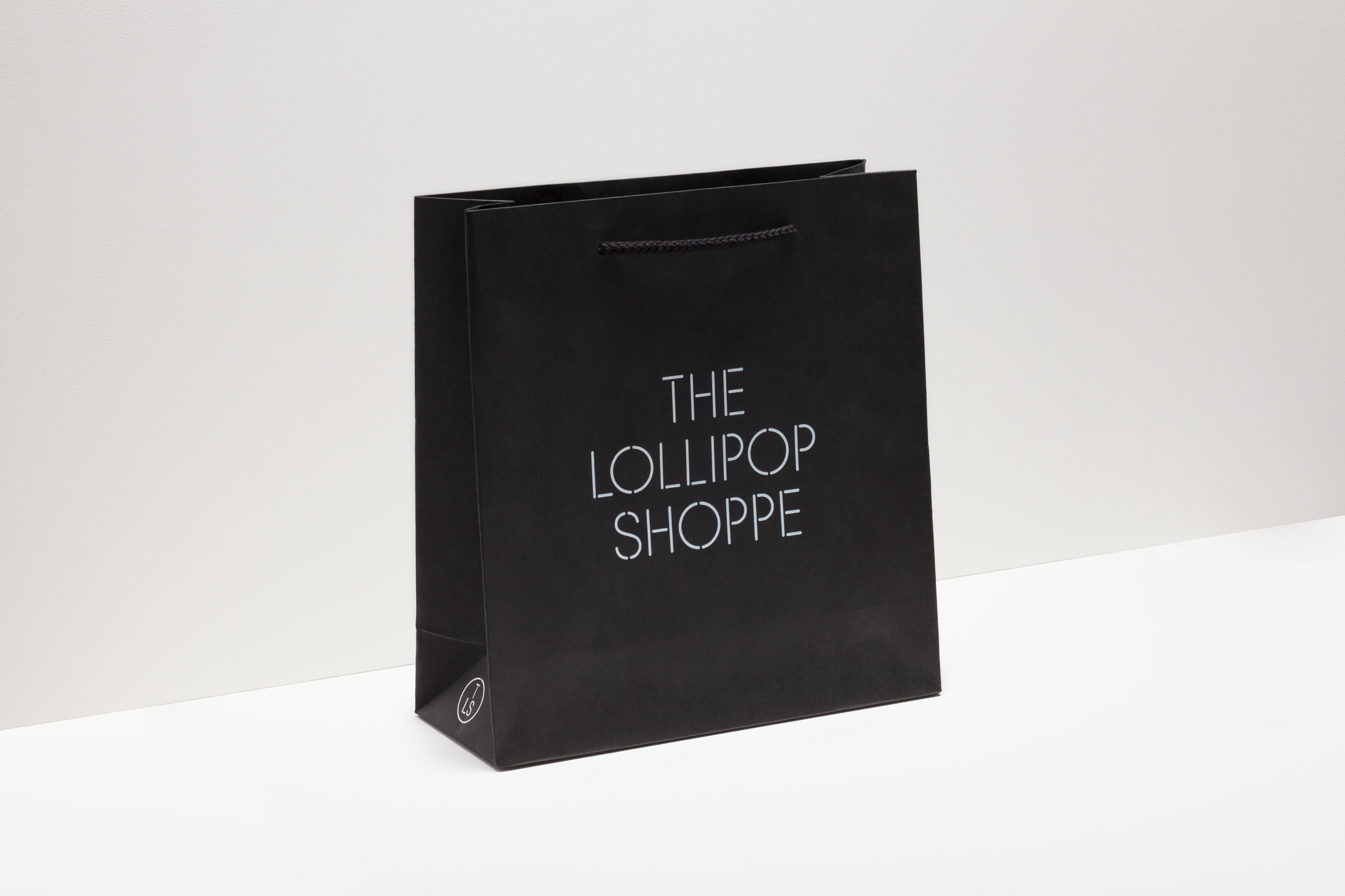
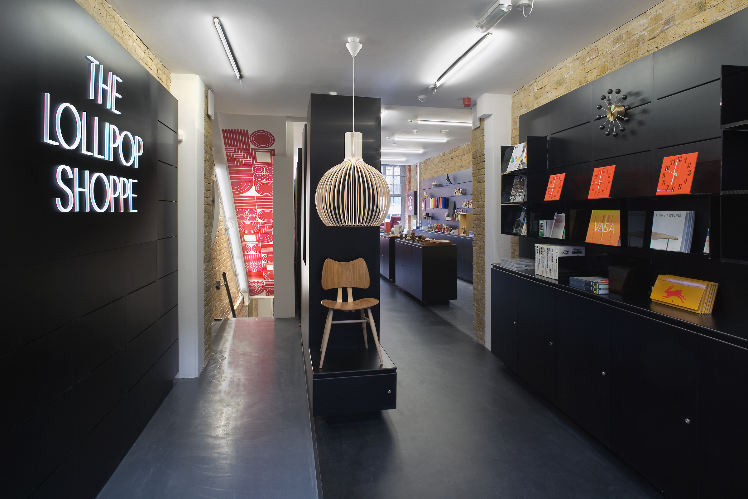
Established in 2007 The Lollipop Shoppe is a contemporary retailer designer furniture and accessories located in Brighton, UK. With its own range in development and another store set for London they challenged Studio Makgill to develop an identity that could reflect their growing ambitions, convey a straightforward business nature and unify the shop’s modern and classic product ranges.
“Our challenge was to create something that reflects the heritage of their large line of classic products from manufacturers like Vitra, that fits in with the contemporary brands like Established & Sons and that conveyed the straightforward nature with which The Lollipop Shoppe conducts its business.”
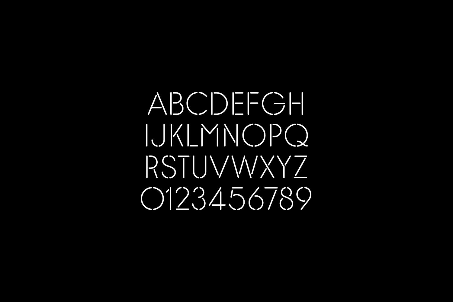
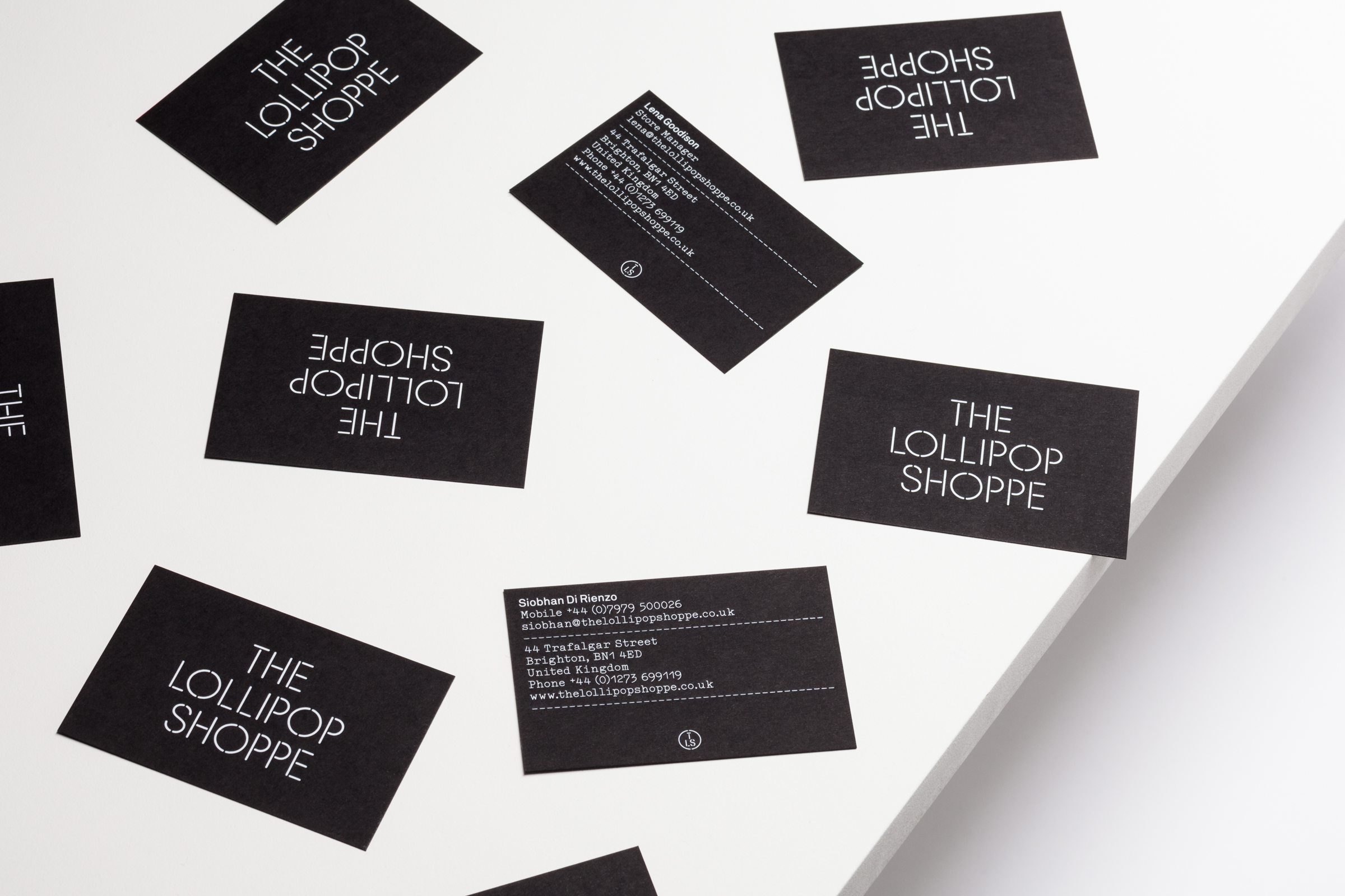
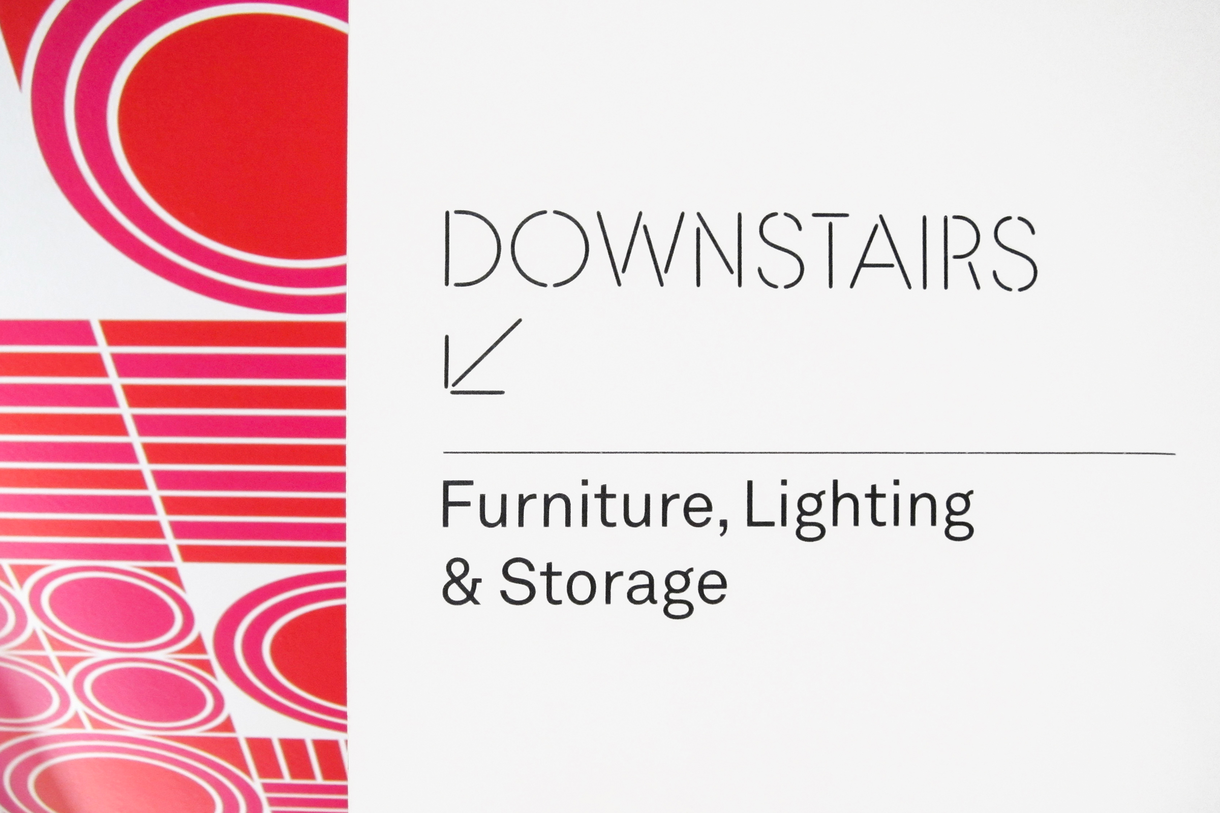
“On top of that, what was also important is that they trade in real objects, so we wanted to create an identity that didn’t have to only exist in two dimensions, an identity with the potential for three dimensions seemed far more fitting. We created a bespoke stencil typeface (part inspired by the 20th century modular stencils created by Josef Albers and Le Corbusier, but with a contemporary elegance). This allows the identity to be physical – it can be cut, it can be built, it can be stamped.” – Studio Makgill
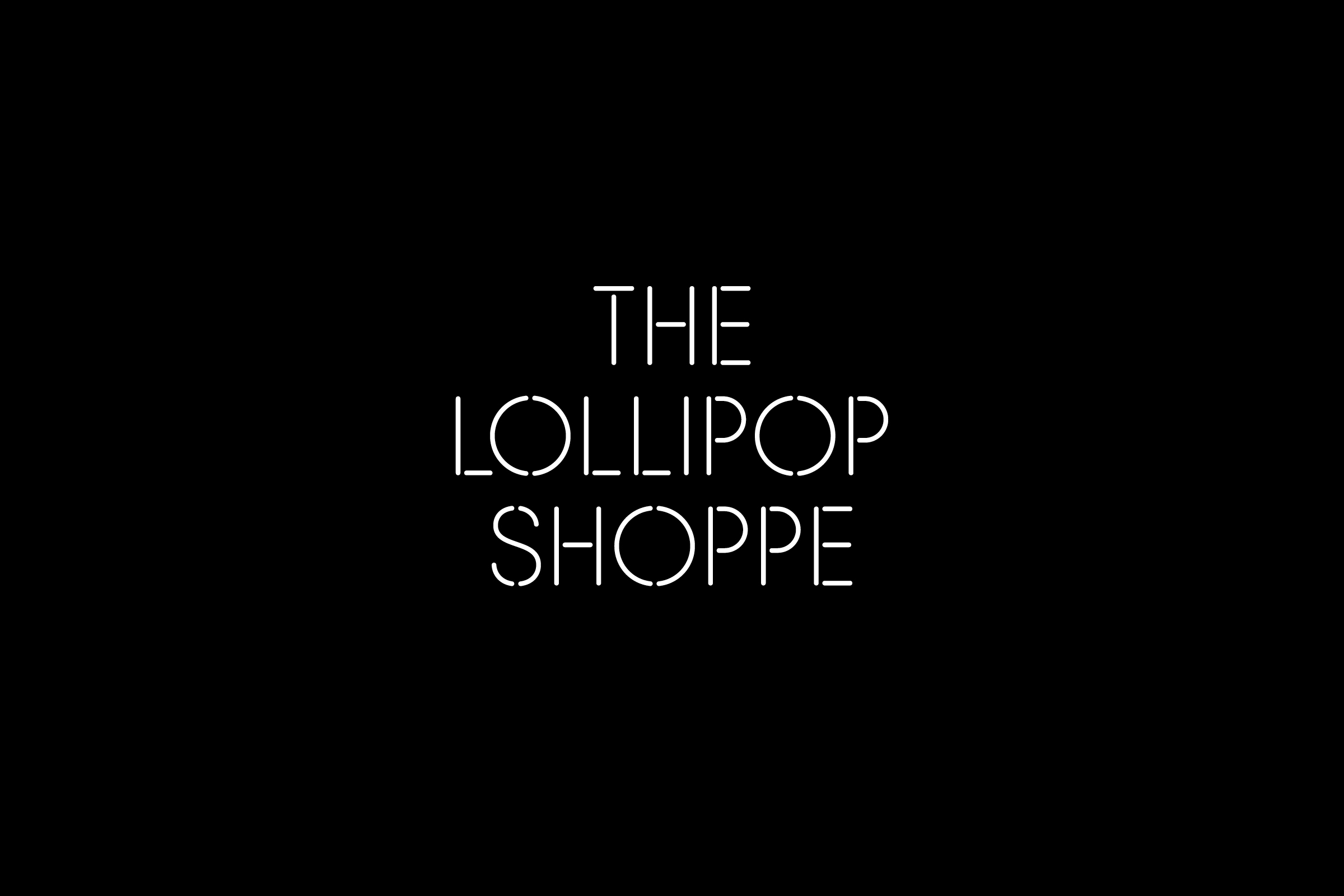
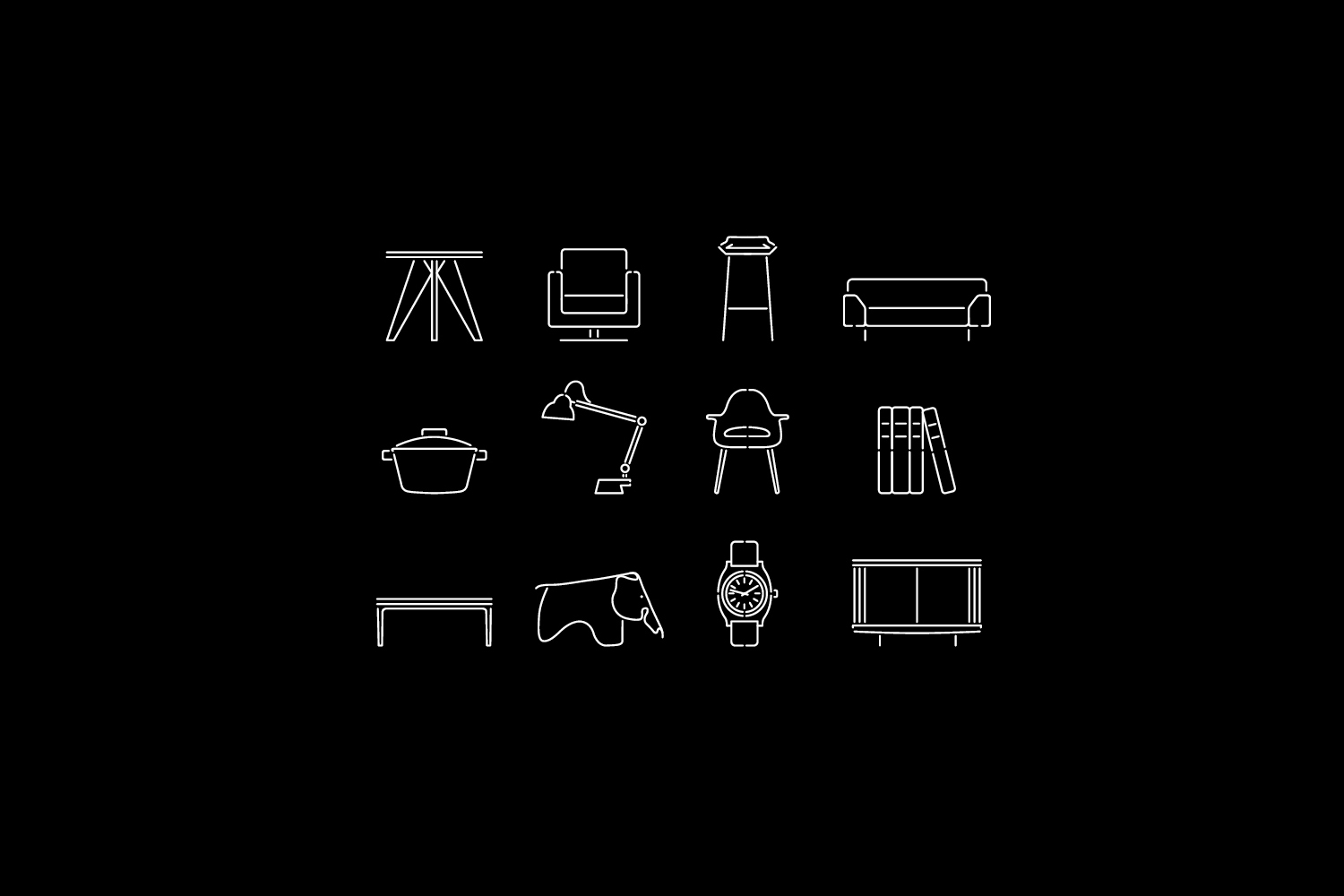
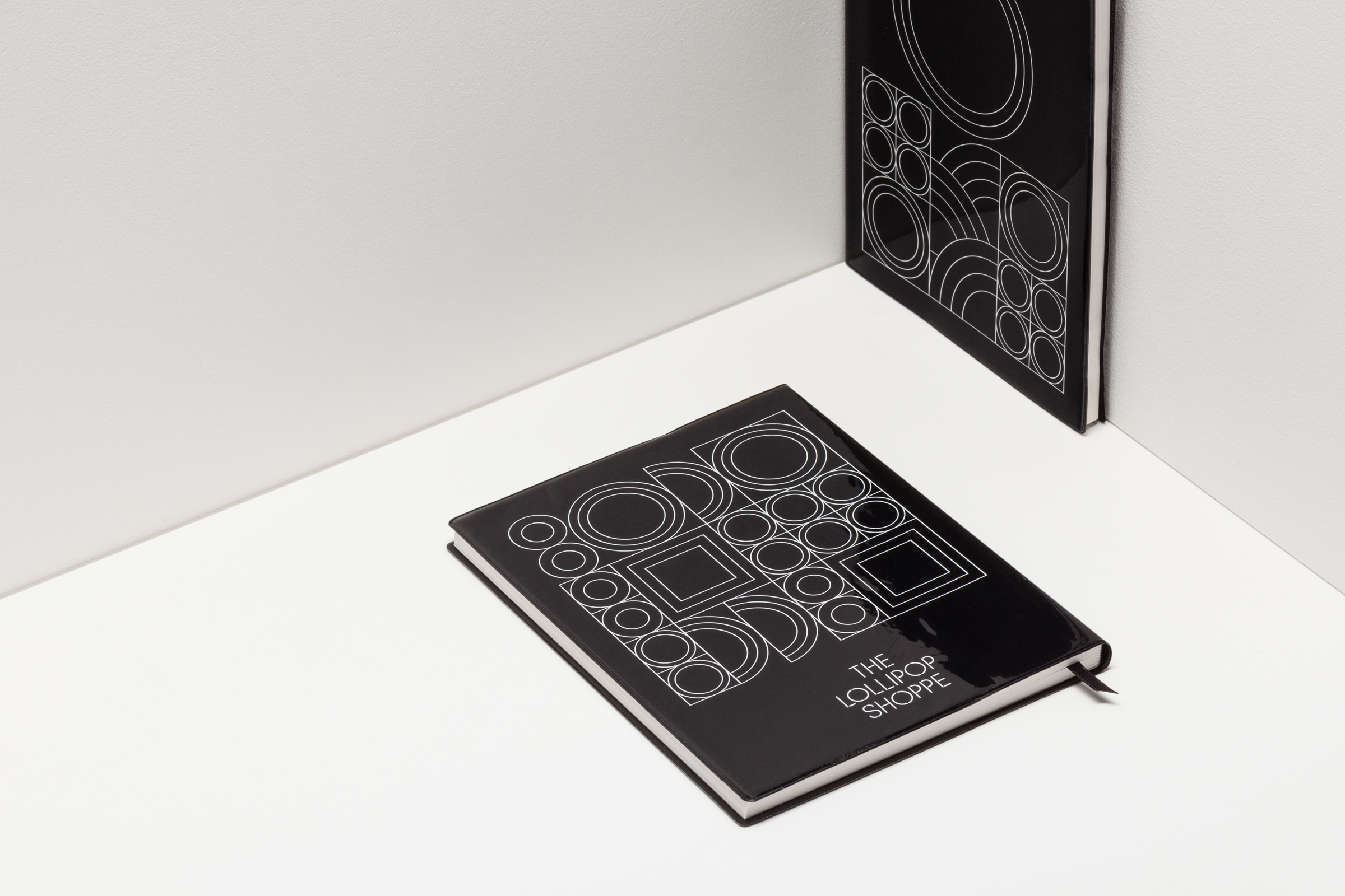
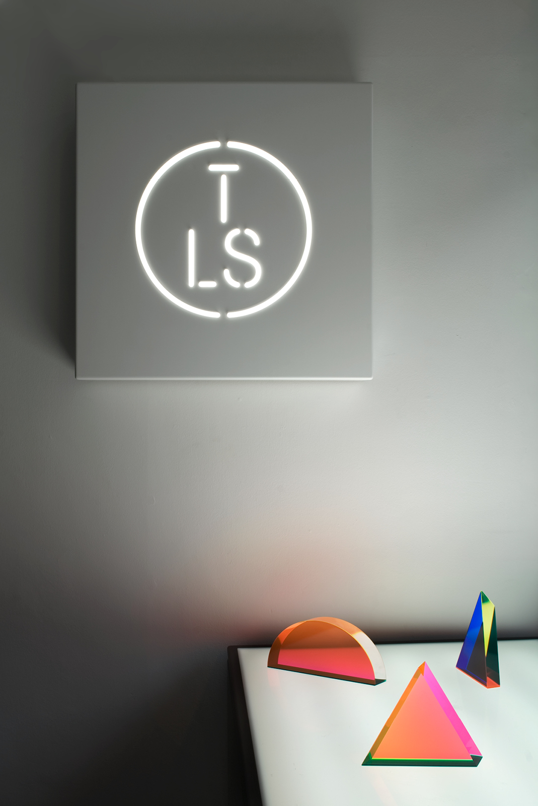
As a student of furniture design (and an admirer of all things utilitarian and Bauhaus) the reference to celebrated designers of the past is evident but not literal and works really well to symbolise the dual nature of the store. The typography, logo-mark and illustrations each have a lovely straightforward utilitarian aspect while the consistent line weight and stencil execution ties them neatly together. The circular ‘O’ in the custom typeface and logo-mark are simple references to the shop’s name an could have easily been overlooked and is a testament to the level detail that has gone into this project.
For me this identity successfully blends the fundamental aspects of the store through a strong understanding and respect for the design past and its re-interpretation and implementation for the expanding future of the brand.
