Banks Peninsula Farms by Strategy
Opinion by Richard Baird Posted 10 August 2011

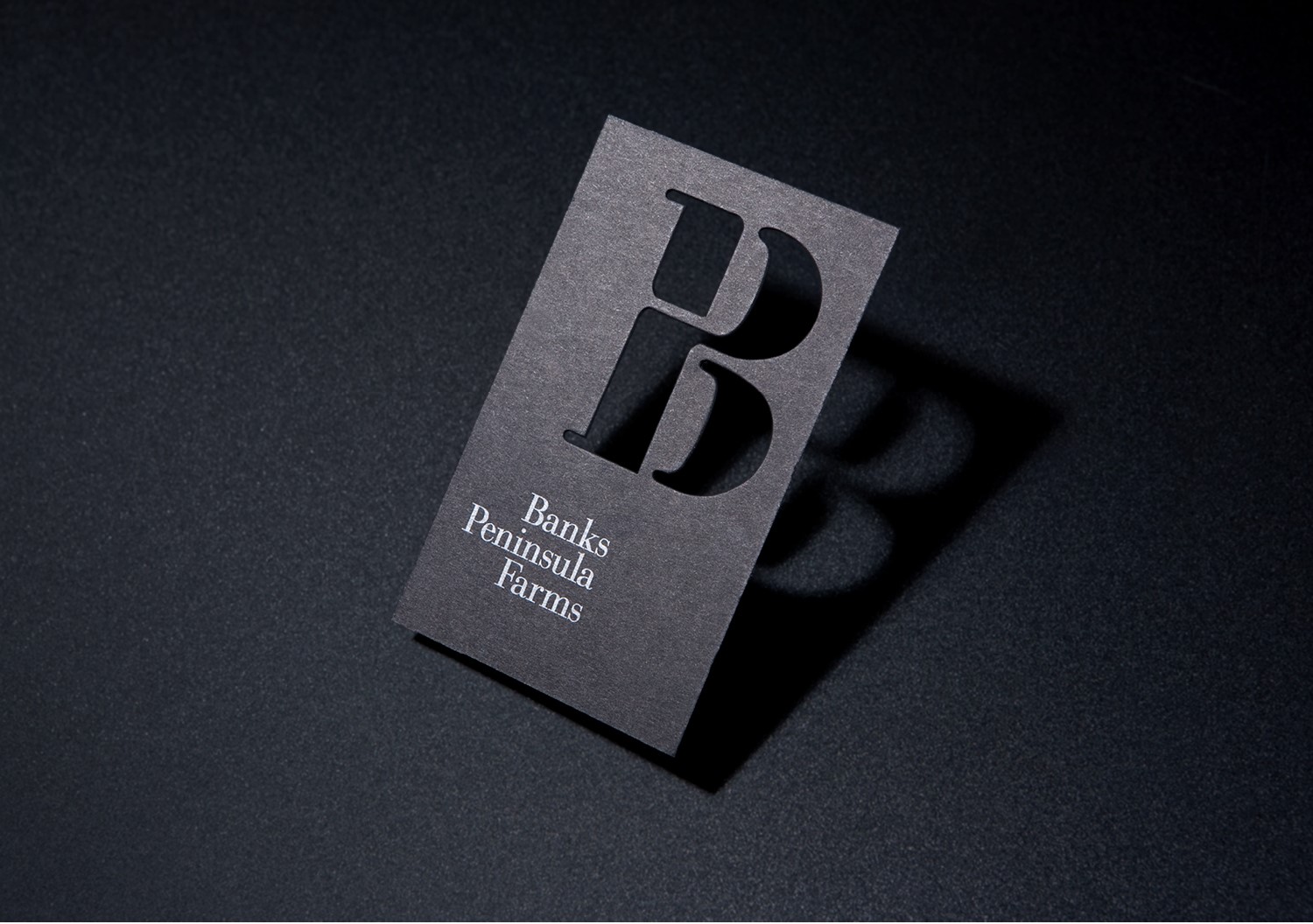
Banks Peninsula Farms is an effort to unite the wool growers of the Banks Peninsula region of New Zealand and increase the value while globally promoting their unique strong wool product under a new Provenance brand. Independent design agency and recent finalist of the Best Awards, Strategy, designed an identity that captures the collaborative nature of the initiative and the premium quality of the product with an iconic BP monogram.
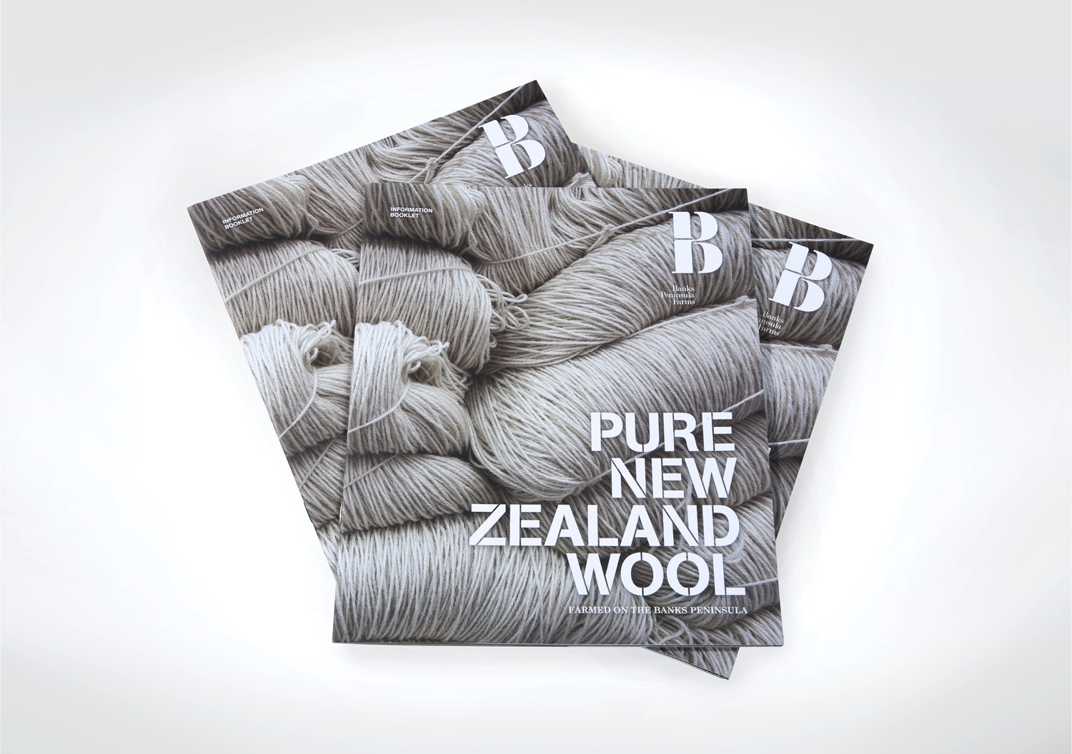
“On the rugged Banks Peninsula, a group of 19 farmers have joined together to create an environmentally sound strong wool product that can be traced right back to the hillside on which it was grown. We saw the opportunity to tap into growing global demand for authentic brands by developing a provenance based brand story, expressed through emotive imagery and typography inspired by traditional wool bales” – Strategy
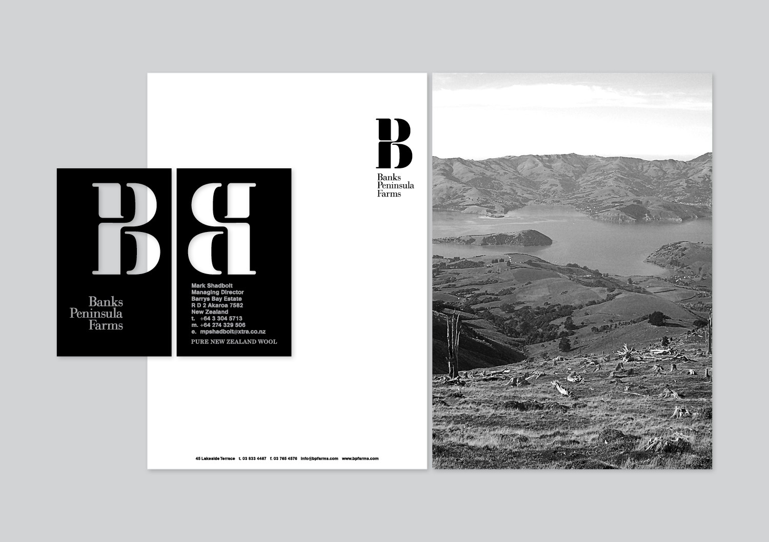
The logo is a conceptually strong idea well executed that resolves the symbiotic nature of the individual farms through the simple unification of two letter-forms with a twisting wool like sensibility. The stencilled serif execution (reminiscent of cargo crates) captures the global aspirations of the brand but with the handmade aesthetic of localised industry. The lock-up, balanced in favour of the mark, carries a trusted stamp like aesthetic suitably for this kind of organisation that guarantees quality and authenticity.
The serifs on the logo and accompanying type choice avoids any agricultural references and plays more to the values of quality. The secondary typeface, AG Book Stencil, in contrast delivers more of an industrial and utilitarian aspect that captures the fundamental and historic involvement wool has had in the clothing society while contrasting against the organic forms in the photography. The black and white colour palette of the identity is a solid choice that helps to enhance the premiumisation of the product while the silver print on the black business card lifts this idea further truly representing the brand’s high standards.


