Beaujais by Parent
Opinion by Richard Baird Posted 12 August 2011
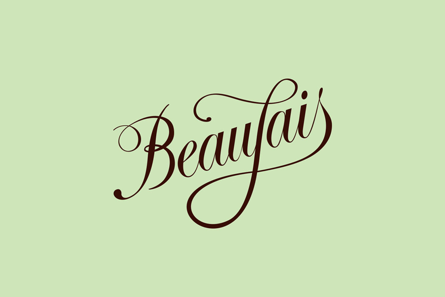
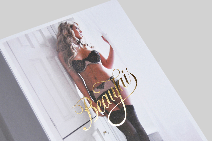
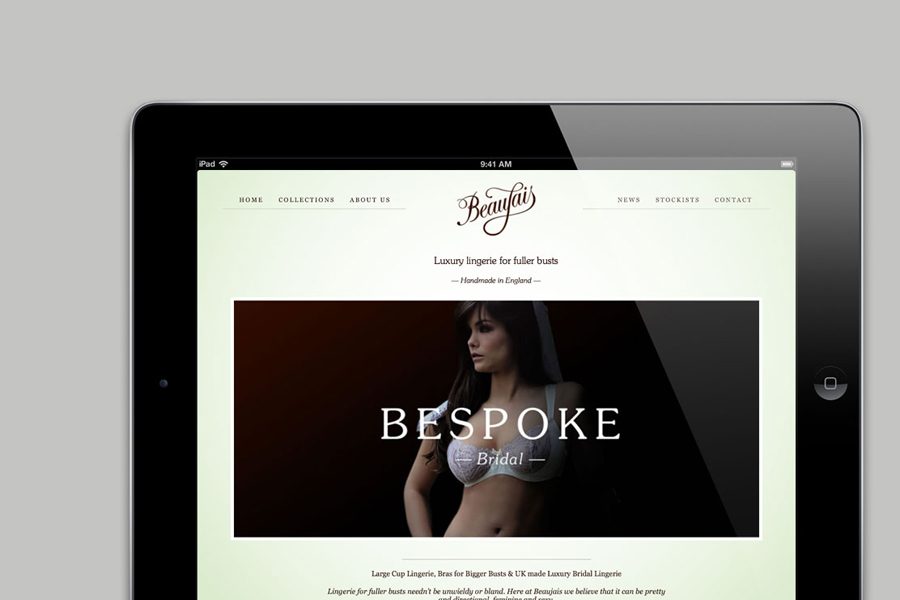
Beaujais is a new company that designs luxury lingerie specifically created for women with a larger bust size. Their identity, designed by brand, strategy and communication design agency Parent based in Dorest, UK captures the fine detail and curvy nature of their collections with a delicate and fluid typographical solution.
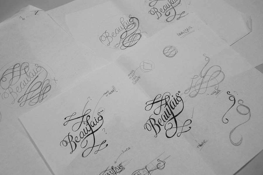
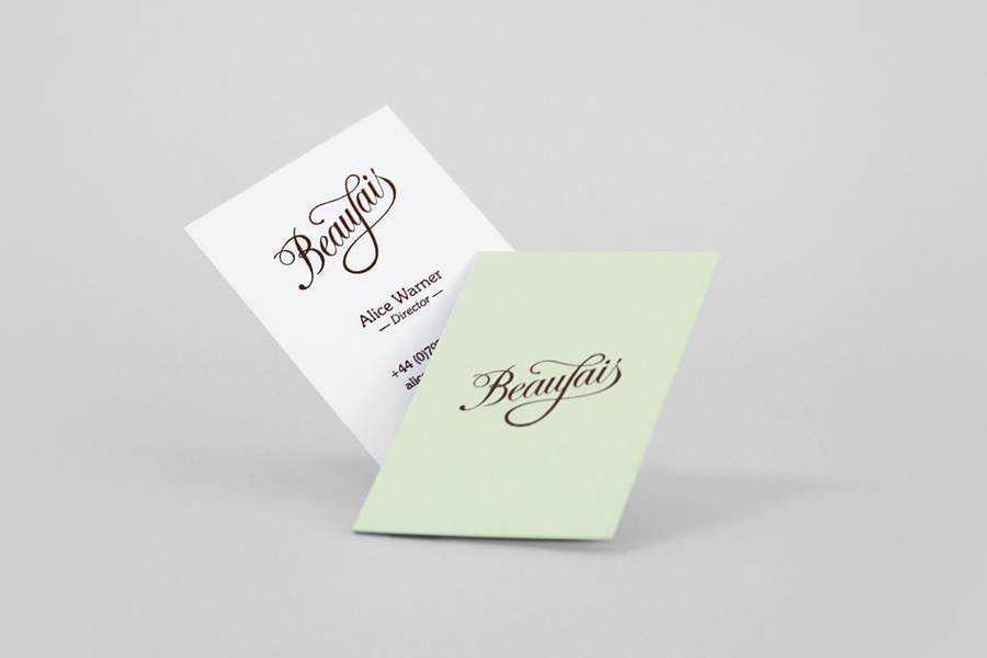
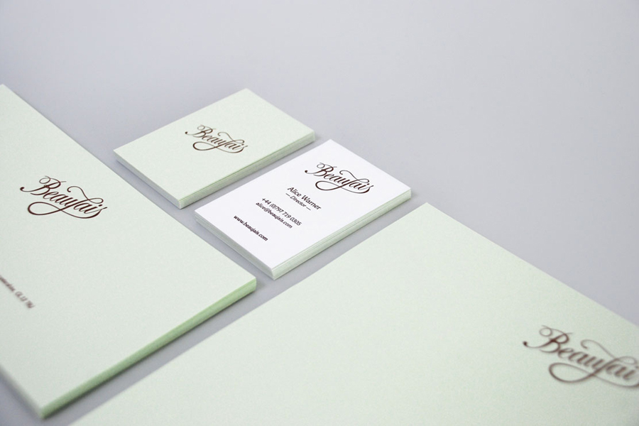
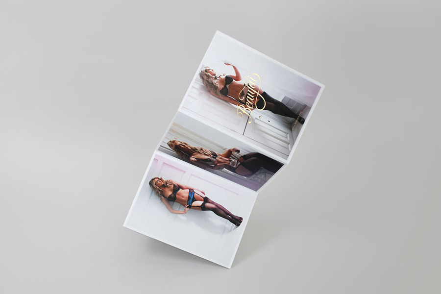
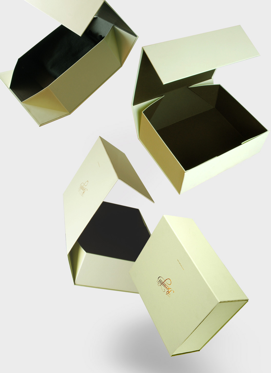
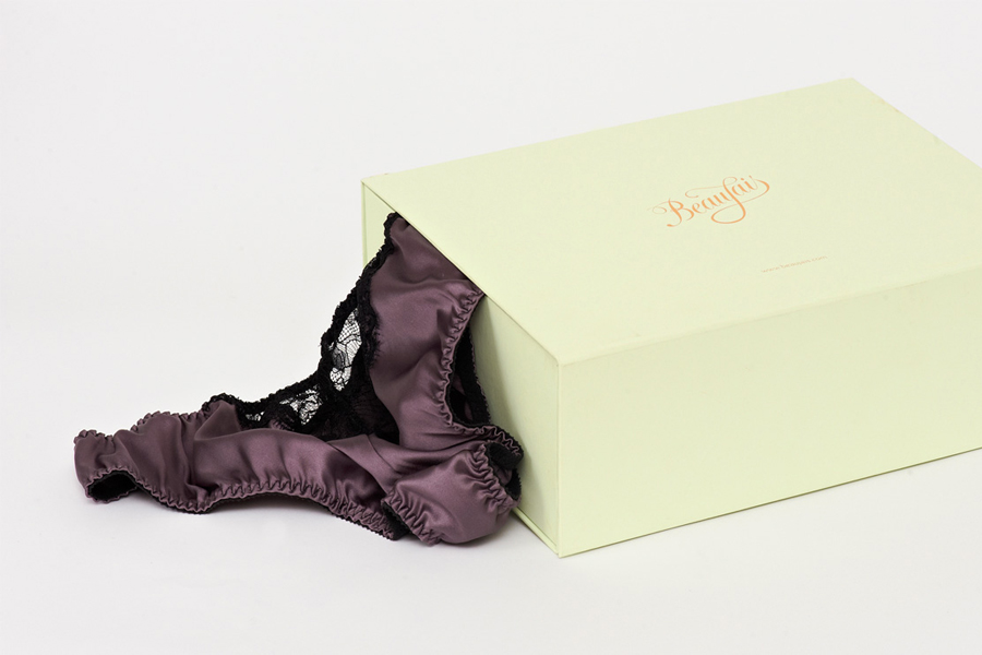
“Parent designed a suitably high-end brand identity and seasonal look book that was both contemporary and unique to their market. Inspired by classic typography and calligraphy we produced a bespoke marque which reflected the voluptuous nature of the brand with a high fashion edge. The marque was hand crafted and is detailed in brown foil on pistachio green colourplan for the stationery.” –Parent
Carefully constructed by hand and suitably analogising the design process involved in fashion, this logo-type has a wonderful sense of movement and detail. The reduction in the superfluous elements featured in the early sketchwork delivers a far more refined and restrained final version that has a classic and timeless simplicity. The line details and letterforms have been very well rendered and feel balanced throughout while the sweeping curves of the ‘J’ are a really nice touch that symbolises Beaujais’ curvier market specialisation. The minty green and warm brown colour palette is a refreshing departure from the saturated black and white luxury themes common in this sector and gives it a handcrafted Victorian boutique sensibility.
