Nemesis Films by Anagrama
Opinion by Richard Baird Posted 17 August 2011

Nemesis is a Latin American horror film production company and one of the first of its kind in the region. They approached brand development agency Anagrama to create an identity that would convey “formality and the highest cinematographic quality”.

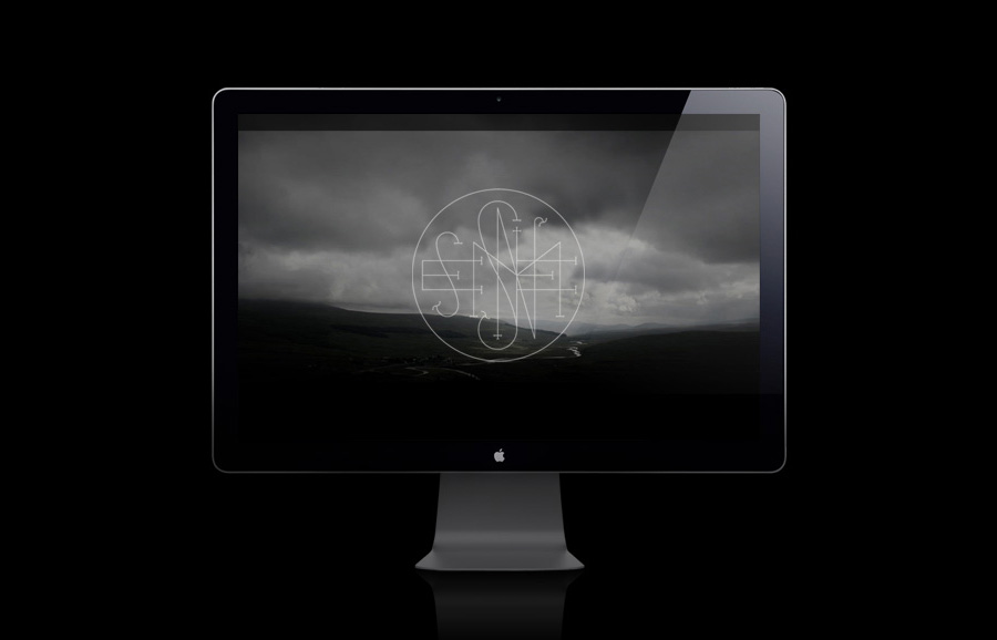
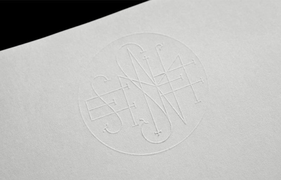
“We developed an identity based on ancient runes, which are related to an atmosphere filled with magic and rituals. The monogram is very complex, creating a counterpoint with the typography’s cleanliness, inspired in 1970’s cinema.” – Anagrama
There are two very distinct aspects to this identity and as the name suggests it builds on the stark depiction of good and evil within horror films visually captured by contrasting light and dark, fine and heavy, complex and simple throughout the project.
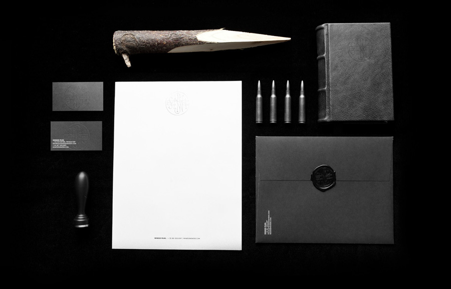
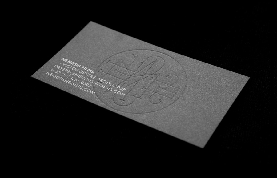
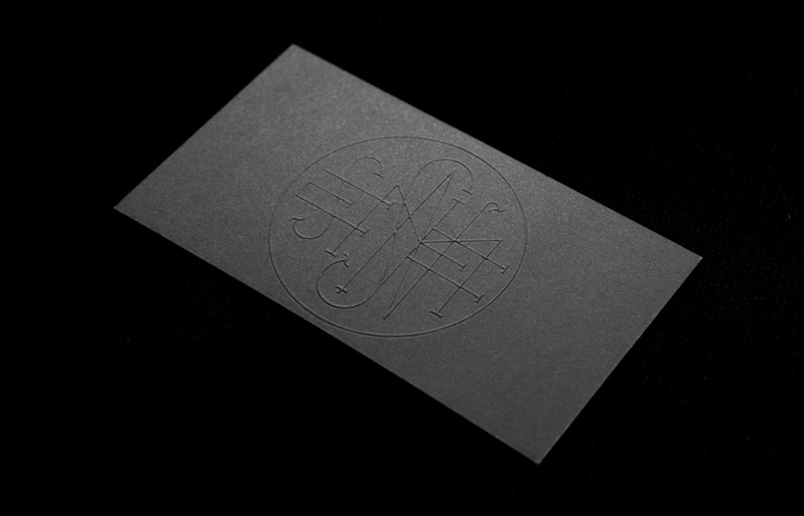
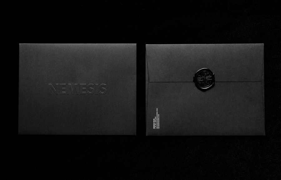
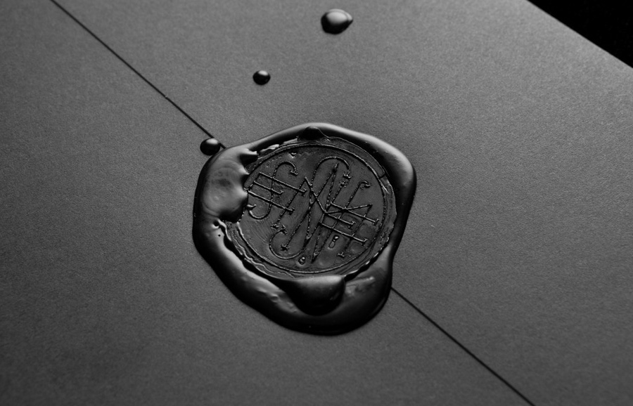
The logo-type is straightforward in its construction, set in a bold sans-serif and predominantly presented in white it has a robust and practical weight. In contrast the circular logo-mark has a complex interior of light-weight and entwined letter-forms that draw on the aspects of the occult and (possibly) family monograms (Van Helsing immediately comes to mind). I have seen a lot of unnecessary and trend driven applications of wax seals recently but within this context it seems perfectly justified and has a classic and eerie Hammer Horror sensibility. The black and white colour palette, substrate choices and use of embossing with light and shadow playing an integral part in reinforcing the theme and overall quality of the brand.
