Beo* by Ergo
Opinion by Richard Baird Posted 26 August 2011
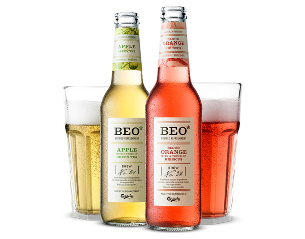
BEO* (meaning happy or delighted in Latin) is a new range of sparkling fruit drinks developed by Carlsberg for the expanding adult market. London based agency Ergo designed and developed a brand and packaging solution that delivers a more sophisticated twist on the popular organic proposition.
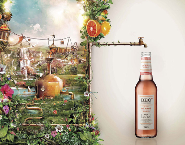
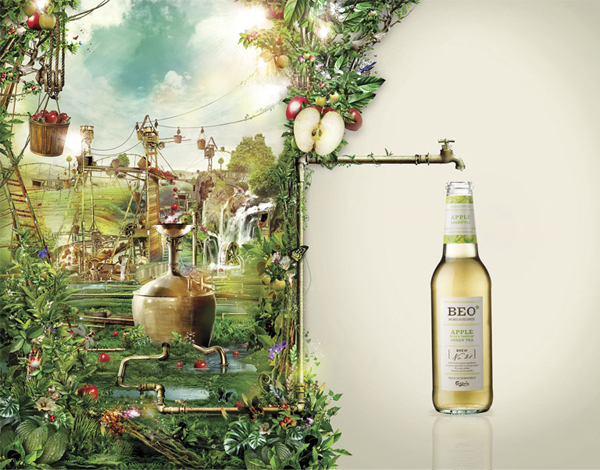
The ‘Hard to Explain. Easy to Enjoy.’ strap-line really sums up the split personality of this project that contrasts a minimalistic packaging proposition with a detailed and illustrative world. The BEO* brand is simple and straightforward in its expression of sophistication through the use of a serif logo-type while the addition of an asterisk implies that there is more to say but appears to be missing some form of visual resolution. The labels, built around mixed typographical combinations are nicely designed but draw slightly too many cues from the wine industry and could be seen as a confusing message.
The etched botanical fruit prints and engraving illustrative style on the neck of the bottle is neat but sit uncomfortably between the minimalism of the labels and the complexity of the marketing campaign. Where the brand truly comes to life (and clearly designed to juxtapose the simple label design) is the lush worlds created for the launch campaign by Indonesian digital illustrator Dhanank Pambayun which really work well to deliver a visual representation of the natural and organic varieties through a richly coloured and quirky style.
For me the visual contrast is fantastic and very well executed throughout but conceptually confusing. Taking the idea of a soft drink and packaging it as alcoholic is indicative of a market desperate to fit in and as a result the confident sophistication the product would like to convey is slightly lost.
