Ness by Moving Brands
Opinion by Richard Baird Posted 29 August 2011
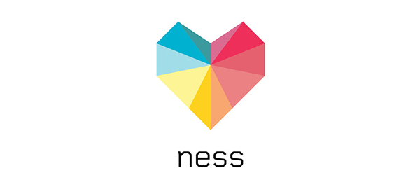
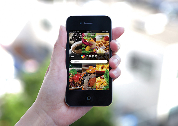
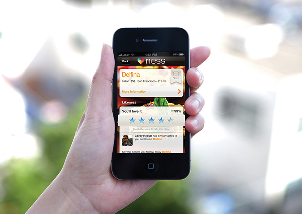
Ness is a new application that draws together personal information from social networking sites such as Twitter, Facebook and Foursquare (a process described as ‘machine learning‘) to provide its users with individualised restaurant recommendations. The app’s identity was strategically managed, named and designed by international brand development agency Moving Brands and represents the idea of unique user-centric data from multiple sources being brought together with a faceted heart logo-mark.
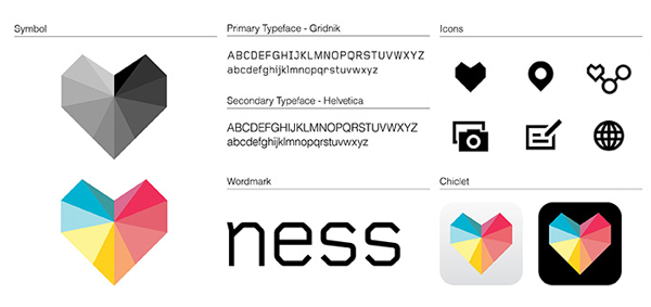
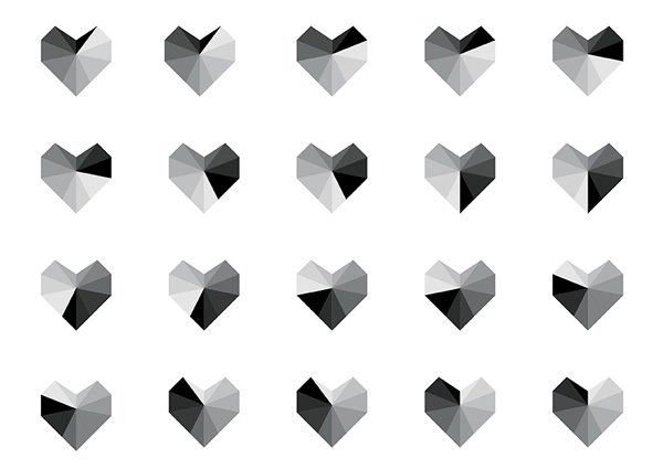
“The Ness identity is strongly informed by the strategy and naming work. We started by exploring visuals which emphasized the idea of what is personal and unique to you. Early identity directions centred around the intelligent learning performed by the app as it gets to know you. Through collaboration with the client, we were led to explore the symbolism of a heart-shape. Careful to avoid cliches, the Ness heart is faceted and technical. The strong geometric silhouette is unique with facets drawing in to a central point. The color palette is multi-colored, playing on the eccentricity of the brand being, and the many future possible verticals of the app. The same technical language of the heart is reflected in the typeface, Gridnik, and the custom iconography. Photography is a major part of the app UI, and guidelines were given to create consistency and showcase the food.” – Moving Brands
The logo-mark carries all the necessary analogous references to represent the integration of information and technology through the simple merging of multi-coloured and geometric facets. The heart formation, a suitable embodiment of individuality (the results) and the love for food and dining out, feels like a nice visual resolution of these core ideas. The word-mark and typeface, set in Gridnik, reinforce the idea of technology and complement the aesthetic of the mark while delivering a signification and unusual juxtaposition within the context of food. The colour palette gives the identity a sense of vivid dimensionality and while it suffers from the use of three key colours into an evenly segmented shape it should look great on backlit devices while the solid CMYK values should deliver impact on the printed collaterals.
