Donovan’s Cellar by United*
Opinion by Richard Baird Posted 31 August 2011

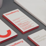
Donovan’s Cellar is an artisan producer of condiments and pickles created from classic techniques and family recipes. Launched in 2011 by NYC based restaurant owners Brandon Donovan and Francis Derby the products are aimed at both the retail and restaurant markets. Donovan’s identity and packaging propositions, developed by United*, convey the regionally sourced, hand packed and home style nature of the range with a mixed typographical solution and two tone colour palette.
This particular typographical direction is quite popular at the moment but I felt this was a well executed example that has a nice mixture of Gotham, Utopia Display and Engravers which is also used as the basis of the logo-type. The logo-mark has a distinctive red, bold and modernist aesthetic that draws it out from the single colour label designs with a stamp like sensibility (for quality) that establishes the abbreviation ‘D’s’ as a verbal and visual shorthand for consumers. The logo-type, a digitization of the classic typeface Engravers is an unusual choice that stands out in this category and while the overall lock-up feels a little tight it sits neatly to the side of the label.
United’s well balanced and modular utilisation of type, line details, containers and a monotone colour palette across the range successfully expresses the small localised tradition of the brand and the simple and straightforward nature of the products. The addition of the Manhattan skyline is a nice touch and expresses pride in its urban origins.