Voimaosakeyhtiö SF by Werklig
Opinion by Richard Baird Posted 26 September 2011
Voimaosakeyhtiö SF is the parent company to over 69 different manufacturing businesses in Finland and majority shareholder in the power company Fennovoima, a company that delivers energy to each of these businesses through a share-holder based co-operative scheme. Voimaosakeyhtiö SF’s new visual identity, stationary, website and brand guidelines, developed by Helsinki based design agency Werklig, resolve the cool Finnish environment, the theme of energy and reductionist sensibilities through sans-serif typography, an lightening bolt visual device and icy colour palette.
“The generalized symbol for energy is the symbol of lightning. Being an energy delivering company it was intentional to have the appearance of electricity and energy as a visible element in the identity. We set the task to have the visual symbol present without emphasizing it too strongly in the logo itself. The solution was leaving the logotype simple yet recognizable placing a supporting lightning element in the background.”
“Apart from the logo a visual element resembling a lightning and energy stream was created. The visual feature divides the surface diagonally from lower left corner to the upper right corner. The splitter in the center is always 1/20 from the height of the surface.” – Werklig
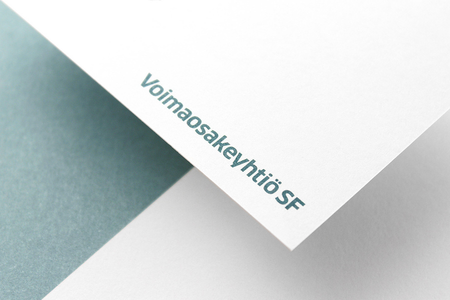
This is a great example of contemporary restraint. The logo-type is freed from what is often communicative or aesthetic excess by utilising a strong secondary graphic element, a diagonal lightening strike that binds print and digital, that allows type to be simple yet professional.
Set in what looks like a modified Titillium the logo-type has been well constructed and consistently spaced, the ‘y’ is a nice detail and has an almost jagged lightening like quality without appearing forced or over designed. The altered tittles over the ‘i’ and ‘o’, usually rectangular, contrast well with an angular spark that neatly captures the transfer of energy between provider and distributor.
The icy metallic green and white colour palette has a cold sharpness that works well to represent the Finnish location while expressing a clean and environmental quality. The collateral layouts are clean and straightforward allowing the reflective qualities of a metallic spot colour to reinforce the ideas of light and energy to deliver additional depth and sophistication to this minimal identity.