Coyote by Moving Brands
Opinion by Richard Baird Posted 19 December 2011

Coyote is a Chicago based third party logistics business working across a variety of industry sectors and boasts a network density unlike its competitors. Coyote commissioned independent and international brand development agency Moving Brands to create an identity that would represent the company’s dynamic work force and their energetic forward momentum.
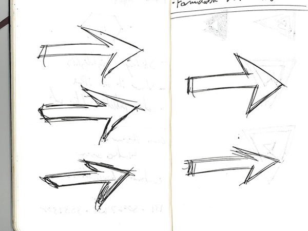
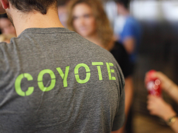
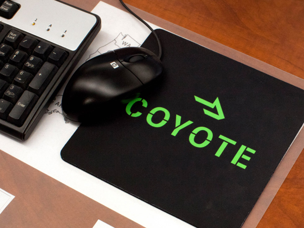
“Moving Brands created a new logo for Coyote which expresses their brand story — “Powerful Momentum”. The logo is called ‘The Arrowhead’. It builds on the strong name by abstracting the Coyote’s silhouette whilst encapsulating a strong left to right motion. The spare, direct feel of the logo is emphasized further by the stencilled wordmark. Bold use of black, white and green colors were chosen specifically to set Coyote apart from the competitor set.” – Moving Brands
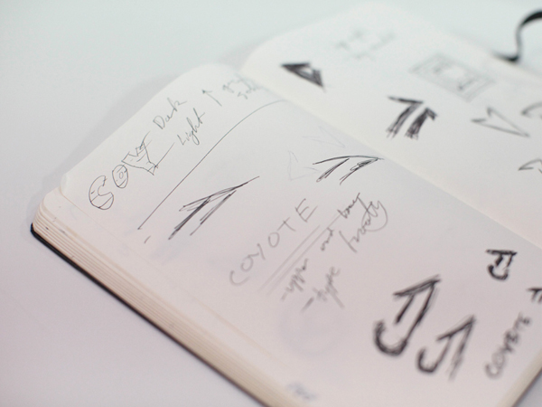
Following the high-profile and much discussed HP identity proposal last week, Moving Brands, who are becoming increasingly recognised for their very minimal visual approach but strategically in-depth resolutions, have published another case study that follows in much the same tradition.
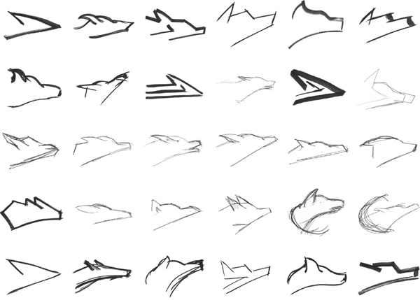
There is a wonderful simplicity to the Coyote logo-mark that manages to deliver a dual character that is both relevant to the brand (the coyote) and dynamic in its execution (the arrow). The marks weight, parallel lines and diagonal intersection bare a resemblance to global railway identities that neatly characterise the expansive network the brand operates. The forward facing arrow is a simple but powerful message of speed and efficiency that is combined with the subtleties of a coyote to add an aggressive and focused determination. The logo-type utilises a familiar (and quite popular) utilitarian stencil cut aesthetic to tie it to heavy industry, shipping and functionality. The changing direction of each cut creates a sense of movement linking each character and allowing the complete typographical construction to appear cohesive, modern and interesting.
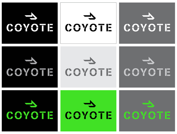
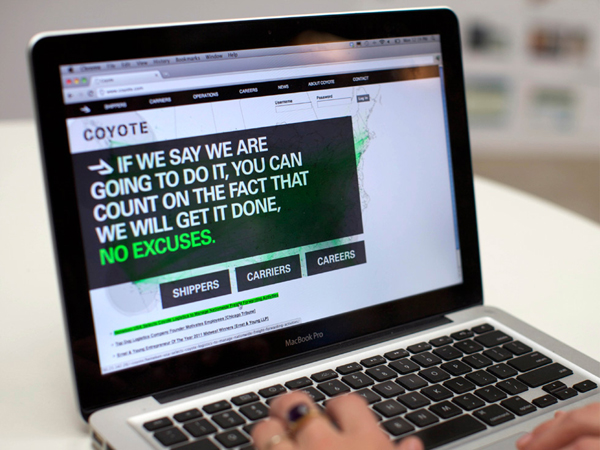
The neon green colour choice set on black, white and grey is full of expression and compliment the bold geometric forms of the identity clearly marking it out from its competitors. This could have been perceived as garish in so many instances but feels extremely modern in this application and highlights Moving Brands’ confident and intelligently restrained design experience. The consistent line weight across the type and mark characterises a solid and reliable service and while I am not keen on the vertical lock-up the identity neatly resolves the brand’s propositions in a clean and contemporary way.
