Partners For Mental Health by Blok
Opinion by Richard Baird Posted 2 January 2012

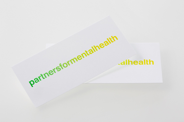
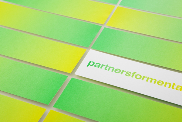
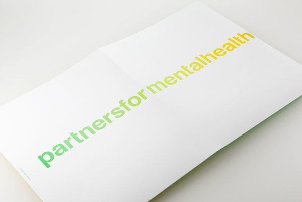
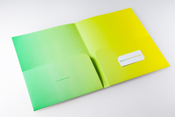
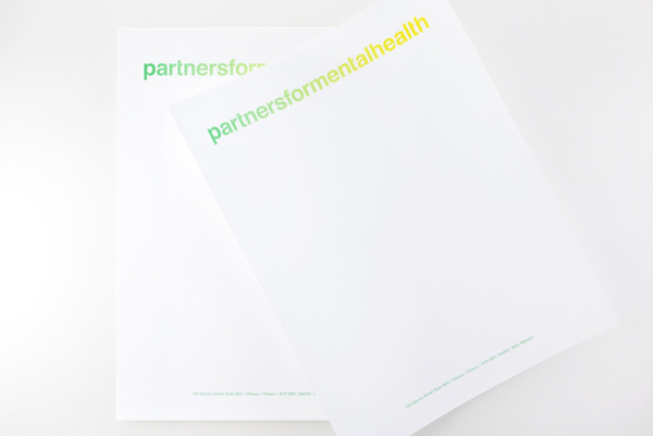
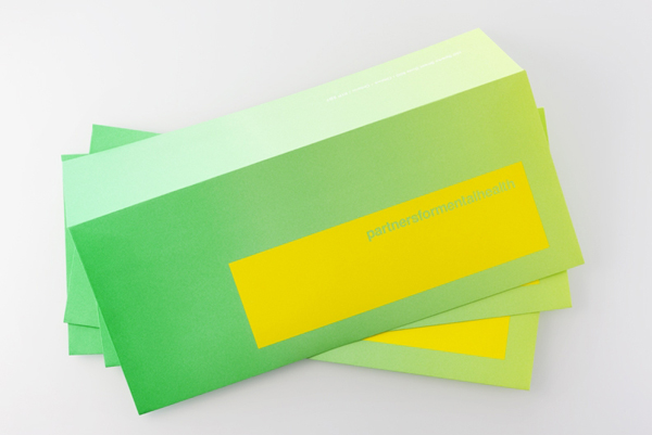
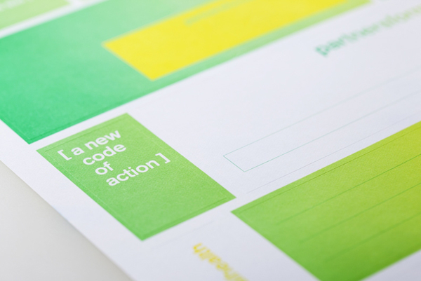
Partners for Mental Health is a Canadian charity that is dedicated to helping, improving and informing the general public about mental health issues through events, online communities and social media. Their new identity, designed by Toronto based Blok, resolves the themes of unity, positivity and a progressive perspective on mental illness with a simple logo-type solution and a vibrant, two-tone, spot colour gradient.
“First, we made the bold decision to run the name together to suggest inclusiveness – we are all in this together. We then used colour to add emotion and a feeling of connectedness – one can find oneself on the spectrum of mental health issues at any point. The identity has a spirit of change and of a movement in action. An element of surprise was crucial; this transformation cannot be achieved without boldness. Therefore, colours are applied vividly and unexpectedly, while language emphasizes the brand’s mission. Embedded throughout is a sense of hope, critical to the movement’s success.” – Blok

I am not usually drawn to such a bold and simplistic use of gradients or of neon greens and yellows (with the exception of Moving Brands recent work on Coyote) but the context in which this has been utilised here feels natural and intelligent, easily expressing a bright and optimistic sensibility. The logo-type is fairly straightforward in its construction and well executed, the absence of word spacing, designed to reinforce the aspect of community, is probably not a message that is as clear as it could be but this does not compromise its legibility and appears suitably expressive in its over-sized use. The use of a neon gradient is stylistically very confident and distinctive within the sector while functioning well as a smart visual analogy for the union and collaborative nature of the brand (an idea that is perhaps lost in the logo-type) as well as the transition to good health and a modern technological approach. The addition of large uncluttered white space across the collaterals gives the brand a sense of clarity and professional composure that really compliments and balances out the gradient.
