The International Center for Tomographic Research
Opinion by Richard Baird Posted 3 January 2012

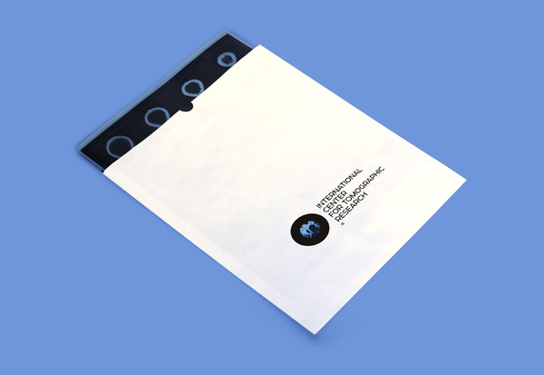
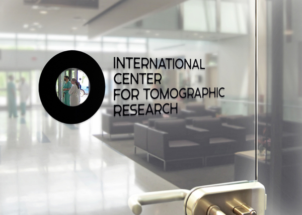
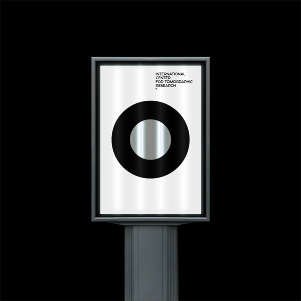
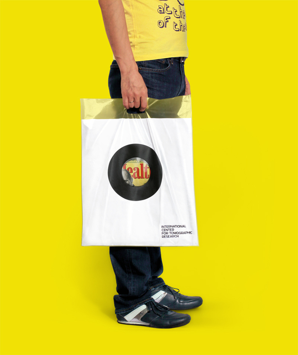
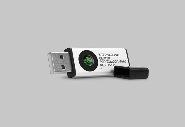
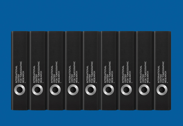
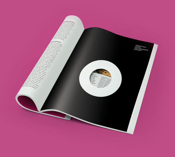
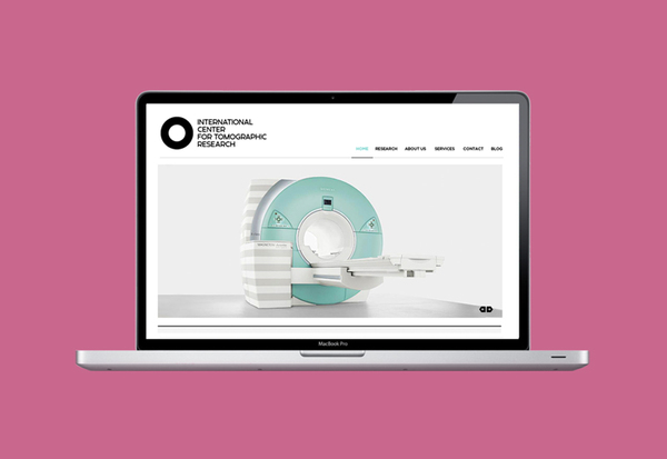
The International Centre for Tomographic Research is a chain of tomographic diagnostic centres located in and around Moscow, Russia. Their identity, created by Tomat Design, utilises a custom typeface and simple roundel device (executed as a window across the collaterals) to visually characterise the imaging process and the unique specialised research the company undertakes.

“Our idea based upon the understanding of the main function of a tomography machine –showing what’s hidden from a human eye. Tomographs do not cure or make a diagnostics – it only allows to look through the tissues. So is the identity –it allows to see what’s hidden inside the city-format, or what’s there on the next page of a magazine, or inside the envelope. We also developed a unique typeface for the logo and for use in advertising materials.” – Tomat Design
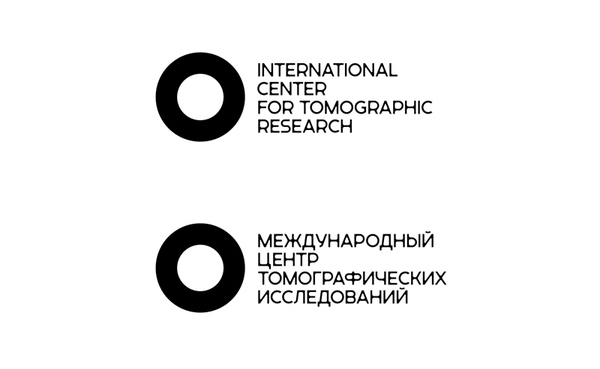
The logo-mark, a simple, but well weighted disk functions well as a distilled rendering of tomographic equipment, but also (and probably more importantly) a representation of the human eye. The union of these two ideas suitably represents both the practical nature of the technology while visually analogising insight, focus and a quest for knowledge that underpins research. The balance of positive and negative space feels substantial and iconic while conveying a sense of internal exploration.
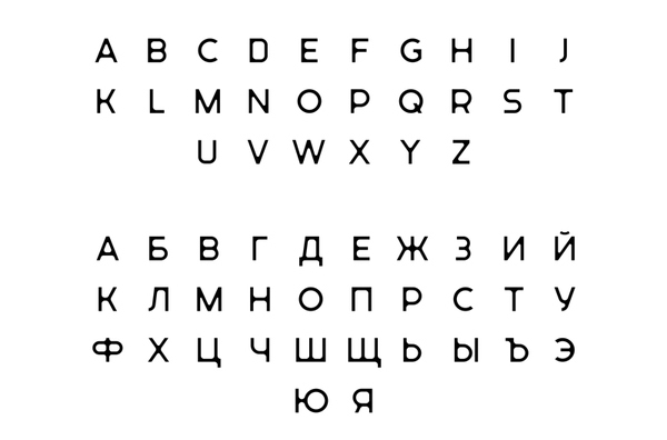
The mark has been accompanied by a proprietary typeface that adds an additional depth and character that plays well to the themes of technology (in its geometric construction), the individual skill of the researchers (in its uniqueness), and humanistic sensibilities (in the radii applied to the corners). Each character appears well resolved and distinctive that collectively look professional without becoming clinical or generic.
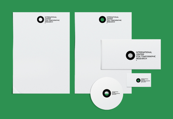
In its isolated form, the mark is far from unique but its application clearly demonstrates a strong conceptual foundation and really comes alive in its execution and is clear in its brand expression (clarity through research). Tomat has displayed exceptional creativity in the expansion of the identity across a number of touch points that remain interesting and engaging throughout.
