Five & Dime by Bravo
Opinion by Richard Baird Posted 5 January 2012
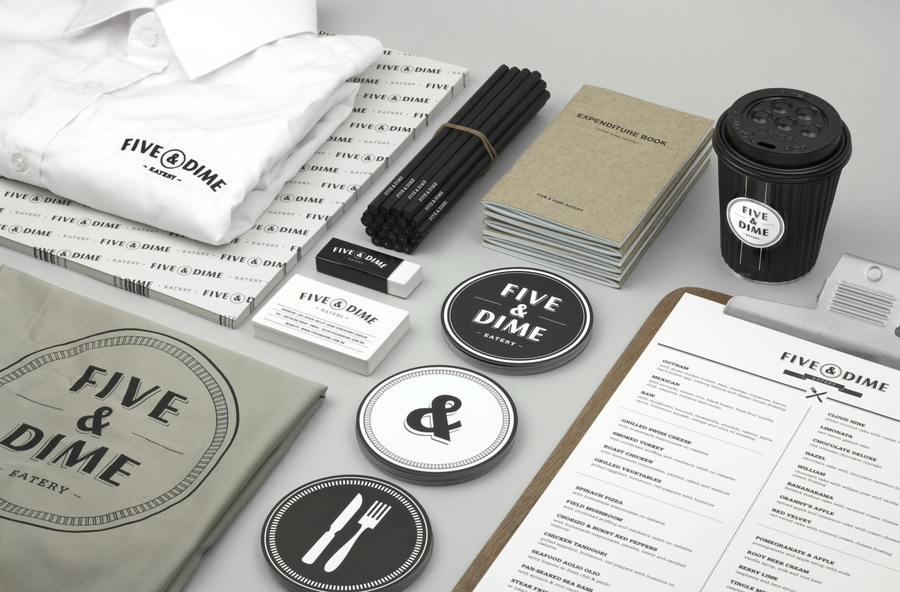
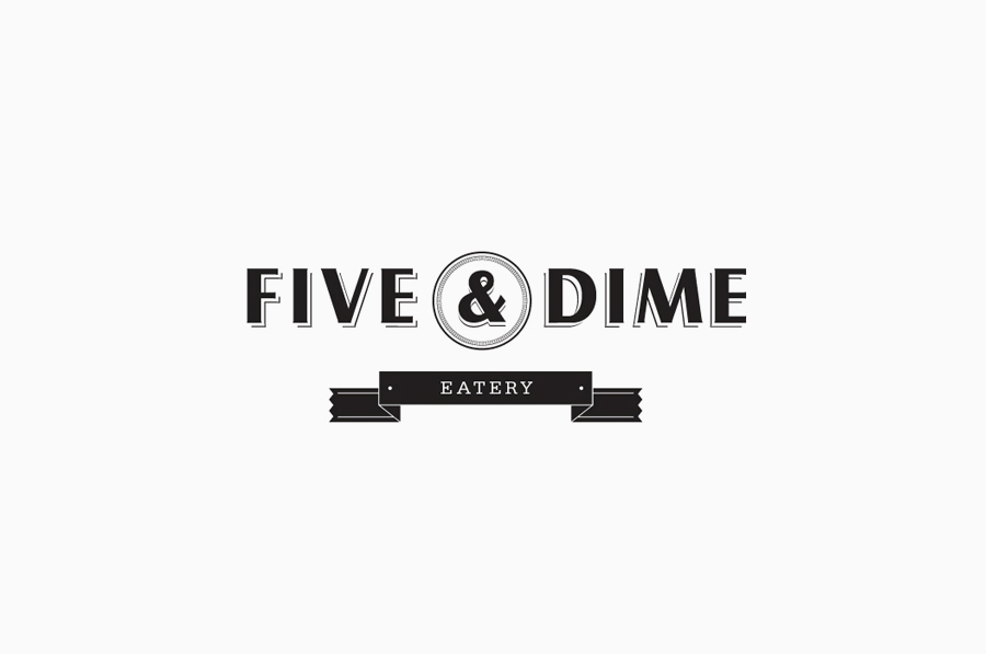
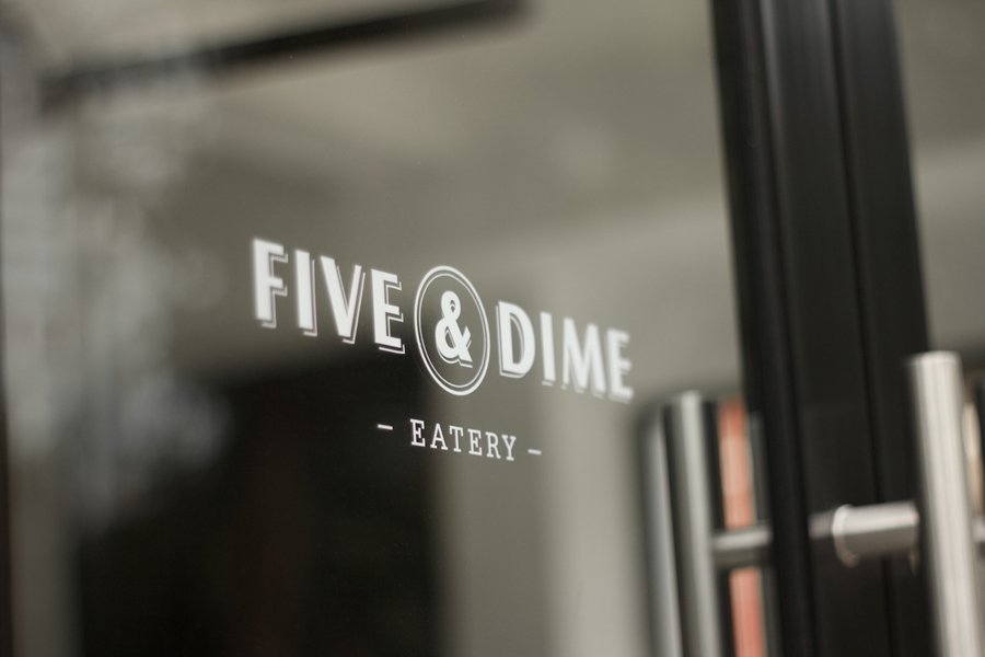
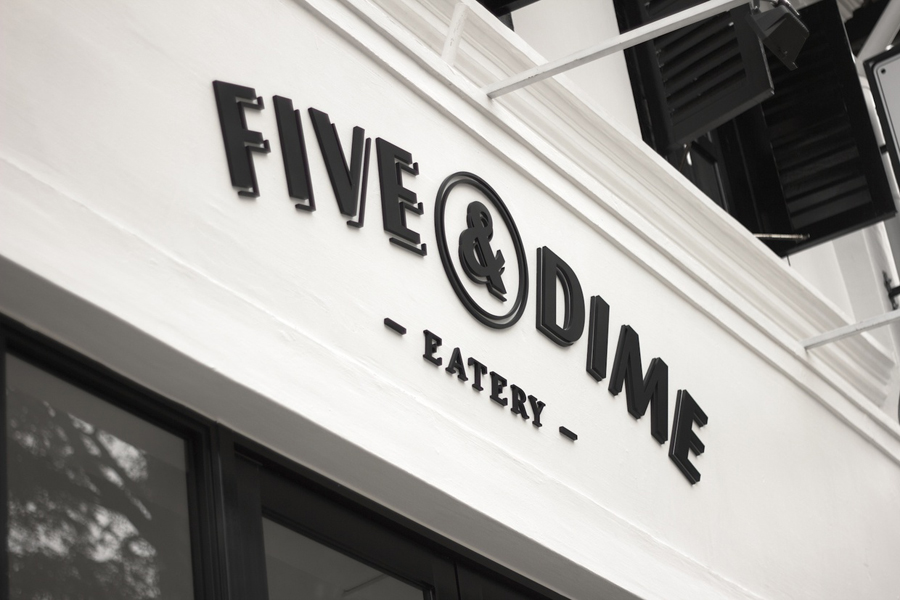
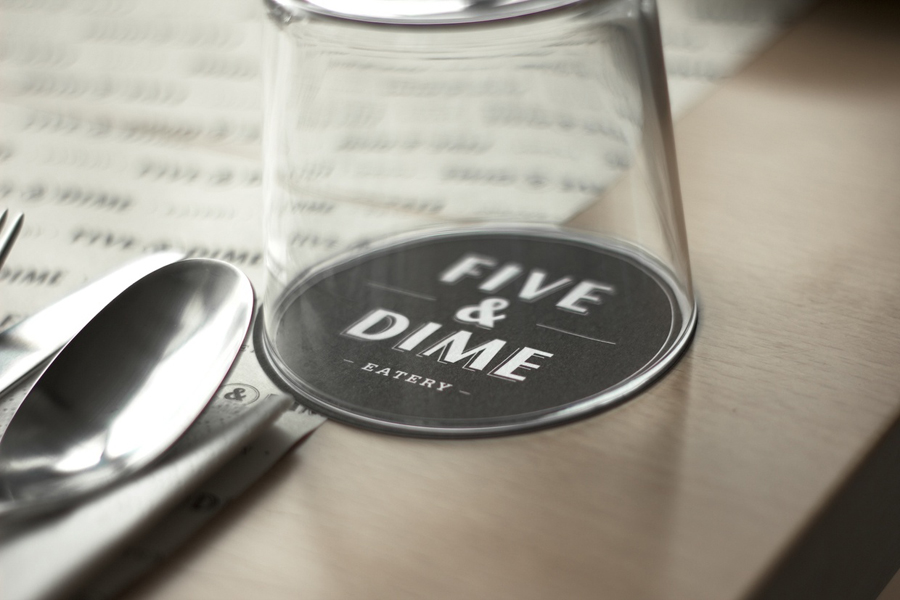
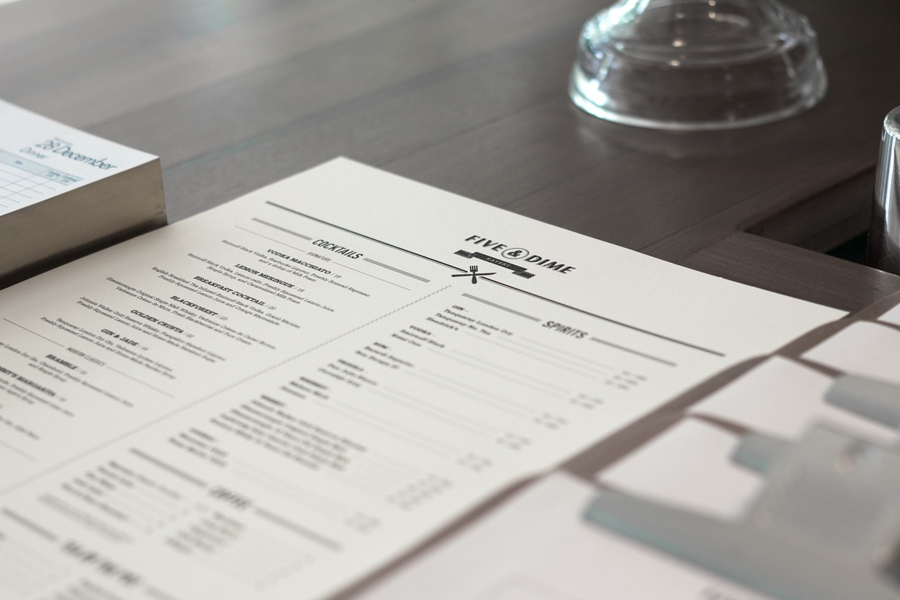
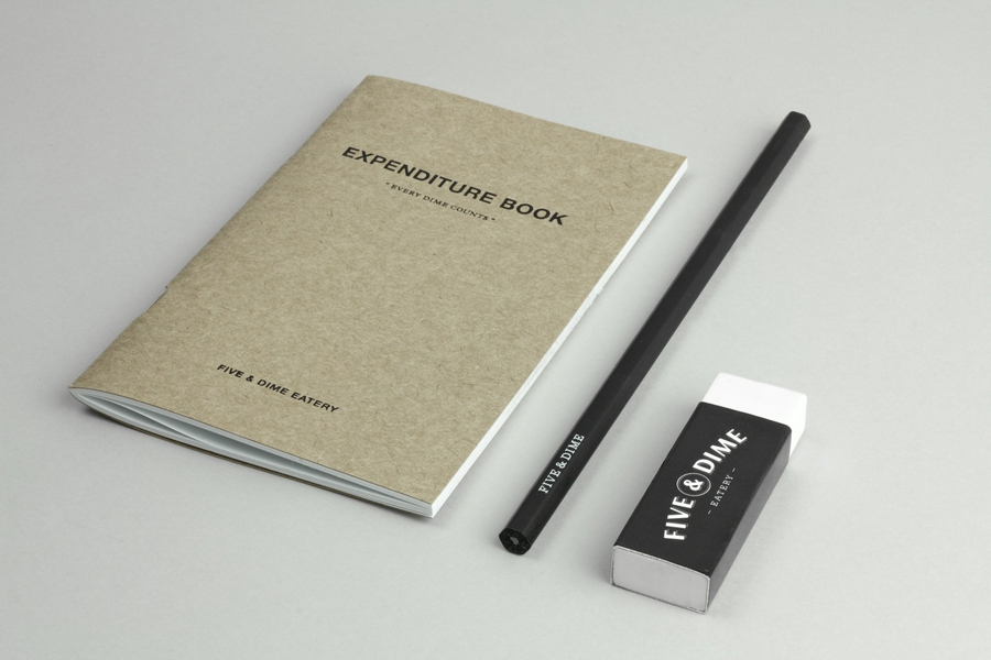
Five & Dime is a new restaurant and cafe located on River Valley Road, Singapore. Their identity, designed by Bravo takes the theme of American 5 or 10 cent stores and crafts a diverse portfolio of brand assets and an affordable product line.
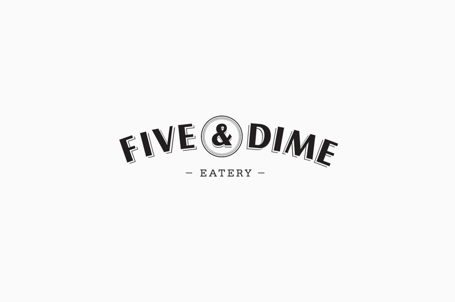
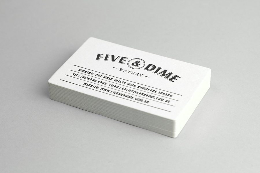
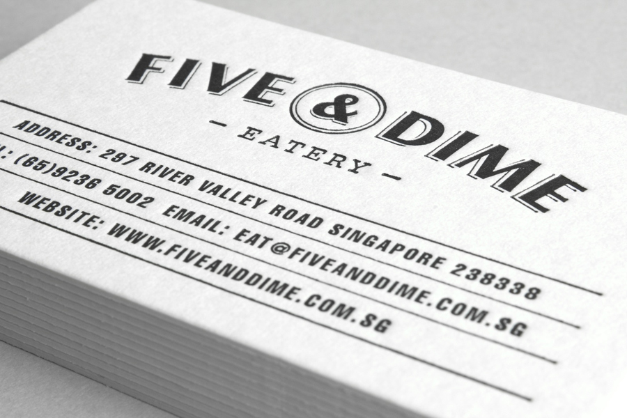
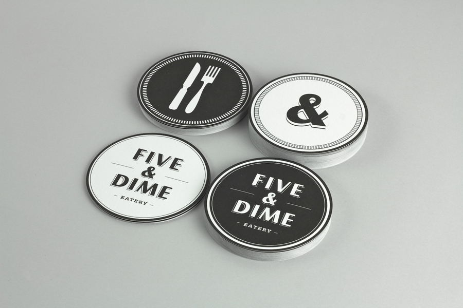
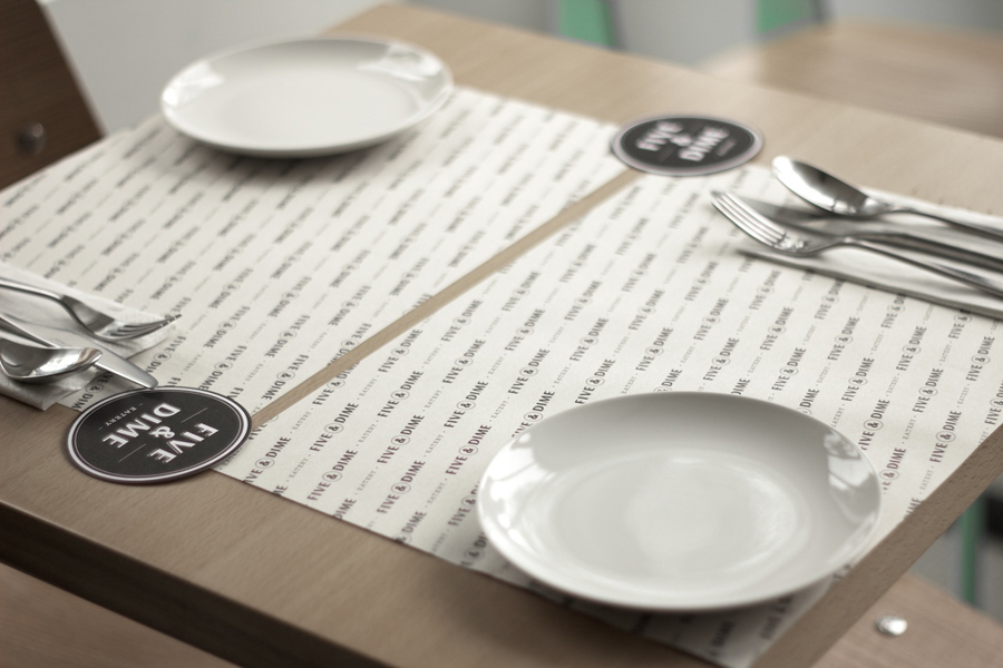
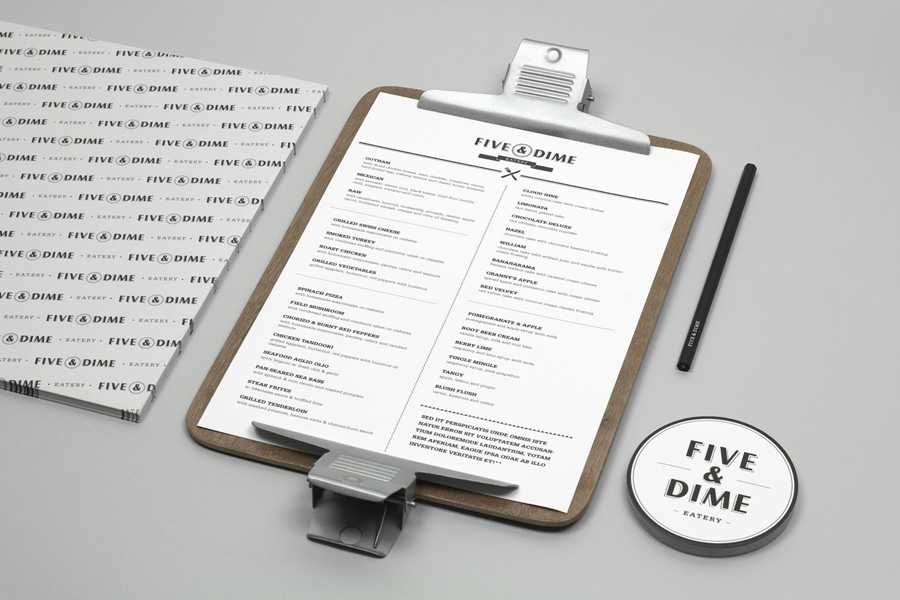
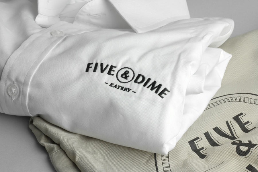
The circular coin form plays a key role across this identity. Set at the heart of the logo-type and reflected across the printed collateral it suitably reinforces the name in communicating an affordable proposition while also functioning well as a plate, a literal idea that neatly resolves the simplicity of the dinning experience.
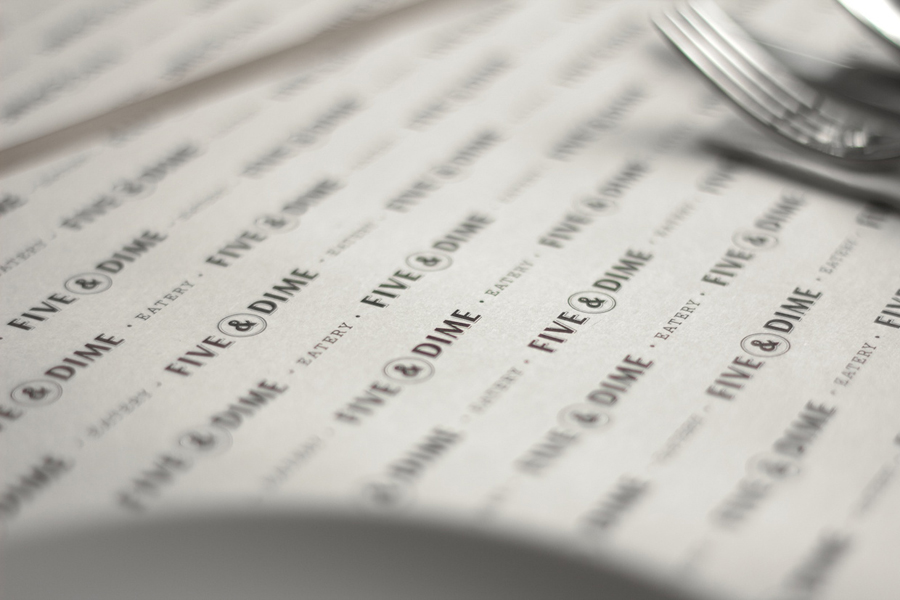
The typography is clear and well executed with a nice sense of depth and an underlying 60’s diner sensibility without being saturated in nostalgia or overly trend based. The alignment of the horizontal lock-up feels a touch awkward as the circle makes it clear the Five and Dime are not equally balanced, this could have been left out as the coin/plate concept is more appropriately communicated elsewhere. This is a relatively minor issue when looking at the stacked version and the consistency of the printed applications.
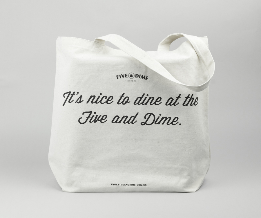
The accompanying and contrasting script utilised across the tote bag looks great and delivers a welcoming and conversational tone to the brand experience. A simple black and white colour palette is practical and affordable complimenting the design work and delivering a sense of quality without appearing inaccessible.
