Trap Recordings by Red
Opinion by Richard Baird Posted 6 January 2012

Trap is a East Sussex (UK) based independent recording studio releasing music from artists such as The Drug Models Love and Ursula Points. The label’s new identity, developed by Red Design, mixes a bold typographical choice and a playful logo-mark that together appears contemporary in its simplicity and literal in its ideation.
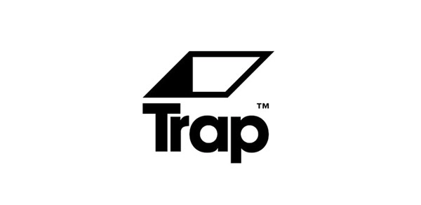
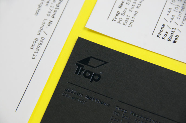
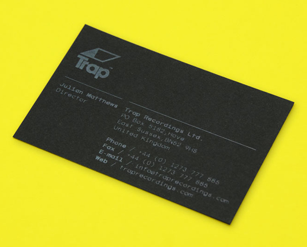
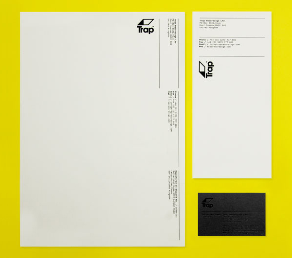
The Trap logo-mark feels remarkably fresh in its straightforward conception and execution, it is a bold statement that speaks of a confident no-nonsense approach to producing and signing original music. For me, the mark shares similarities with an on-screen loading bar that delivers a two and three dimensional duality to the identity and alludes to the global movement towards digital content and streaming services. The logo-type, set in ITC Avant Garde Bold, is suitably weighted and compliments the mark above while the ‘TR’ combination, tightly kerned feels well-considered and gives a more distinctive character to a fairly saturated typeface. The identity’s application across the collaterals keeps it looking contemporary with a very clean layout and a right angle copy and logo-mark combination that infuses a more experimental quality. A spot UV and grey print treatment across the business cards gives the identity an almost ‘hidden’ quality that reinforces the ‘trap’ concept and looks pretty neat.
