Getner by Anagrama
Opinion by Richard Baird Posted 11 January 2012
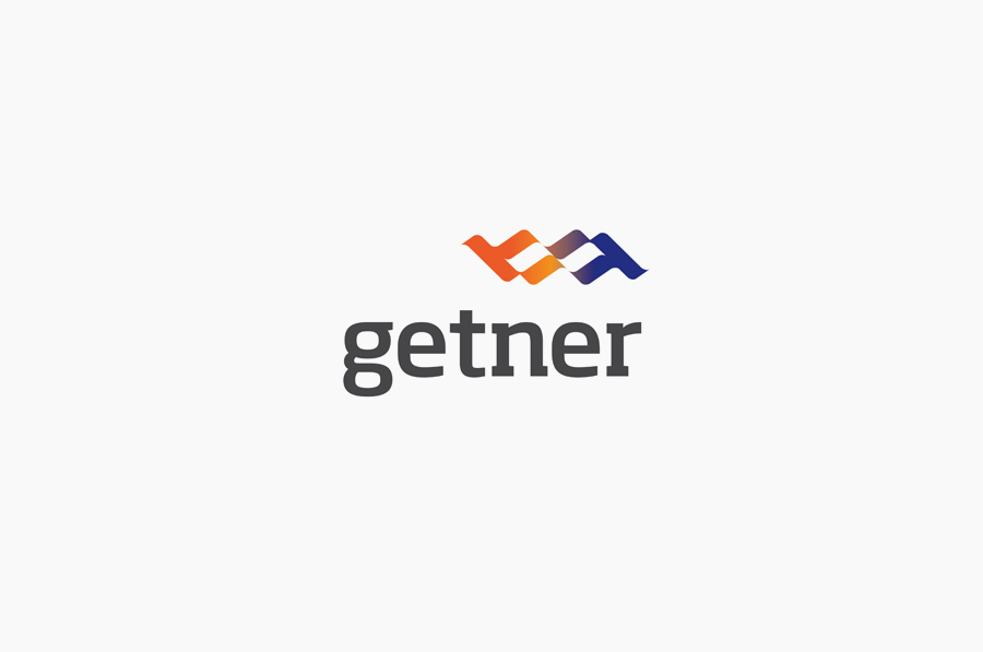
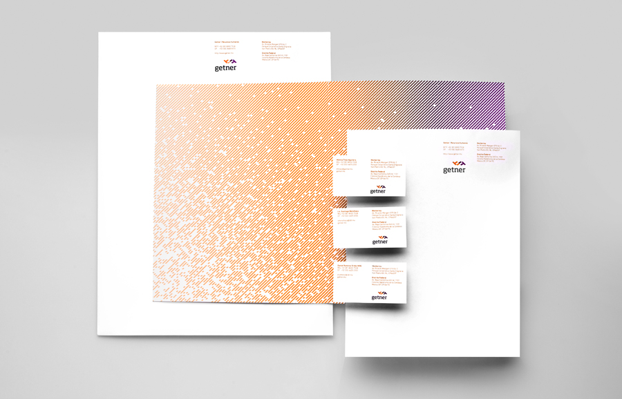
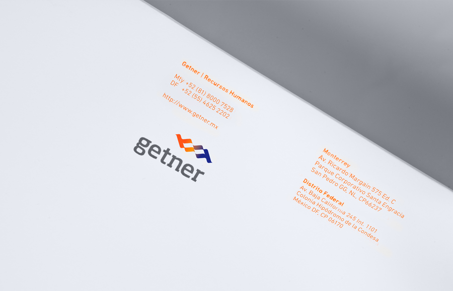
Getner is a payroll management company focused on the Latin American market. Their new identity, designed Mexico based brand development agency Anagrama, fuses a simple logo-type and flag like logo-mark solution to characterise a personal service delivered to big business.
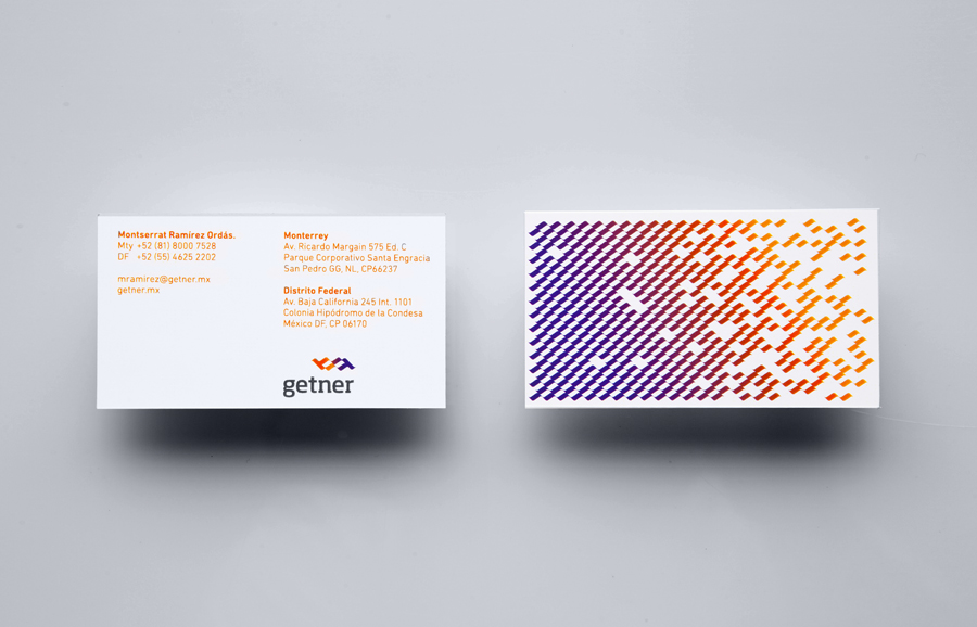
“It was very important for this young enterprise to appear as a responsible, modern company, with the ability to handle big corporate accounts providing the benefits of a team small enough to pay attention to detail, but experienced never the less. The logo-mark evolved from the abstraction of two hands closing a deal, conveying Getner’s human nature; and a waving flag that denotes the company’s dynamism. As for the color palette, we chose to work with very bright colors, in order to stand up from their competitors, who tend to use much more sober tonalities.” – Anagrama
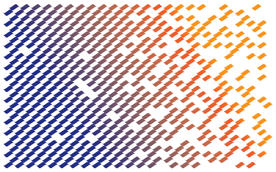
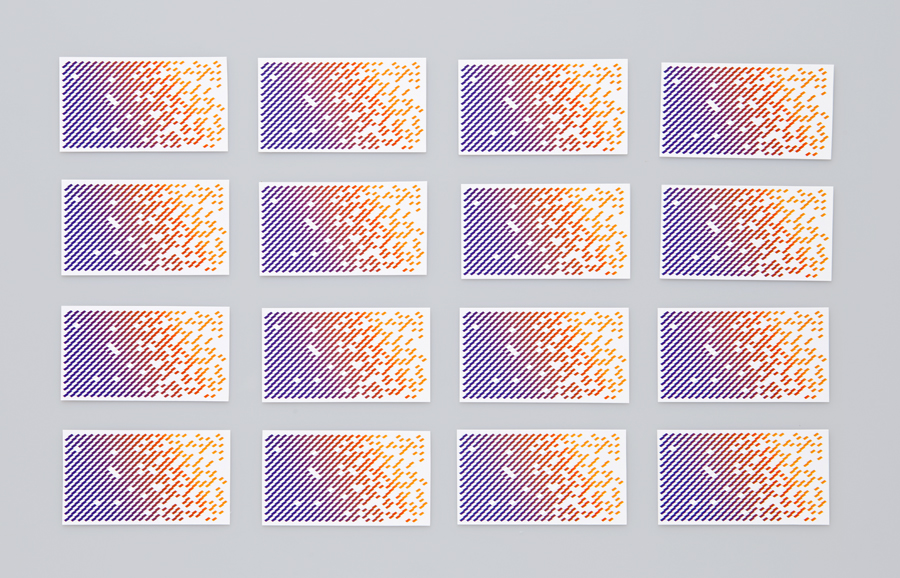
The logo-mark’s two hand ideation is a simple concept but fairly abstract in its execution, the two blended colours do however make the aspect of collaboration a lot clearer while the flag like aesthetic works well to suggest pride and is successful in appearing youthful, bright and positive. This is reinforced with some nice repeating pattern work on the reverse of the collaterals that helps to add a slightly more creative dimension. The type is simple and clear, perhaps a little generic but with a nice technological undertone that gives the company a forward thinking sensibility. The result looks neat and professional while appropriately side-stepping a overly corporate aesthetic.
