Commando Group by Commando Group
Opinion by Richard Baird Posted 17 January 2012

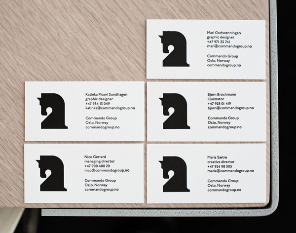
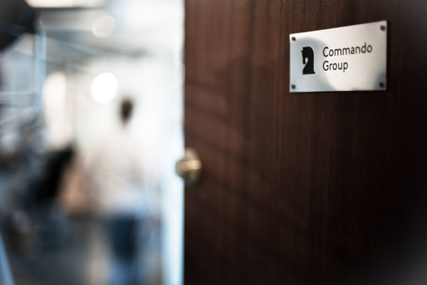
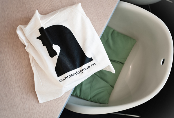
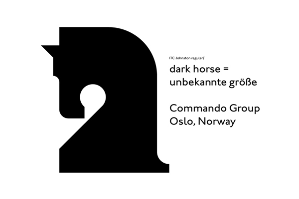
Commando Group is an Oslo based, multi-disciplined, visual communications agency. Towards the end of last year the group embarked on a rebranding exercise replacing their previous running horse logo-mark and script logo-type with a simple, geometric head, utilising chess as an analogy to deliver a clearer, less superflous and more authoritative brand message.
“We feel that this horse truly reflects our spirit – it’s stronger, clearer and even more dedicated. We like the connotations to the chess knight – with its mobility it’s a versatile and strong piece. And of course; we do like the ambience of the dark horse!” – Commando Group
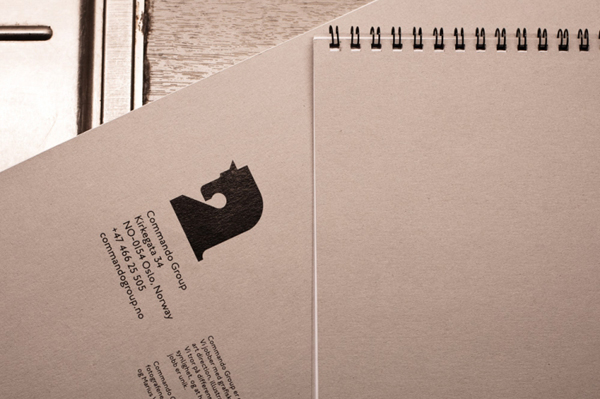
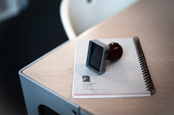
Although not the latest news, (this was released back in September), I really felt that the strength and depth of the concept was smartly contrasted against the simplicity of the execution and worth a mention. The use of the Knight, a chess piece known for its dexterity across the board, (jumping over other pieces) is a smart resolution of strength, agility and, with reference to the game, strategy. As a visual piece it has a confident, minimal construction and features some lovely geometry that manages to fluently communicate the company’s considered approach and aesthetic values. The mark is straightforward in its application across the collaterals while appearing iconic and confident in its over-sized use in conjunction with a small and restrained type choice. The stamp is an interesting and perhaps slightly contradictory approach but delivers a practical and personal quality that neatly offsets what could initially be perceived as slightly cold.
