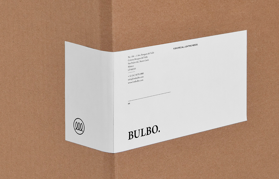
Bulbo by Anagrama
Opinion by Richard Baird Posted 18 January 2012

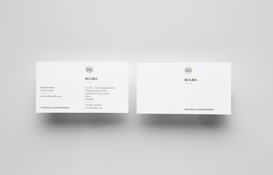
Bulbo is a San Pedro, (MX) based boutique lighting shop that specialises in high-end products and interior planning. The brand approached independent design agency Anagrama to develop a visual identity that would unite the company’s experience of light and space with the contemporary elegance of their products.
“Their added value relies on the fact that each of their pieces are carefully selected from their catalogue, as well their ability to manage an entire lighting project for a specific space. When it came to their identity, Bulbo knew the importance of portraying their products’ sophistication. They approached us asking for a for a brand identity that communicated the brand’s elegance above anything else. The monogram is inspired on the language of electric diagrams and it is complemented with a sober serif typeface.” – Anagrama

Anagrama seems to be putting out a lot of work recently and while I do not think this is their strongest piece of identity work it does have a quiet confidence that feels fitting for a business based on silent illumination.
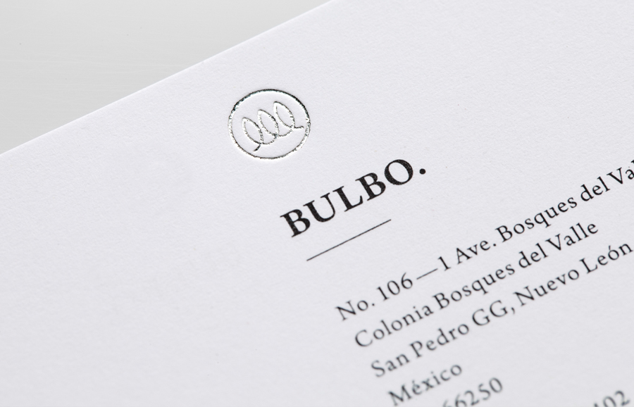
There are four clear aspects to this identity, on the surface, light and the interior space it occupies, followed by a contemporary approach to timeless design. These characteristics are seamlessly distributed across a symbol, logo-type and very restrained colour palette. The logo-mark has a confident duality that balances the simple aesthetic of a traditional filament, a representation of classic design (and a nod to the origins of modern lighting) and electric diagrams, something that perhaps resolves the more advanced technologies as well as the aspect of planning and informed advice. The contemporary mono-line weight execution of the logo-mark is juxtaposed with a serif logo-type, set in Arno Pro, that delivers a more conventional sense of elegance and design sophistication. The letter-forms appear smart and well spaced and while the punctuation feels like a superfluous detail it does add a level of confident authority.
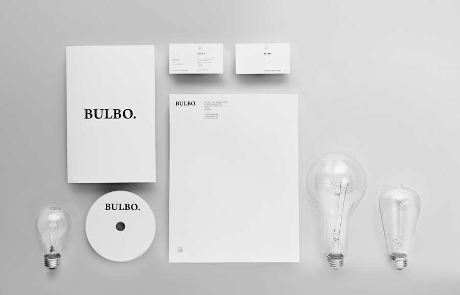
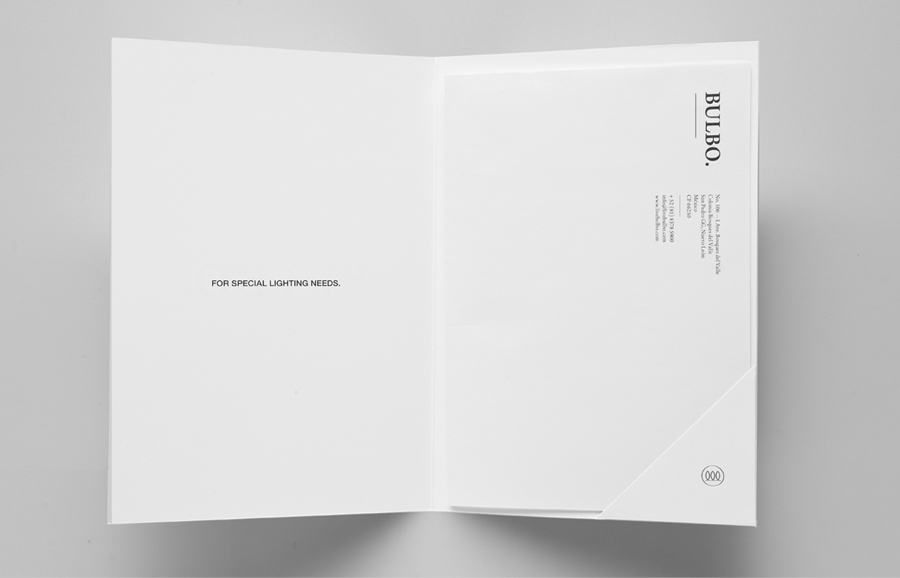
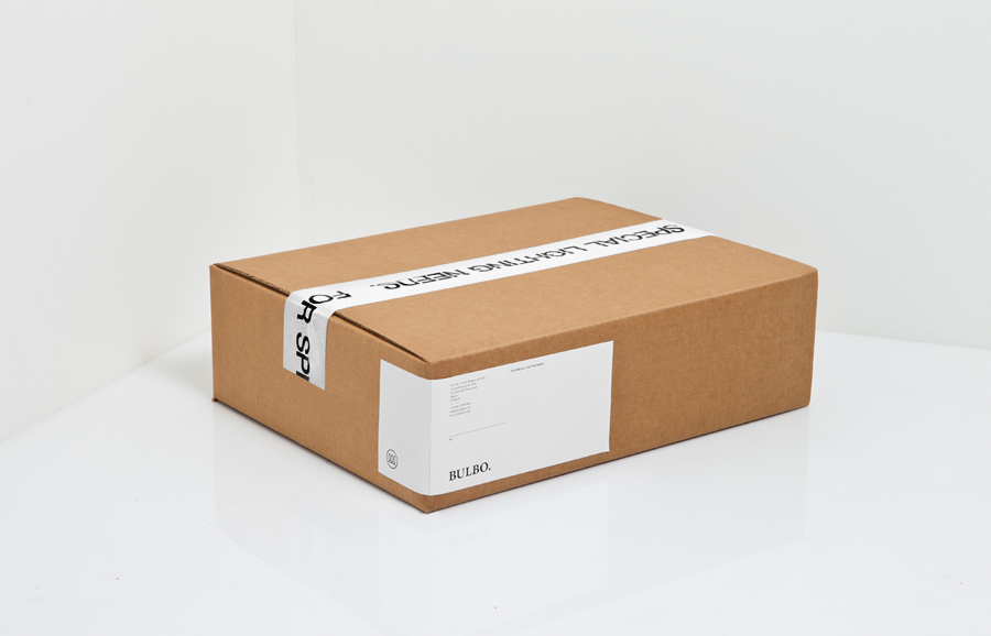
The balance of internal space created within the logo-mark is reflected throughout the external space and layout of the stationary, labels, and website, combined with a classic black and white colour palette (with an on/off sensibility) it works well to unify light and space in a simple but considered fashion. The block foil treatment on the business card is a nice touch that draws the light from the environment into the branding while reinforcing its premium proposition.
