Vibo by Saffron
Opinion by Richard Baird Posted 21 May 2012
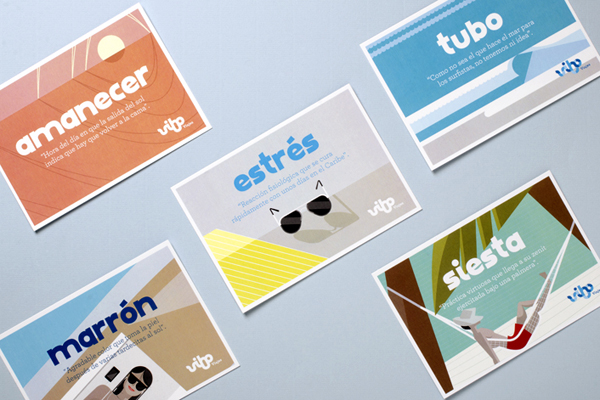
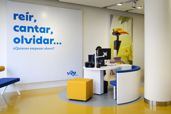
Towards the end of 2011, Spanish high street travel agent Vibo (formally Viajes Iberia) began to roll out its new visual identity developed by international design consultancy Saffron as part of a new strategy to differentiate itself from an increasingly generic market place. Following this rebrand, Saffron has published some of the signage and printed collaterals that make up the visual identity system (alongside a new logo-type) that offers an imaginative alternative to conventional destination photography.
“Spain’s tourism industry is over-saturated with travel agencies and their promotions. A total lack of differentiation makes it hard for customers to find an offer that suits them. Everyone sells the same products, tells the same story – all with the same approach and (lack of engaging) attitude.
Most Spanish travel agencies have been in the business for a long time – and it shows. They still operate in the same way they did before internet bookings turned the industry upside down. They have clumsy web pages, slow processes, incredible inefficiencies and a frustrating lack of customer service… a truly anachronistic industry.
In 2011, Viajes Iberia, part of the first travel group in Spain, Orizonia, wanted to lead the charge towards real change. Saffron was hired to undertake a rebranding programme that would help them reinvent themselves and with them the travel agency industry in Spain.
Saffron defined a brand idea that matched the new positioning of the organisation – “Fast track to good times”, renamed the company and created a vibrant and lively visual expression to support the new brand experience. The new name comes from Viajes IBeria Orizonia – VIBO. The company’s positioning passionately defends each person’s right to a good time.
The new brand has a fresh attitude that offers a dynamic and simplified service and focuses on turning everything around travelling into an enjoyable moment, from preparing your journey to actually getting and being there.” – Saffron
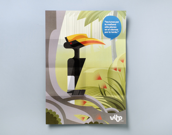
Following their recent Evo identity project, Saffron continues to offer new aesthetics to the Spanish high street. The tired oversaturated stock holiday photography is refreshingly absent in favour of a proprietary illustrative approach that delivers far more originality to the in-store travel experience.
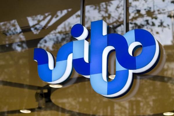
Primarily based around a logo-type constructed from large curves, a heavy line weight, ligatures and three blues, the identity delivers a bold and playful quality (one that mirrors those of a winding river, a possible analogy to journeys and exploration) that drops the formality of corporate business. The bowls of the ‘v’, ‘b’, ‘o’ and partially through the ligature of the ‘i’ have a pleasant repetition and simplicity that delivers movement while its geometric quality implies reliability and a packaged consistency. The stem of the ‘b’ (I originally wrote ‘h’ here by mistake highlighting a potential readability issue) and the tittle over the ‘i’ offer a counter-balance to the quirky and unusual extended baseline of the ‘B’ which is followed by a subtle sense of depth and dimensionality of a looping ‘BO’ ligature.

For me it is the illustrations that give this project its warmth and personality neatly side stepping the beach shots, cityscapes and blue skylines in favour of a bright but natural colour palette and a geometric rendering that confidently moves between busy and minimal abstract styles appropriately communicating the variety of destinations and pace. An accompanying speech bubble device, while a common technique delivers, alongside a lowercase and loosely rendered typeface, a friendly and conversational visual language that aesthetically binds the logo-type and illustrations to enhance and compliment the holiday booking experience, a detail absent from an increasingly on-line market place.
